Letterforms

Type is the part of design people are most willing to believe is neutral, and it is the least neutral thing on the page. Every shape here is a fossil of the tool that made it.

31 parts named·10 classifications·Live specimens·6 films

HandglovesHandglovesHandglovesHandglovesHandglovesHandglovesHandglovesHandglovesHandglovesHandgloves

Cinzel · UnifrakturMaguntia · EB Garamond · Libre Baskerville · Playfair Display · Roboto Slab · Archivo · Jost · Source Sans 3 · Tangerine, scroll sideways. Same word, same size, ten different arguments.

Three different things

Type

A system of repeatable parts. You license it, and so does everybody else who licensed it. Its whole value is that the same shape arrives ten thousand times identically, which is why it was worth inventing and why it cannot be made to fit any one word perfectly.

Lettering

Letters drawn for one job. They belong to nobody else and they can do things a font cannot, a line that tightens as it runs out of room, a join that exists once. What it costs is flexibility: draw the twenty characters of your name, license a typeface for the other ten thousand words.

Calligraphy

Letters WRITTEN, in one pass, with a tool whose behaviour makes the shape. Not drawing and not type: a calligrapher does not redraw a stroke, and the thick and thin are decided by the pen rather than by the hand. Everything below about contrast comes from here.

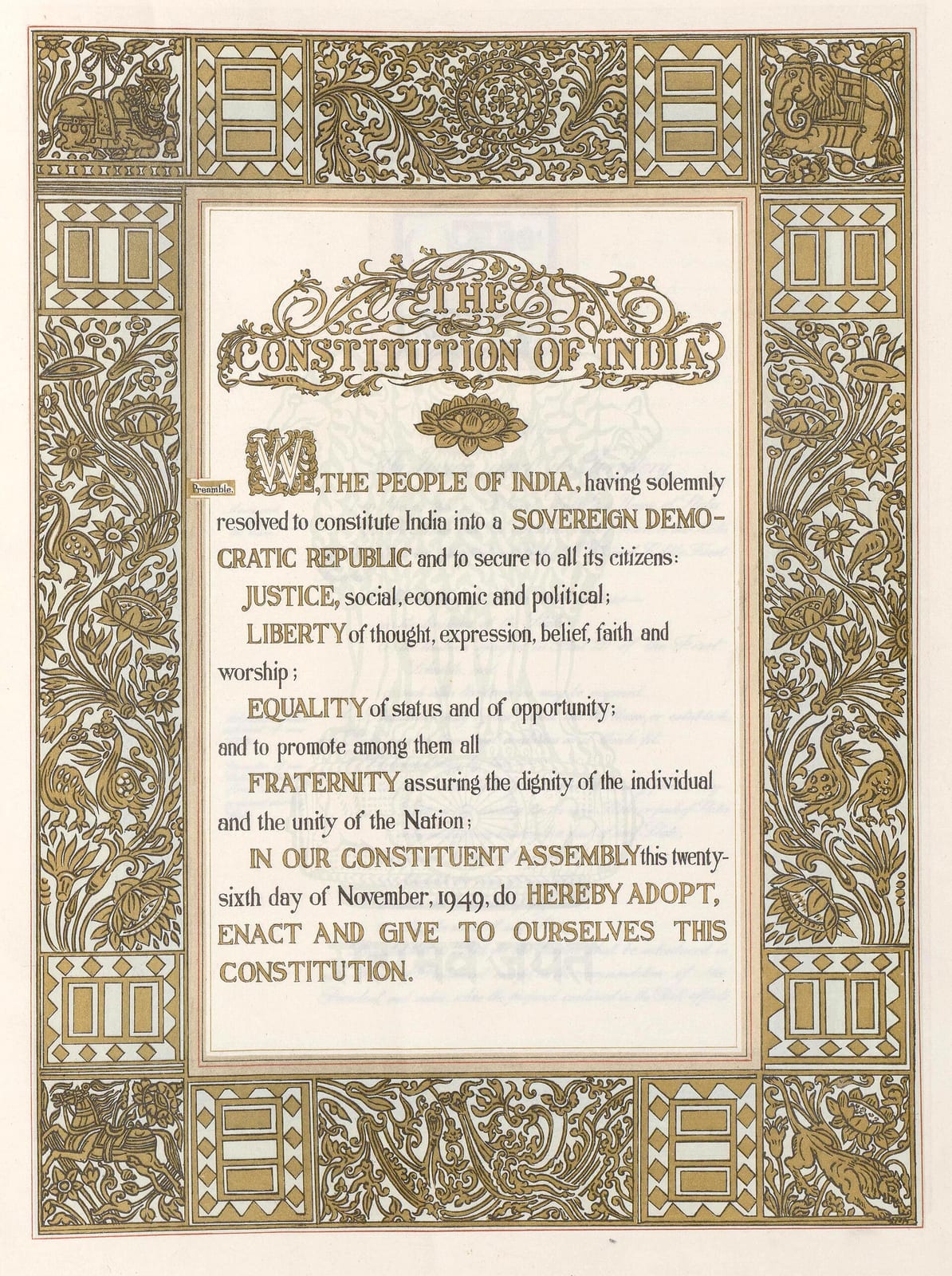
The Preamble page of the Constitution of India: a block of hand-lettered text beginning WE, THE PEOPLE OF INDIA, with JUSTICE, LIBERTY, EQUALITY and FRATERNITY picked out in capitals, framed by a wide gold border of foliage, peacocks, elephants, a bull and a chariot. A pale blue watermark of the Lion Capital sits behind the text.
The Preamble page of the Constitution of India, lettered by hand inside a gold border. Every word on it was drawn, not set in type.Preamble page, the Constitution of India. Ornamentation by Beohar Rammanohar Sinha; calligraphy by Prem Behari Narain Raizada; art direction by Nandalal Bose.Wikimedia Commons/Public domain

Nobody set this. The Preamble of the Indian Constitution was written out by hand, letter by letter, and its hierarchy is made entirely of case and weight rather than of font choices.

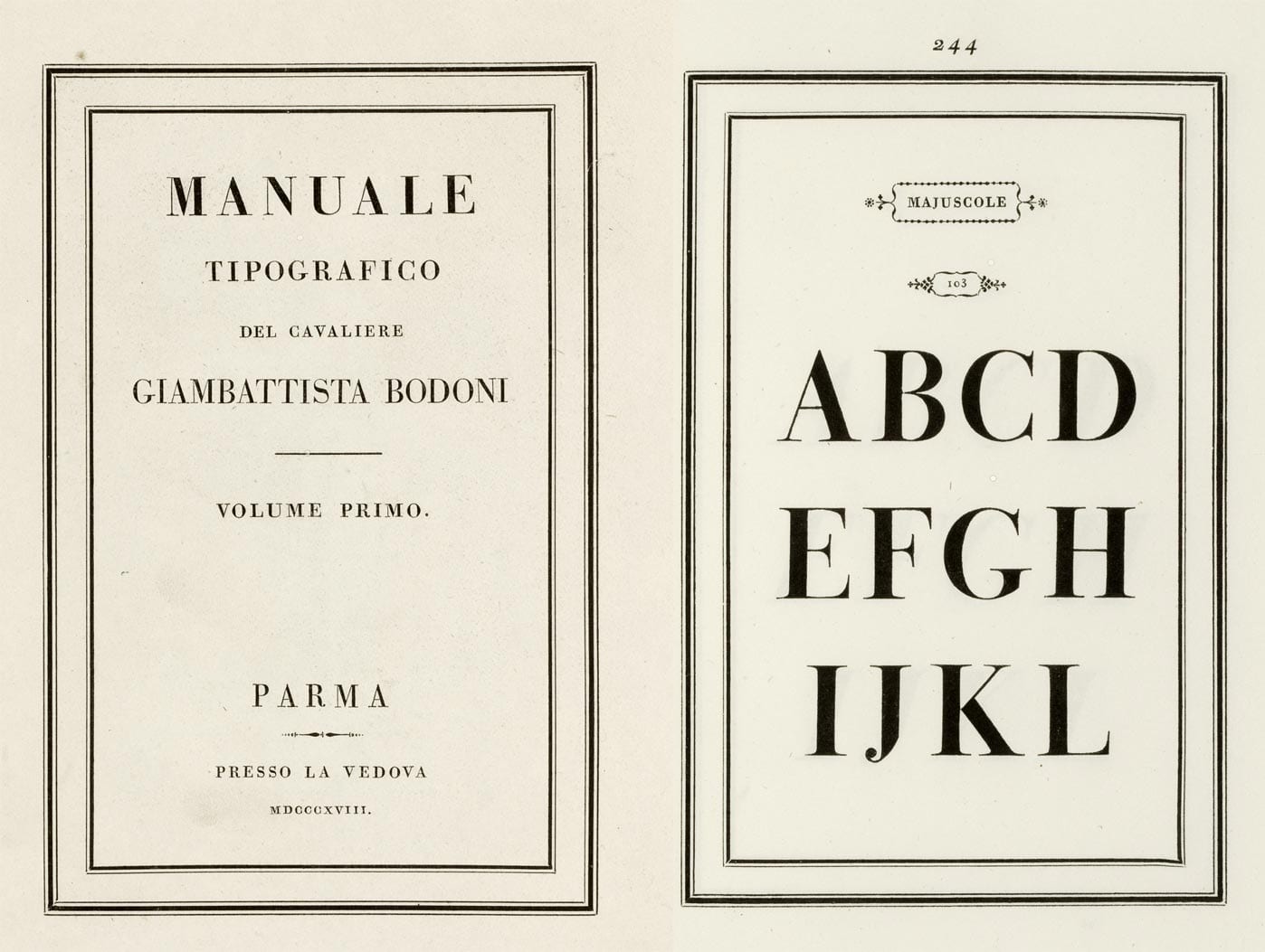
A two-page spread from Bodoni's specimen book. The left page is the title page, MANUALE TIPOGRAFICO set in widely spaced capitals inside a double rule. The right page, numbered 244, shows the capitals A to L at enormous size in a serif with hairline-thin horizontals and heavy vertical stems.
A spread from Bodoni's 1818 type specimen book, with giant capitals whose thin strokes are almost hairlines. That extreme thick and thin became a style of its own.Manuale Tipografico, specimen page. Giambattista Bodoni, published posthumously by Margherita Dall'Aglio, Parma, 1818.Wikimedia Commons/Public domain

Bodoni's own specimen book. A system: every size, every weight, cut in metal so it can be set and reset by somebody who never met him.


The anatomy of a letterform

Thirty-one parts, named on the letter rather than in a list beside it. Press a name, or press a marker. Then switch the face and watch the guides move. They are measured off whichever font your browser has actually loaded, because these are properties of a typeface and not of typography.

EB Garamond · measuring

baselinex-heightcap heightascenderdescenderRagbep

Measuring the loaded face, so the guides land where they really are rather than where they look right.

A Garalde: small x-height, generous ascenders, angled stress. Watch the x-height line drop when you pick it, that one number is most of why it feels older than the others.

The invisible lines

X-height

The height of a lowercase x, and the single most consequential number in a typeface. A large x-height reads bigger at the same point size, holds up better small and on screens, and looks more modern; a small one looks more classical and needs more size to work. Two faces set at 16px can differ by a third in apparent size because of this alone.

The invisible lines

Strokes

Curves

Bowls, counters and holes

How a stroke ends


Contrast is a tool, not a taste

Drag the pen angle. Nothing in the drawing decides to be thick or thin: a flat nib held at one angle produces both automatically, and the axis the thicks fall on is set by the angle of the pen. Eight hundred years of letterforms are a record of that one fact.

Pen angle

30°

Nib width

26 units

Nothing in that drawing decided to be thick or thin. A flat pen is held at one angle and dragged; the stroke is at full width where it crosses the nib and thins to nothing where it runs along it.

At 0° the horizontal bar vanishes and the stress is dead vertical, that is a Didone, and it is why Bodoni looks engraved rather than written. Around 30° you get the tilted stress of a Renaissance face like Garamond, because that is the angle a right-handed scribe naturally holds a pen. At 90° the whole thing inverts and the verticals disappear.

Right now the thick axis runs at about 120°. Widen the nib without changing the angle and you get a bolder weight at identical contrast, which is exactly what a weight axis in a variable font does.


Weight, and why it is not contrast

Handgloves

200The quick brown fox

300The quick brown fox

400The quick brown fox

500The quick brown fox

600The quick brown fox

700The quick brown fox

800The quick brown fox

Weight axis

wght 400

One font file, every weight in between. A variable font stores the outlines once plus the instructions for moving them, so 437 is as available as 400, and a page can ship one file instead of six.

Weight and contrast are separate things. This slider adds mass to every stroke and leaves the RATIO between the thick and the thin roughly where it was. A Didone at 400 has more contrast than a grotesque at 800, and confusing the two is why "make it bolder" so often fails to fix a heading that was really suffering from too much contrast at too small a size.


The classifications

Every one of these is set in a face that genuinely belongs to its class, because the subject is differences you can only see side by side. The standard scheme, Vox-ATypI, was retired by its own association in 2021 for being Eurocentric and for sorting by shape and period at the same time; nothing has replaced it. What survives is the useful part, a rough order of arrival, and the fact that each group is a record of a tool.

01 · 1st century AD

Roman inscriptional

Set in Cinzel

Handgloves

The quick brown fox jumps over the lazy dog.

The capitals cut into Trajan's Column, and the ancestor of every serif in this list. There is no lowercase, it had not been invented, which is why a face in this manner still reads as a monument and refuses to be a paragraph.

How to spot it. Capitals only. Wide O, narrow E and S, serifs that flare rather than bracket.

02 · c.1150–1500

Blackletter

Set in UnifrakturMaguntia

Handgloves

The quick brown fox jumps over the lazy dog.

What European handwriting actually looked like when Gutenberg started, so it is what he cut his type to imitate. Dense, vertical, economical with parchment, and nearly unreadable to a modern eye, which is a fact about training rather than about the letters.

How to spot it. Broken curves, diamond terminals, every stroke at the same angle. A page of it is a texture.

03 · c.1530

Garalde / old style

Set in EB Garamond

Handgloves

The quick brown fox jumps over the lazy dog.

Claude Garamond's cuts, and the point at which type stops imitating handwriting and starts being type. Moderate contrast, a tilted stress inherited from the pen, and a small x-height that wants generous size.

How to spot it. Angled stress, bracketed serifs, a slanted bar on the lowercase e in the earliest versions.

04 · c.1750

Transitional

Set in Libre Baskerville

Handgloves

The quick brown fox jumps over the lazy dog.

Baskerville, in the middle of the argument: sharper than a Garalde, not yet a Didone. It was hated at the time, contemporaries complained it was so crisp it hurt the eyes, and it is now the safest book face in English.

How to spot it. Near-vertical stress, higher contrast, flatter and sharper serifs than an old style.

05 · c.1790

Didone

Set in Playfair Display

Handgloves

The quick brown fox jumps over the lazy dog.

Bodoni and Didot took the argument to its end: vertical stress, extreme contrast, unbracketed hairline serifs. It is a drawing made with a compass and a ruler rather than a record of a pen, and it is the reason every fashion magazine looks the way it does.

How to spot it. Hairline serifs meeting the stem at a right angle. Fails at small sizes and on bad paper, which is exactly why it read as expensive.

06 · 1815 onward

Slab serif

Set in Roboto Slab

Handgloves

The quick brown fox jumps over the lazy dog.

The first typefaces designed for advertising rather than for reading. Industrial revolution, posters, a need to be seen across a street. The serifs are as heavy as the stems because subtlety was not the brief.

How to spot it. Serifs the same weight as the stems, little or no contrast, usually unbracketed.

07 · 1816 / 1957

Grotesque and neo-grotesque

Set in Archivo

Handgloves

The quick brown fox jumps over the lazy dog.

Sans-serifs were called grotesque because that is what people thought of them. The neo-grotesques (Helvetica, Univers) refined them into the corporate voice of the twentieth century, on an argument about neutrality that was never true and is still repeated.

How to spot it. Closed apertures, horizontal terminals, a tightly closed C and S.

08 · 1927

Geometric sans

Set in Jost

Handgloves

The quick brown fox jumps over the lazy dog.

Futura and its descendants: letters built from the circle, the triangle and the square, on a Bauhaus argument about rationality that a hundred technology companies have since joined without noticing they were taking a side.

How to spot it. A near-perfect circular o, a single-storey a, a pointed A. Beautiful in a headline, tiring in a paragraph.

09 · 1928 onward

Humanist sans

Set in Source Sans 3

Handgloves

The quick brown fox jumps over the lazy dog.

A sans-serif that remembers the pen: proportions taken from Renaissance capitals and calligraphic lowercase, with the serifs simply left off. Gill Sans, Frutiger, and most of what interfaces are set in now.

How to spot it. Open apertures, varying stroke widths, a double-storey a and g. It is the most legible sans at small sizes, which is why signage uses it.

10 · 18th century onward

Script and copperplate

Set in Tangerine

Handgloves

The quick brown fox jumps over the lazy dog.

Type that imitates a pointed steel nib: a flexible pen where pressure, not angle, makes the thick strokes. That is a different tool from the broad nib above and it produces a different logic of contrast entirely.

How to spot it. Joined letters, extreme pressure-based contrast, a steep slope. Never, ever set it in capitals.

Kerning, tracking, leading

Three words that get used interchangeably and mean three different things. Two of them are sliders and one of them is a thousand individual decisions stored inside the font.

Kerning

The space between ONE specific pair of letters. An A next to a V leaves a hole, because the two diagonals lean away from each other; the fix is a rule stored in the font for that pair and about a thousand others. It is not a setting you apply to a paragraph, that is tracking, below, and using one for the other is the most common typographic mistake there is.

AVATAR Wo. To,

font-kerning: normal, look at AV, Wo and the comma after To

Tracking

0/1000 em

Leading

1.50×

Tracking is space added to EVERY pair at once. It is right for a line of capitals, which were designed for inscriptions and are too tight together at small sizes, and it is wrong for body text, where the font's own spacing is already the answer.

Leading is the distance between baselines, and it is the one setting most people get wrong in the same direction: too tight. The longer the line, the more you need, because the eye has to find the start of the next one. The word is from the strips of lead a compositor slid between lines of metal type, which is also why it rhymes with sledding.

Nobody set the Preamble of the Indian Constitution. It was written out by hand, letter by letter, and its hierarchy is made entirely of case and weight rather than of font choices, the four big nouns in capitals, the grammar hurrying between them in a cursive hand. Set the same words in a typeface with the same instructions and you get something correct and dead. What hand-lettering buys is unevenness with intent, and things a font cannot do: a line that tightens as it runs out of room, a break no art director would approve that nobody has ever complained about.

letter-spacing: 0.000em · line-height: 1.50


The size steps

Ratio

Pick one ratio, multiply your base size by it repeatedly, and use only those sizes. The sizes are then related to each other instead of chosen one at a time, which is the entire benefit, and it is a real one, because most muddled-looking pages are muddled in their size steps rather than in their fonts.

The ratios are borrowed from musical intervals, and the golden ratio is on the list because it always is. None of them is correct. A tight ratio like 1.125 suits an interface with many levels; a wide one like 1.5 suits a poster with three. Choosing a wide ratio and then needing six levels is how people end up back where they started.

48.8pxHandgloves

39.1pxHandgloves

31.3pxHandgloves

25.0pxHandgloves

20.0pxHandgloves

16.0pxHandgloves

12.8pxHandgloves


How a typeface is made

Drawing is about a fifth of it

It starts with a handful of letters rather than an alphabet. Most designers draw n, o, H and O first, because those four settle the proportions, the weight, the stress and the counters, and everything else is built from the decisions in them. The word many people test with is adhesion: it contains a round, a stem, an ascender, a descender, a diagonal and a join, which is most of the problems in one word.

Then the spacing, which is where the work actually is. Every glyph carries a left and right sidebearing, and the goal is that the white space between any two letters looks equal. Not measures equal, looks equal, which is a different and much harder thing because an o and an I leave completely different shapes of gap. Get this wrong and no amount of good drawing saves the face. Get it right and nobody will ever notice, which is the job.

Kerning comes after, and only for the pairs that spacing cannot fix: AV, To, Ta, ry, and a few hundred to a few thousand others depending on the script. A well-spaced font needs little kerning. A badly spaced one cannot be rescued by any amount of it, and a designer adding their ten thousandth kern pair is a designer who should have gone back three steps.

Hinting is the instructions that tell a screen what to do when a curve falls between two pixels. It mattered enormously at 96dpi and matters much less now, which is why modern faces can afford complications that a 2005 screen font could not.

Then it is exported: OTF or TTF for desktops, WOFF2 for the web, which is the same outlines compressed by roughly half. And increasingly it is a VARIABLE font: one file holding the extremes plus the instructions for everything in between, so weight, width and optical size become continuous axes rather than separate files. The weight slider above is one file, not seven.

What you buy at the end is a licence, not a font, and it is worth reading once. Desktop licences are usually per seat, web licences per monthly pageview, app licences per title, and almost all of them forbid you from handing the file to your printer or converting it yourself. The most common way a small company breaks a type licence is uploading the desktop file to its own website, which is both the easiest thing to do and the one thing every EULA explicitly prohibits.
Watch

Titles and channels as YouTube reports them

Typography: Anatomy of a Letter · Envato Tuts+
How Gutenberg cast moveable type · Sabrina Huyett
Basic Romans · Reggie Ezell
Kerning and Tracking Type Explained · Gary Bradley
Spacing & Kerning of an All Caps Logotype – Typographic Review · Pimp my Type
Sign Painters - an insight into hand-lettered sign painting across America · NOWNESS

Hear about new courses.

Leave an email and we will tell you when something new lands. We do not write often.