The Palette/green/Made in a lab or a works
Emerald green
Brighter and more stable than Scheele's green, more poisonous than Scheele's green, and sold simultaneously as artists' paint and as rat poison.
Also called Paris green · Schweinfurt green · Veronese green · Vienna green
- Hex
- #4DB56A
- RGB
- 77, 181, 106
- First used
- 1814
- From
- Schweinfurt, Bavaria
What it is
Copper(II) acetoarsenite, Cu(C₂H₃O₂)₂·3Cu(AsO₂)₂.
How it is made
Verdigris and arsenic trioxide are combined in solution and the pigment precipitates as small, remarkably uniform crystals. The uniformity is why it is so bright: regular particles scatter light consistently, which is the same reason a well-made cadmium outperforms a badly made one.
It was produced in enormous quantity from the 1810s, at Schweinfurt first and then everywhere, because it was cheap and because it had a second market as an insecticide. The same barrel could go to a paint merchant or to a farm.
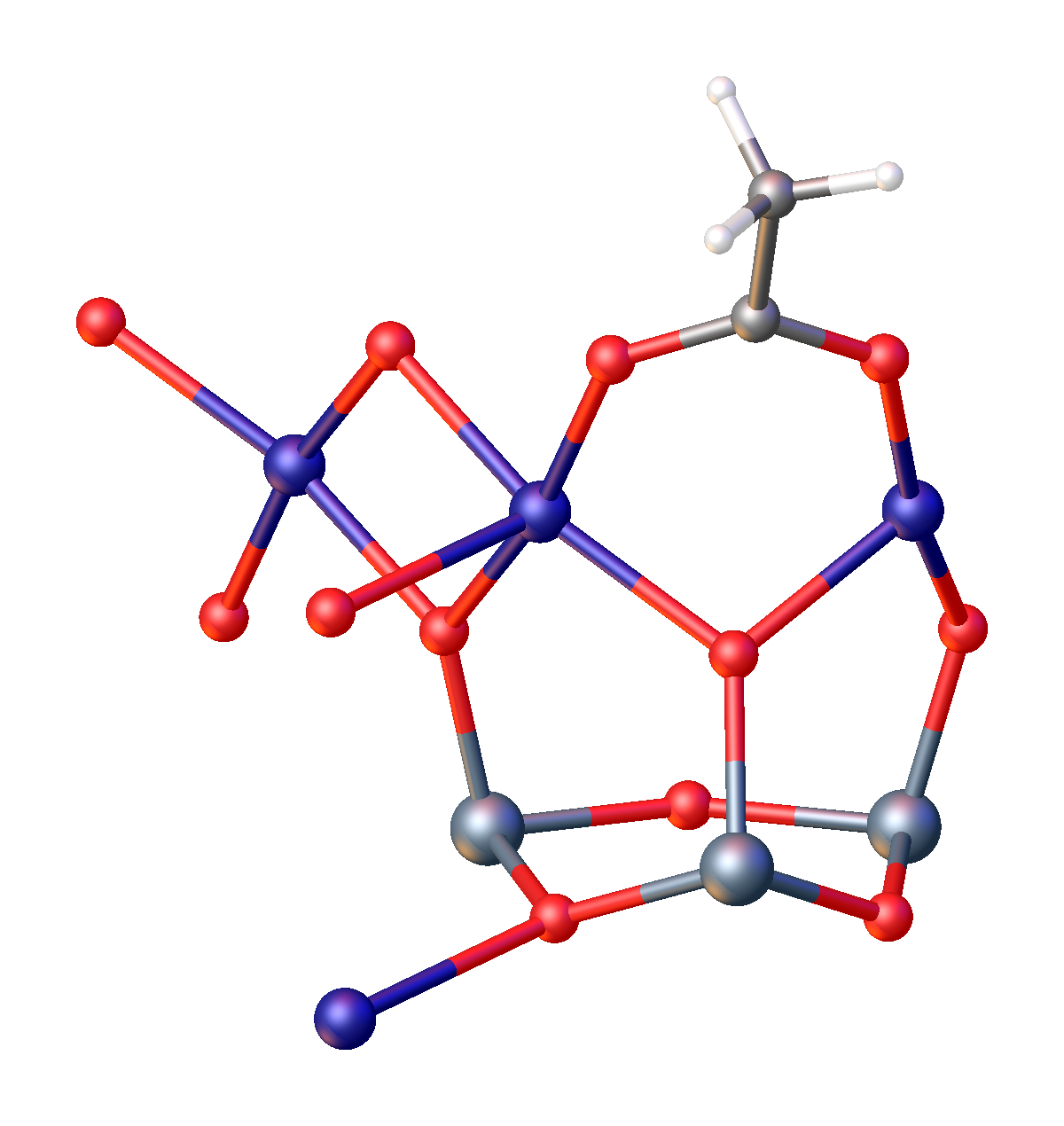
Emerald green, Highly toxic arsenic-based pigment. Wikipedia's description, not ours.
The history
Painters used it widely in the nineteenth century (the Impressionists, Van Gogh, Turner, Cézanne) because it was the brightest green ever available and nothing else came close. Van Gogh used it alongside chrome yellow, which is a palette of two heavy-metal poisons that between them produce most of the light in his paintings.
It has one incompatibility that matters enormously: sulfur. Put emerald green next to a cadmium or a vermilion and both go black. Several nineteenth-century paintings have blackened passages for exactly this reason, and conservators can identify the fault from the pattern of damage alone.
Its industrial career outlasted its artistic one by a long way. Paris green was the standard agricultural insecticide into the twentieth century, was used against mosquitoes in malaria control, and was sprayed over crops in quantities that would now be unthinkable. The colour left the art shop long before it left the fields.
Where it is used
Painting, wallpaper, fabric and printing in the nineteenth century; insecticide, rodenticide and mosquito control well into the twentieth.
Its replacement is the interesting part. Viridian and then phthalo green gave painters permanent, non-toxic greens that are arguably better in every measurable way, and the surviving complaint about them, that they are 'cold' or 'artificial', is a taste formed by two centuries of looking at arsenic. What a period thinks a colour should look like is usually just what its materials happened to do.
Go and look at it
Van Gogh's greens
Van Gogh Museum, Amsterdam
Emerald green beside chrome yellow. Two poisons doing most of the work in the brightest paintings of the century.
How it behaves
- Made of
- Copper(II) acetoarsenite, Cu(C₂H₃O₂)₂·3Cu(AsO₂)₂.
- Opacity
- Opaque. It covers what is under it.
- Lightfastness
- Good. Safe for anything that is not hung in direct sun for a century.
Hazard
Copper acetoarsenite. Acutely poisonous; also used deliberately as a pesticide.
- Blackens instantly with sulfide pigments: cadmiums, vermilion, ultramarine in some conditions.
- Unusually uniform crystal size, which is why it is so bright.
- Still found in nineteenth-century painting, wallpaper and book cloth.
The numbers
All derived from the hex, never typed beside it
- HEX
- #4DB56A
- What a browser and a design file want.
- RGB
- 77, 181, 106
- The same three numbers in base ten. Light, not ink.
- HSL
- 137°, 41%, 51%
- Hue, saturation, lightness, how a person describes a colour.
- CMYK
- 57, 0, 41, 29
- Arithmetic only. A real separation depends on the press, the paper and a profile.
- LAB
- 66, -47, 29
- Perceptual. L* of 66 is how light this actually looks, which HSL gets wrong.
This hex is an approximation, and a page about pigment has to say so. Emerald green is a substance. A ground mineral scatters light from thousands of separate grains at slightly different angles, and no single sRGB value is that event. It is a flat average of a photograph of it, and the real thing is outside what a screen can emit. Use the number to specify a screen colour. Do not use it to judge the pigment.
Where it sits on the wheel
Hue 137°
Its opposite, by the diagram
The arithmetic opposite, 180° round in HSL. Useful, and not the same as the opposite a painter mixing pigment would name, that wheel was built for paint.
Lighter and darker
Towards white
Mixing with white does not only lighten, it dulls and cools. This is why a pale tint of a brand colour so often looks chalky, and why a designed light shade beats a generated one.
Towards black
Mixing with black kills the hue as it darkens. A better dark is usually the colour plus its neighbour round the wheel, which is what every painter does instead.
Can you set type on it
Handgloves
White on it
2.58:1 · Fails
Handgloves
Black on it
8.13:1 · AAA
Handgloves
It on paper
2.45:1 · Fails
Handgloves
It on ink
7.08:1 · AAA
4.5:1 is the floor for body text and 3:1 for large text, by WCAG. Treat it as a minimum you may not go under rather than as a target: plenty of pairs pass at 4.6:1 and are still unpleasant to read for a page, and the checker will not tell you that.
Read more, elsewhere
Colours next to this one
Back up
Foundations · Colour·green·Made in a lab or a works