Verdict · It worked
Airbnb kept the Bélo through the jokes, and more than 80,000 people made their own versions in the months after launch.
Before
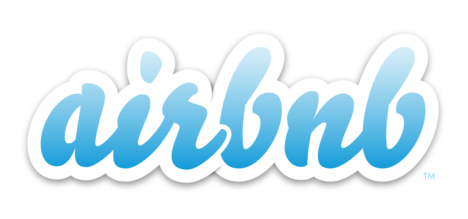
Until July 2014, Airbnb's logo was a lower-case cursive “a” that had stood for the company for several years.2 Creative Review later called it a “friendly but unmemorable blue-and-white scripted logo”.10 The website around it was full of shadows and gradients, and its text sat on top of photos.2
Airbnb was already a big company with a thin brand.74 Entrepreneur put its worth at upwards of $10 billion, and noted it was in some highly controversial legal battles.7 DesignStudio, the agency it hired, said Airbnb “didn't have a brand as we know it”, and that the brand it did have spoke for the technology more than the people.4
The founders had never sat down to design a whole brand, DesignStudio said.4 They had made a series of logos to keep up with a fast-growing business.4
The brief
Chesky wrote that the community “has outgrown the original Airbnb brand.”1 Chesky and co-founders Joe and Nate had spent the past year soul-searching.17 Their answer was one idea. “For so long, people thought Airbnb was about renting houses. But really, we're about home.”1 Belonging defined Airbnb, Chesky wrote, but the way the company had shown itself to the world “hasn't fully captured this.”1
Fortune reports that the rethink began sometime in 2013, led by Douglas Atkin, the new global head of community.8 His team interviewed 480 people around the world, including employees as well as guests and hosts.8 Guests kept saying that “the last thing they wanted to be is tourists.”8 DesignStudio did its own fieldwork. A process note quoted by Logo Design Love says four of its staff set out to visit 13 cities on four continents, staying with 18 hosts, each with a $100 video camera.6 The agency's current case study speaks of 18 metro cities and villages instead.5 It concluded that Airbnb's line “a place to stay” was “selling it short.”5
What changed
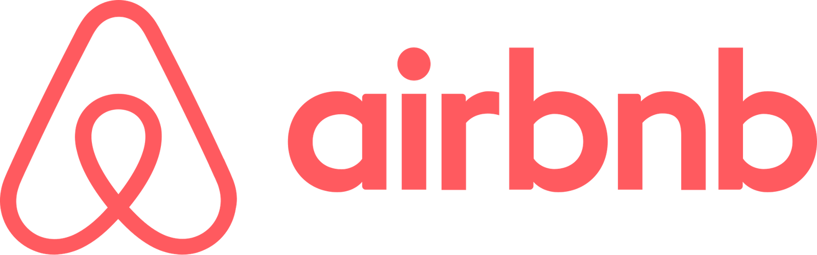
Airbnb launched the new identity on July 16, 2014, at an event for its users, alongside a redesign of its website and apps.23 The script “a” was replaced by the Bélo, which Chesky introduced as “the universal symbol of belonging.”1 Entrepreneur described it as four simple symbols combined.7 A head stands for people and a location icon for place, while a heart stands for love and the A stands for Airbnb.7
DesignStudio, based in London and San Francisco, took a year to finish the identity.6 Four of its team worked at Airbnb's headquarters for the whole project.4 Part of the aim was a mark anyone could draw.4 Around it came a custom version of Lineto's Circular typeface and a bespoke colour called Rausch, named after the street where Airbnb was founded.4 DesignStudio described Rausch as passion “without the aggression of pure red.”4
The site changed too. Chesky said every page of the web and mobile experience had been redesigned.1 TechCrunch saw a flatter look with more white space, and text that once sat on photos moved below them.2 A tool called Create Airbnb let each user make a personal version of the symbol.1 Chesky called the result “a shared brand identity.”1 Fortune says the chief marketing officer, Jonathan Mildenhall, who had recently joined from Coca-Cola, named the Bélo and persuaded the founders to make “Belong anywhere” the official tagline.8 DesignStudio says it defined that mission itself, while Fortune credits Atkin with leading the belonging work.58
After
The Bélo and the new wordmark
Airbnb, identity by DesignStudio. Wikimedia Commons/Public domainTrademark of its owner
What happened next
The mockery started at once. Within 24 hours, sexual readings of the logo had been collected on a Tumblr blog, Fortune reports.8 On launch day, TechCrunch called belonging “kind of a hippy-dippy concept.”2 In 2024, DesignStudio co-founder Paul Stafford told Creative Review that a search for the memes turns up “every part of genitalia you can imagine, through to Peter Griffin's chin.”10
Some saw other logos in it.9 Users pointed to the Habitat and Sushi Shop symbols, and to the software developer Automation Anywhere.9 A statement reported by Dezeen and quoted by The Branding Journal called that likeness a coincidence, and said Automation Anywhere was moving to a new logo.9 The same statement says both firms began using their new logos in early 2014, while Airbnb's own timeline dates the launch July 16, 2014.93
Airbnb's own users joined in. Over the next few months, more than 80,000 people designed their own versions of the logo, Fortune reports.8 In November 2014, Chesky told Atkin he felt “Belong anywhere” would be the company's mission for the next 100 years.8 Ten years after launch, Creative Review wrote that the logo now has “a reassuring familiarity”, though it was “greeted very differently” in 2014.10
Why it worked
The people it was made for took it up.8 Fortune argues that whatever the press thought, Airbnb's users “seemed to get it”, and says more than 80,000 people designing their own versions was a rate of engagement larger brands would consider “off the charts”.8 Airbnb also embraced the fuss.8 Atkin later called it “equal-opportunity genitalia.”8
DesignStudio's own view is that “Belong Anywhere” unified the business and set it apart.5 The agency says the messaging stopped leading with location and price, and spoke instead about the warmth of no longer feeling like a tourist.5 That matches what guests told Atkin's team, which suggests the idea came out of customers' own words.8
The business numbers need care. DesignStudio says the rebrand trended on Twitter and helped push Airbnb's valuation to “$29 billion above their closest competitor in less than four years.”5 That is the agency's claim about its own work, and the wording is hard to parse. Entrepreneur put Airbnb at upwards of $10 billion at launch, and Fortune's 2016 excerpt mentions a $30 billion valuation.78 None of these sources shows how much of that growth came from the brand.
Three things to take from it
- 01
Find the idea before the mark
Airbnb's team interviewed 480 people before it settled on belonging.8 The symbol was drawn to carry that idea.8 Collect your customers' own words first, and brief a designer only once one idea keeps coming back.
- 02
Make a mark people can draw
DesignStudio set out to design a mark anyone could draw.4 More than 80,000 people later made their own versions.8 Ask a few customers to draw your logo from memory, and simplify whatever they leave out.
- 03
Expect the joke, then decide
Sexual readings of the Bélo were on a Tumblr blog within 24 hours.8 Airbnb embraced the fuss, and the mark is still in use ten years on.810 Show your new mark to outsiders before launch and ask what else it looks like, then decide in advance which answers would make you change it.
Try it on your brand
Try a small version of Airbnb's method on your own brand. It takes an afternoon and a handful of customers.
- 1Ask five customers why they chose you over the obvious alternative. Write down their exact words.
- 2Circle any phrase that comes up twice or more. Write one sentence that uses it.
- 3Ask three people to draw your logo from memory. Compare their drawings with the real mark.
- 4Show the mark to two people outside your company. Ask what else it looks like and note every answer.
Sources
- 1Belong AnywhereBrian Chesky on LinkedIn · 2014-07-16 · linkedin.com
- 2Airbnb Launches Massive Redesign, With Reimagined Listings And A Brand New LogoTechCrunch · July 16, 2014 · techcrunch.com
- 3The Airbnb Story TimelineAirbnb Newsroom · news.airbnb.com
- 4airbnb rebrand gives its community a sense of belongingdesignboom · 2014-07-16 · designboom.com
- 5Airbnb: Creating the world’s first community-driven superbrandDesignStudio (agency case study) · design.studio
- 6Airbnb introduces “the Bélo”Logo Design Love · July 17, 2014 · logodesignlove.com
- 7Airbnb, Why the New Logo?Entrepreneur · 2014-07-17 · entrepreneur.com
- 8How Airbnb Found a Mission, and a BrandFortune (excerpt from Leigh Gallagher's The Airbnb Story) · 2016-12-22 online; January 1, 2017 issue · fortune.com
- 9Airbnb’s consistent rebrand focuses on the sense of belonging to a communityThe Branding Journal · 2014-07-23 · thebrandingjournal.com
- 10The Airbnb rebrand: 10 years onCreative Review · 17 October 2024 · creativereview.co.uk
Every fact above links to one of these. Checked against them on 2026-09-19.
Next teardown
How Paper Boat made a shelf for India's home drinks
Hector Beverages' third drink came from the aam panna a co-founder brought to lunch in a steel flask.
All 10 teardowns →