The Palette/white/Made in a lab or a works
Titanium white
The whitest white there is, non-toxic, and now so ubiquitous that it is in your toothpaste, your paper, your sunscreen and most of the paint on earth.
- Hex
- #FAFAF6
- RGB
- 250, 250, 246
- Pigment index
- PW6
- First used
- 1916 commercially
- From
- Norway and the United States
What it is
Titanium dioxide, TiO₂, in the rutile or anatase crystal form.
How it is made
Titanium ore (ilmenite or rutile) is processed by either the sulfate or the chloride route to titanium dioxide, then the crystal is grown and surface-treated to control its behaviour. Rutile is the more stable form and is what modern paint uses; anatase is chalkier and photocatalytically active, which is a problem in paint and a feature in self-cleaning surfaces.
It has an exceptionally high refractive index, which is the whole reason it is so white. Refractive index is what determines how much light a particle scatters, and titanium dioxide scatters more than almost anything else available, so a small amount hides a great deal.
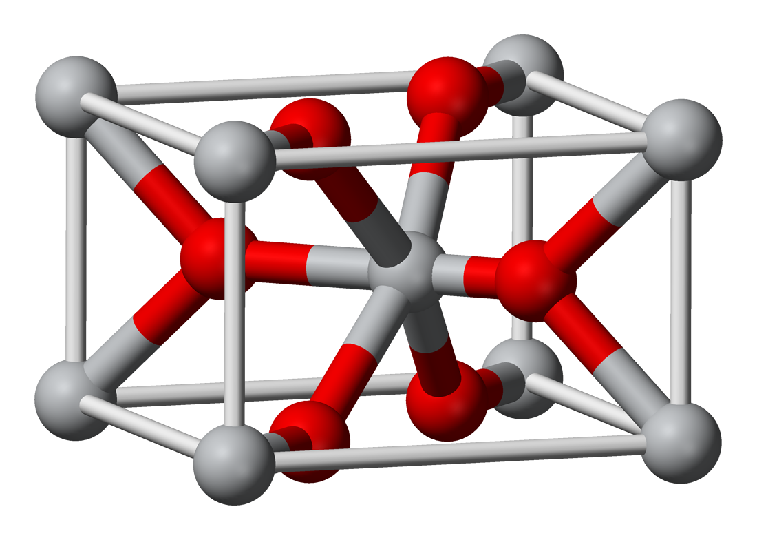
Titanium white, Chemical compound. Wikipedia's description, not ours.
The history
Titanium white replaced lead white in one generation, and it did so because it is not poisonous, it is cheaper, and it covers about twice as well. As a public-health outcome that is unambiguous. As a painting material it is a downgrade and painters said so from the start: it is cold, it is absolutely opaque, and it is inert, so it flattens mixtures rather than sitting inside them.
Its industrial scale is hard to overstate. Titanium dioxide is the most-used white pigment in the world by an enormous margin, and it is in architectural paint, paper, plastic, ink, toothpaste, sunscreen, cosmetics and food. It was a food additive (E171) in the EU until 2022, when it was banned on genotoxicity grounds. A decision other regulators have not all followed, which is a live scientific disagreement rather than a settled fact.
It is also the reason sunscreen works the way it does, and the reason mineral sunscreen leaves a white cast: the particles scatter UV, and the same scattering that makes paint opaque makes your face look grey in photographs.
Where it is used
Essentially all modern white: paint, paper, plastic, ink, sunscreen, cosmetics. Also the brightener in most paper stock, which means it is the white of nearly everything printed since about 1950.
For a designer the important consequence is that modern paper is very white and very cold, and it was not always. A design that looks refined on a warm uncoated stock can look clinical on a bright white coated one, because the white is doing something different behind it. Sampling the paper is as much a part of specifying a palette as sampling the ink.
Go and look at it
Any white wall painted since 1960
The room you are in
Almost certainly this. The most-used pigment on the planet.
How it behaves
- Made of
- Titanium dioxide, TiO₂, in the rutile or anatase crystal form.
- Opacity
- Opaque. It covers what is under it.
- Lightfastness
- Permanent. It will outlive the thing it is painted on.
- Extremely high refractive index, which is why it covers so well.
- Cold and inert, it dulls mixtures rather than glowing in them.
- The anatase form is photocatalytic and degrades organic binders; rutile is the stable one to use.
The numbers
All derived from the hex, never typed beside it
- HEX
- #FAFAF6
- What a browser and a design file want.
- RGB
- 250, 250, 246
- The same three numbers in base ten. Light, not ink.
- HSL
- 60°, 29%, 97%
- Hue, saturation, lightness, how a person describes a colour.
- CMYK
- 0, 0, 2, 2
- Arithmetic only. A real separation depends on the press, the paper and a profile.
- LAB
- 98, -1, 2
- Perceptual. L* of 98 is how light this actually looks, which HSL gets wrong.
This hex is an approximation, and a page about pigment has to say so. Titanium white is a substance. A ground mineral scatters light from thousands of separate grains at slightly different angles, and no single sRGB value is that event. It is a flat average of a photograph of it, and the real thing is outside what a screen can emit. Use the number to specify a screen colour. Do not use it to judge the pigment.
Where it sits on the wheel
Hue 60°
Its opposite, by the diagram
The arithmetic opposite, 180° round in HSL. Useful, and not the same as the opposite a painter mixing pigment would name, that wheel was built for paint.
Lighter and darker
Towards white
Mixing with white does not only lighten, it dulls and cools. This is why a pale tint of a brand colour so often looks chalky, and why a designed light shade beats a generated one.
Towards black
Mixing with black kills the hue as it darkens. A better dark is usually the colour plus its neighbour round the wheel, which is what every painter does instead.
Can you set type on it
Handgloves
White on it
1.05:1 · Fails
Handgloves
Black on it
20.07:1 · AAA
Handgloves
It on paper
1.01:1 · Fails
Handgloves
It on ink
17.48:1 · AAA
4.5:1 is the floor for body text and 3:1 for large text, by WCAG. Treat it as a minimum you may not go under rather than as a target: plenty of pairs pass at 4.6:1 and are still unpleasant to read for a page, and the checker will not tell you that.
Read more, elsewhere
Colours next to this one
Back up
Foundations · Colour·white·Made in a lab or a works