The Palette/blue/Ground from a rock or crystal
Ultramarine
Ground out of a gemstone from a single Afghan valley, and for eight hundred years the most expensive substance in a European painter's studio.
Also called lapis lazuli blue · oltremare · azzurrite oltramarino
- Hex
- #120A8F
- RGB
- 18, 10, 143
- Pigment index
- PB29
- First used
- 6th century AD in painting; the stone traded for 6,000 years
- From
- Sar-e-Sang, Badakhshan, Afghanistan, effectively one valley
What it is
Lazurite, a sodium calcium aluminosilicate with sulfur trapped in the crystal cage. The sulfur is what makes it blue.
How it is made
Crush lapis lazuli and you do not get blue, you get grey. The rock is lazurite mixed with white calcite and brassy pyrite, and simple grinding averages all three into a disappointing dust. This defeated Europe for centuries.
The method that works was described by Cennino Cennini around 1400 and it is closer to cooking than to grinding. The powdered stone is kneaded into a warm dough of pine resin, gum mastic and wax, the lump is worked under a weak lye solution, and the blue particles migrate out into the water while the calcite and pyrite stay behind in the dough. You pour off the first washing, which is the finest and deepest blue, then the second, which is paler, then the third, which is nearly grey and was sold as ultramarine ash.
The yield is brutal. A few percent of the rock by weight becomes first-grade pigment, and the work takes days. That is the whole explanation of the price, not the rarity of the stone so much as the labour buried in the extraction.
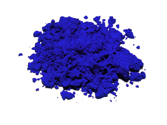
Ultramarine, Deep blue pigment. Wikipedia's description, not ours.
The history
The name means 'beyond the sea', because that is where it came from as far as an Italian was concerned: overland from Badakhshan in what is now north-eastern Afghanistan, through Persia, onto a ship. The mines at Sar-e-Sang have been worked for something like six thousand years and were essentially the world's only good source.
In medieval and Renaissance Europe it cost more than gold by weight, and contracts named it explicitly. A patron commissioning an altarpiece specified how many florins of ultramarine were to go into the Virgin's robe, which is why she wears blue. Not because blue was symbolically hers first, but because the most expensive pigment was reserved for the most important figure and the symbolism grew up around the accounting. Michelangelo's Entombment in London is unfinished partly because the blue never arrived.
In 1824 the Société d'Encouragement pour l'Industrie Nationale in France offered a prize of six thousand francs for a synthetic version. Jean-Baptiste Guimet claimed it in 1828, and within a generation the most expensive colour in the world cost about as much as any other tube of paint. Synthetic ultramarine (French ultramarine) is chemically the same compound and slightly more uniform, which is exactly why some painters find it less interesting: the natural pigment's uneven particle size is what made the blue shift as the light moved.
Where it is used
The Virgin's robe, obviously, and then everything: Titian's skies, Vermeer's Girl with a Pearl Earring, where it turns up in the turban and, more surprisingly, mixed into the shadows of the white wall. Vermeer used it in quantities he could not really afford, which is one of the arguments for him having a patron rather than a market.
It is still the reference blue for anything that wants to signal seriousness or expense. Every brand that reaches for a deep saturated blue is standing downstream of eight hundred years of ultramarine meaning 'the client paid extra for this'. Worth knowing before you pick it, because the association is doing work whether you intended it or not.
A practical note if you ever use the real thing: it is transparent and weak in tinting strength compared with a modern phthalo blue. Painters who switch expecting power are disappointed. What it has instead is depth: a dark blue that still reads as blue rather than as black, which almost no other pigment manages.
Go and look at it
Girl with a Pearl Earring
Mauritshuis, The Hague
The turban is the obvious place. The interesting place is the shadow on the white collar, where Vermeer spent gemstone money on something nobody would notice.
The Entombment, Michelangelo, unfinished
National Gallery, London
The blank patch where a robe should be. One reading is that the ultramarine never arrived and he could not proceed without it.
Sar-e-Sang mines, Badakhshan
Afghanistan
Still the source. A supply chain that has run more or less continuously for six thousand years.
How it behaves
- Made of
- Lazurite, a sodium calcium aluminosilicate with sulfur trapped in the crystal cage. The sulfur is what makes it blue.
- Opacity
- Transparent. It stains rather than covers, so it can be glazed over another colour.
- Lightfastness
- Permanent. It will outlive the thing it is painted on.
- Attacked by acid, even mild acidity turns it grey, a fault called ultramarine sickness.
- Weak tinting strength. It cannot bully a mixture the way phthalo blue can.
- Natural ultramarine's uneven grain is a feature: the blue moves as the light moves.
The numbers
All derived from the hex, never typed beside it
- HEX
- #120A8F
- What a browser and a design file want.
- RGB
- 18, 10, 143
- The same three numbers in base ten. Light, not ink.
- HSL
- 244°, 87%, 30%
- Hue, saturation, lightness, how a person describes a colour.
- CMYK
- 87, 93, 0, 44
- Arithmetic only. A real separation depends on the press, the paper and a profile.
- LAB
- 17, 48, -67
- Perceptual. L* of 17 is how light this actually looks, which HSL gets wrong.
This hex is an approximation, and a page about pigment has to say so. Ultramarine is a substance. A ground mineral scatters light from thousands of separate grains at slightly different angles, and no single sRGB value is that event. It is a flat average of a photograph of it, and the real thing is outside what a screen can emit. Use the number to specify a screen colour. Do not use it to judge the pigment.
Where it sits on the wheel
Hue 244°
Its opposite, by the diagram
The arithmetic opposite, 180° round in HSL. Useful, and not the same as the opposite a painter mixing pigment would name, that wheel was built for paint.
Lighter and darker
Towards white
Mixing with white does not only lighten, it dulls and cools. This is why a pale tint of a brand colour so often looks chalky, and why a designed light shade beats a generated one.
Towards black
Mixing with black kills the hue as it darkens. A better dark is usually the colour plus its neighbour round the wheel, which is what every painter does instead.
Can you set type on it
Handgloves
White on it
14.33:1 · AAA
Handgloves
Black on it
1.47:1 · Fails
Handgloves
It on paper
13.60:1 · AAA
Handgloves
It on ink
1.28:1 · Fails
4.5:1 is the floor for body text and 3:1 for large text, by WCAG. Treat it as a minimum you may not go under rather than as a target: plenty of pairs pass at 4.6:1 and are still unpleasant to read for a page, and the checker will not tell you that.
Watch
Titles and channels as YouTube reports them
Read more, elsewhere
Colours next to this one
Next, in time
Gamboge
Tree sap tapped like rubber, used to dye Buddhist monks' robes, and a laxative strong enough to be dangerous.
Back up
Foundations · Colour·blue·Ground from a rock or crystal