The Palette/blue/Made in a lab or a works
Cobalt blue
The clean, cool, slightly dull blue that every glaze and every Impressionist sky is made of.
Also called Thénard's blue
- Hex
- #0047AB
- RGB
- 0, 71, 171
- Pigment index
- PB28
- First used
- 1802 as a pigment; cobalt in glass and glaze for millennia
- From
- Paris
What it is
Cobalt(II) aluminate, CoAl₂O₄: a spinel, made by firing cobalt and aluminium oxides together.
How it is made
Cobalt oxide and alumina are mixed and fired at around 1200°C. The two lock into a single hard crystal, which is why the result is chemically inert, completely lightfast and unusually expensive for something so simple: cobalt is not cheap and the firing is hot.
Louis Jacques Thénard made it in 1802 at the request of the French ministry, looking for a replacement for smalt: the ground cobalt glass that had been the cheap blue and which loses colour as it is ground fine, in the same way azurite does.
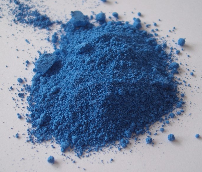
Cobalt blue, Blue pigment. Wikipedia's description, not ours.
The history
Cobalt as a colourant in glass and ceramic glaze is thousands of years old: Egyptian glass, Chinese blue-and-white porcelain, Persian tilework, Delftware. The Chinese imported cobalt ore from Persia for their blue-and-white, which makes fourteenth-century porcelain a joint product of two ends of a trade route. Ming blue-and-white is one of the earliest examples of a global luxury brand and its whole identity is one pigment.
As an artist's pigment it arrives in 1802 and is immediately taken up because it is the first blue that is both strong and completely stable. Impressionist painting depends on it. Monet used a lot, and Van Gogh wrote to Theo that cobalt was 'a divine colour' and there was nothing so fine for putting atmosphere around things.
It has a quality that is hard to name and easy to see: it is slightly greyed, slightly dulled, and therefore it sits in a painting as air rather than as an object. A phthalo blue at the same value looks like a thing; a cobalt blue at the same value looks like distance.
Where it is used
Skies, shadows on white, glass, glaze, porcelain, enamel on steel. The blue of a Le Creuset pot, a Bombay Sapphire bottle, a Delft tile and a gas flame's outer edge are all this family.
The brand lesson is in the porcelain. Blue-and-white is possibly the most durable visual identity ever made: a restricted palette of one colour on white, applied consistently across six centuries and four continents, still instantly legible. Nobody wrote it in a guideline. It held because the material enforced it, cobalt was the one colour that survived the glaze firing.
Go and look at it
Ming blue-and-white porcelain
British Museum, London; Palace Museum, Beijing; Topkapı, Istanbul
Persian cobalt on Chinese porcelain for an export market. A global product in the fourteenth century.
Van Gogh's night skies
Van Gogh Museum, Amsterdam; MoMA, New York
He called cobalt a divine colour and used it for the air around things rather than for objects.
How it behaves
- Made of
- Cobalt(II) aluminate, CoAl₂O₄: a spinel, made by firing cobalt and aluminium oxides together.
- Opacity
- Semi-opaque. It covers, but something of the layer beneath still comes through.
- Lightfastness
- Permanent. It will outlive the thing it is painted on.
Hazard
Cobalt salts are toxic; the fired pigment is stable, but the dust should not be breathed.
- Chemically inert, so it survives fresco, glaze, enamel and anything else.
- Expensive, and often imitated with cheaper phthalo mixtures sold as 'cobalt blue hue'.
- Dries fast in oil and can crack if used too thickly.
The numbers
All derived from the hex, never typed beside it
- HEX
- #0047AB
- What a browser and a design file want.
- RGB
- 0, 71, 171
- The same three numbers in base ten. Light, not ink.
- HSL
- 215°, 100%, 34%
- Hue, saturation, lightness, how a person describes a colour.
- CMYK
- 100, 58, 0, 33
- Arithmetic only. A real separation depends on the press, the paper and a profile.
- LAB
- 33, 23, -58
- Perceptual. L* of 33 is how light this actually looks, which HSL gets wrong.
This hex is an approximation, and a page about pigment has to say so. Cobalt blue is a substance. A ground mineral scatters light from thousands of separate grains at slightly different angles, and no single sRGB value is that event. It is a flat average of a photograph of it, and the real thing is outside what a screen can emit. Use the number to specify a screen colour. Do not use it to judge the pigment.
Where it sits on the wheel
Hue 215°
Its opposite, by the diagram
The arithmetic opposite, 180° round in HSL. Useful, and not the same as the opposite a painter mixing pigment would name, that wheel was built for paint.
Lighter and darker
Towards white
Mixing with white does not only lighten, it dulls and cools. This is why a pale tint of a brand colour so often looks chalky, and why a designed light shade beats a generated one.
Towards black
Mixing with black kills the hue as it darkens. A better dark is usually the colour plus its neighbour round the wheel, which is what every painter does instead.
Can you set type on it
Handgloves
White on it
8.44:1 · AAA
Handgloves
Black on it
2.49:1 · Fails
Handgloves
It on paper
8.01:1 · AAA
Handgloves
It on ink
2.17:1 · Fails
4.5:1 is the floor for body text and 3:1 for large text, by WCAG. Treat it as a minimum you may not go under rather than as a target: plenty of pairs pass at 4.6:1 and are still unpleasant to read for a page, and the checker will not tell you that.
Read more, elsewhere
Colours next to this one
Back up
Foundations · Colour·blue·Made in a lab or a works