A is an existing image used to show somebody what you mean. Creative work runs on them because words make unreliable instructions. Warm is a word four people will picture four ways, one as low evening sun, one as an orange colour grade, one as a cosy room and one as a friendly face. A photograph handed over with a note saying it is there for the way the light falls off behind her shoulder is a single instruction that everybody reads the same way. That is a reference's whole job. It removes ambiguity, so the photographer, the stylist and the set designer are all working towards the same picture before anybody has spent money on it.
A reference is almost never used whole. Any photograph is a stack of separate decisions that can be pulled apart and borrowed one at a time, such as where the light comes from and how hard it is, how high the camera stands, how the frame is cropped, which colours are in it, who is in it and what they wear, what they stand on, and how the finished picture was treated, down to the grain and the retouching. When you choose a reference you are usually after one or two of those, and the rest of the picture is noise. So before a picture goes anywhere near a board, decide which of those layers you are borrowing it for.
Film shows the idea clearly, because a film crew is large and a director needs all of it seeing the same thing. While making Blade Runner, released in 1982, Ridley Scott used Edward Hopper's 1942 painting Nighthawks, which shows four people in a diner late at night, seen through its big glass window, with the diner's light falling on a dark and empty street. Scott later said, "I was constantly waving a reproduction of this painting under the noses of the production team to illustrate the look and mood I was after." The film is set in a future Los Angeles, a long way from Hopper's diner. What the painting gave the crew was the glow of a lit interior against a dark city. That glow travelled into another world.
A reference also commits you to whatever it costs to make. For Barry Lyndon, released in 1975, Stanley Kubrick and his cinematographer John Alcott drew on eighteenth-century painting, including the landscapes of Watteau and Gainsborough, and Kubrick was determined to avoid the artificially lit look of other costume dramas of the period. So some interiors were shot by candlelight alone, which needed far faster lenses than film cameras normally carried. The production obtained three Zeiss 50mm lenses with an aperture of f/0.7, made for NASA's Apollo Moon landings, and had them modified for a film camera. Your shoot will not need one. Every shoot faces the same question, though, which is whether the budget can deliver what the reference shows.
Choosing a reference starts from the brief and never from the feed. First decide what you need to show, in words, such as low hard light from the left, or a crop that cuts the head off at the eyebrows. Then look for pictures in which that quality is the strongest thing in the frame, because if the light is subtle and the model is striking, everybody will remember the model. Look past the obvious sites. The images everybody else has saved lead to the pictures everybody else is making, while museum collections, film stills and old magazines hold plenty that nobody in your category has used. Test each candidate on somebody who has not read the brief by asking what they notice first, and keep it if they name the thing you chose it for.
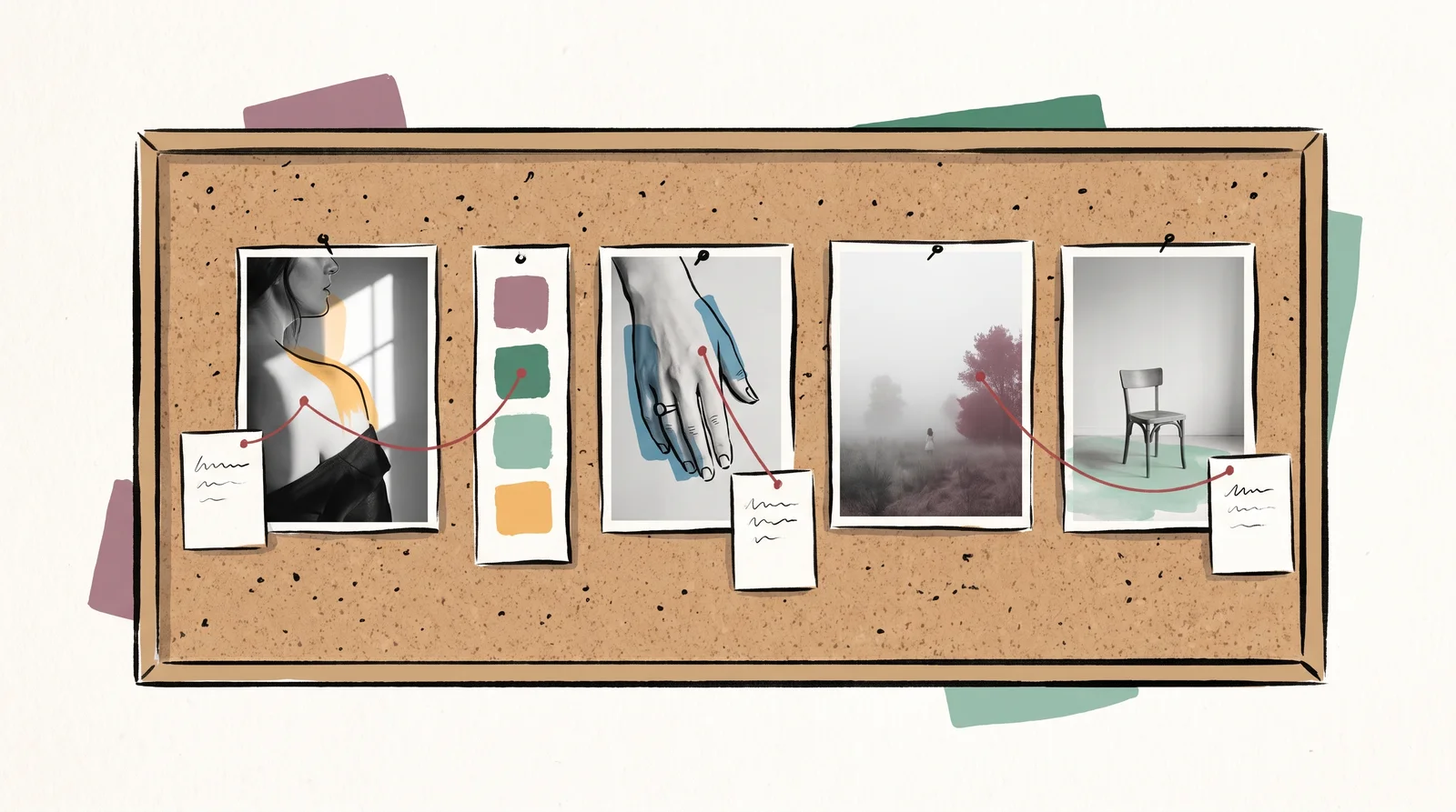
Every reference you keep gets a note, one line per image. The notes can be as short as this one is for the palette, this one for the crop, and this one for the mood and nothing else. It takes ten minutes, and it turns a mood board into a brief. Say what you are not taking too, because a reference chosen for its light will be copied for its styling unless somebody says otherwise. Record where each image came from and who made it at the moment you save it, since an image you cannot credit cannot be shown to a client. Then keep the board small. Five images with reasons will produce a more coherent shoot than fifty without, and the fifty will contain contradictions nobody noticed.
Checklist
Check each image before it goes on the board
- You can say in one line what it is there for, such as the light, the crop or the palette.An image with no stated reason becomes a Rorschach test, and each person on the crew takes something different from it.
- You have written down what you are not taking from it.A picture chosen for its light will be copied for its styling unless somebody says otherwise.
- The quality you want is the strongest thing in the picture.If the light is subtle and the face is striking, people will remember the face.
- It does not contradict another image on the board.Two references with opposite light send the photographer two ways at once, and the day goes on deciding which.
- The budget can make what it shows.A board is read as a promise. The client will measure every frame against the reference.
- You know who made it and where you found it.An image you cannot credit cannot go in front of a client, and you cannot hire a photographer you cannot name.
- You found it somewhere other than the first page of the usual feeds.The images everybody else has saved lead to the pictures everybody else is making.
What to do it with
- Are.naFree tier, paid above it
Collecting and connecting references in channels, with no feed and no algorithm.
Bad at Deliberately slow and unsocial. That is the point and it is also why teams abandon it.
- MilanoteFree tier, paid above it
A board where images, notes and links sit together, built for the messy early stage.
Bad at Boards get big and stop being readable. It has no opinion about editing.
- FigJamFree tier, paid above it
A whiteboard next to the design files, for workshops, maps and the argument before the work.
Bad at A workshop board is a record of a conversation, not a decision. Somebody still has to write the decision down.
- CosmosFree tier, paid above it
A visual collection tool built for taste, with search that understands what an image looks like.
Bad at Attribution is thin, so it is easy to save an image and lose who made it.
The words, in plain language
- Reference
- An existing image used to show somebody what you mean, usually for one or two of its qualities.
- Moodboard
- A set of references arranged to show the direction of a shoot or a campaign.
- Specific reference
- One image with one stated reason. Far more useful than a wall of pictures.
- Annotation
- The line beside a reference that says what it is there for and what to ignore in it.
- Decoration
- A board that looks good and directs nothing. Most boards.
- Primary source
- The original thing, such as the painting or the film, instead of a copy of a copy found on a feed.
Why it matters
The commonest mistake is the pretty board with no notes. Its cost arrives on the shoot day. The stylist builds the look from one picture and the photographer lights from another, both in good faith, and the first frames on the screen match neither the board nor each other. An hour goes on working out what everybody thought the board meant. On a day paid for by the hour, with a model, a crew and a studio all on the clock, that is the most expensive conversation of the job, and a line under each image would have prevented it.
The second is choosing a reference nobody can afford. A board gets read as a promise, so a picture of an aerial shot has promised a helicopter, and a still from a feature film has promised a set builder and a week. Clients fall for the reference itself. Every frame you deliver is then measured against it, so check before anything goes on the board that the budget can make what it shows, or say plainly which part of it you are using.
The third is treating a reference as a picture to reproduce. A reference is there for a quality, and once you know which quality, you can build it into your own picture without taking anything else. A crew handed a single photograph and told to get this will rebuild that photograph down to the pose, and a copy of somebody else's picture is a legal and professional problem for the client. Naming the quality keeps the borrowing honest.
The module builds on these habits. It starts with the working board a crew can act on, and adds a board of what the work must not look like. It shows where to look for references that nobody else is using, how to save them so you can find and credit them years later, and how to take an image apart to find the one thing that makes it work. It draws the line between influence and copying, then sets the client's board beside the crew's and shows how to keep the two in step. It covers letting go of a direction you love when it is wrong for the job, and ends with references as instructions for image models and a library a studio shares across projects.
Activity
Find five references the feeds have never shown you
Pick one quality your own brand's shoot needs, such as low hard light from the left, or the warm early sun No. 4's shoot asks for. Then look for it in the New York Public Library's digitised collections, which hold old catalogues, trade photographs and printed ephemera that nobody in your category has saved to a board. Keep an image only if that quality is the strongest thing in it. Five will do.
Open NYPL Digital Collections- 01Write the quality you are after in words before you search, because this lesson starts every reference with the brief.
- 02Search for things that might carry it without looking like your product, such as shop windows, hospital wards or mail-order catalogues.
- 03Save five images and give each a one-line note saying what it is there for and what you are not taking from it.
- 04Record the title, the date and the collection link for each image at the moment you save it.
- 05Show the five to somebody who has not read your notes and keep only those where they name your quality first.
Done when Five credited images nobody in your field is likely to have used, each with a line on what it is for and what to ignore./Time 45 minutes
Elsewhere
- Type
- term
- Period
- ongoing