An identity is designed on a screen and spends the rest of its life somewhere else. It gets stitched onto shirts, painted on vans, printed on invoices, shrunk into an app icon and animated on a website, and each of those uses can break something that looked fine in the presentation. The classic reference is the NASA Graphics of 1975, by Richard Danne and Bruce Blackburn. It set out how the red logotype known as the worm should appear on letterheads, vehicles, aircraft, uniform patches and the Space Shuttle, each with its own drawings and rules. NASA retired the worm in 1992. It came back in 2020, and the manual is in print again after a 2015 Kickstarter campaign slate.com by the designers Jesse Reed and Hamish Smyth.
also outlive their designers. British Rail's Corporate Identity Manual en.wikipedia.org, whose first volume the Design Research Unit published in 1965, set the double arrow symbol and the Rail Alphabet lettering across the network, and later volumes dealt with printed publicity, then with architecture and the Sealink ferries. The double arrow is still used by National Rail on tickets and station signs. So the work starts with an inventory. List everything that carries the brand, how many of each exist, who makes them and when each is next due for replacement. For most organisations the list runs through stationery, signage, shops and offices, staff uniforms and merchandise, vehicles, the website and product, social media, presentations, advertising, email and events.
Not every item on that list deserves the same care, so rank them. Rank by how many people meet each item, by how costly it is to change once it exists, and by who will produce it after the designers have gone. A sign or a painted aircraft is made once and stays in service for years, so a mistake on it is close to permanent. A social post lasts a day, but there will be thousands of them, made by people who are not designers. Both need care of different kinds. Airlines show the costly end clearly. American Airlines replaced its bare polished-metal look in 2013 because the carbon-composite skin of its new Boeing 787s could not be left unpainted, and it finished repainting 992 aircraft airlinegeeks.com at the end of 2017.
The hardest applications should be tested while the identity is still a concept. A failure found then costs a redraw, and the same failure found after launch costs reprinted signs and repainted vans. Pick the three or four uses that will stress it most. Usually that means embroidery a couple of centimetres wide, an app icon at 16 pixels, a one-colour print on a thermal receipt, a sign read from across a road, and the identity in motion. Motion is the one people forget. In June 2007 an animated film promoting the London 2012 logo was taken off the organisers' website cbc.ca after reports that it had triggered seizures in people with photosensitive epilepsy, and Ofcom later ruled that the BBC had broken broadcasting rules by showing it in the news.
Budget the before the design is approved, because it is usually the larger bill. Fabrication, printing, vehicle wraps, new uniforms and the staff time to rebuild all sit outside the design fee, and a client who has priced only the design is likely to stop the rollout halfway. The cheapest method is to replace things when they would have been replaced anyway. When Southwest Airlines launched its Heart identity in September 2014, it said aircraft would get the new within their existing repainting schedule, and described the aim as staying cost-neutral through a . Some items cannot wait. After a change of name, anything that states the name to a customer, such as invoices, contracts and the website, has to change on the first day.
Much of an identity's life is spent in the hands of people who are not designers. Social posts, slides and emails are made every day from templates by people in marketing and sales, so for most of what the public sees, the templates are the identity. Few of them read the brand book. Build the templates in the software those people already use, and lock anything that should not move, so that the easy way to make a post is also the correct one. A template that only works with fonts nobody has installed will be abandoned quickly, and replaced by whatever the last person improvised.
This gives an order of work. During the concept stage, test the identity on the hardest three or four applications, so that whichever one breaks it does so while a fix is still cheap. Once it is approved, design what is needed on the first day and what lives longest, which usually means signage, stationery and the website. Then build the templates other people will use. Everything else follows the replacement cycle, changing as uniforms wear out and as vehicles come up for their next repaint, which is how a big organisation changes its identity without one enormous bill.
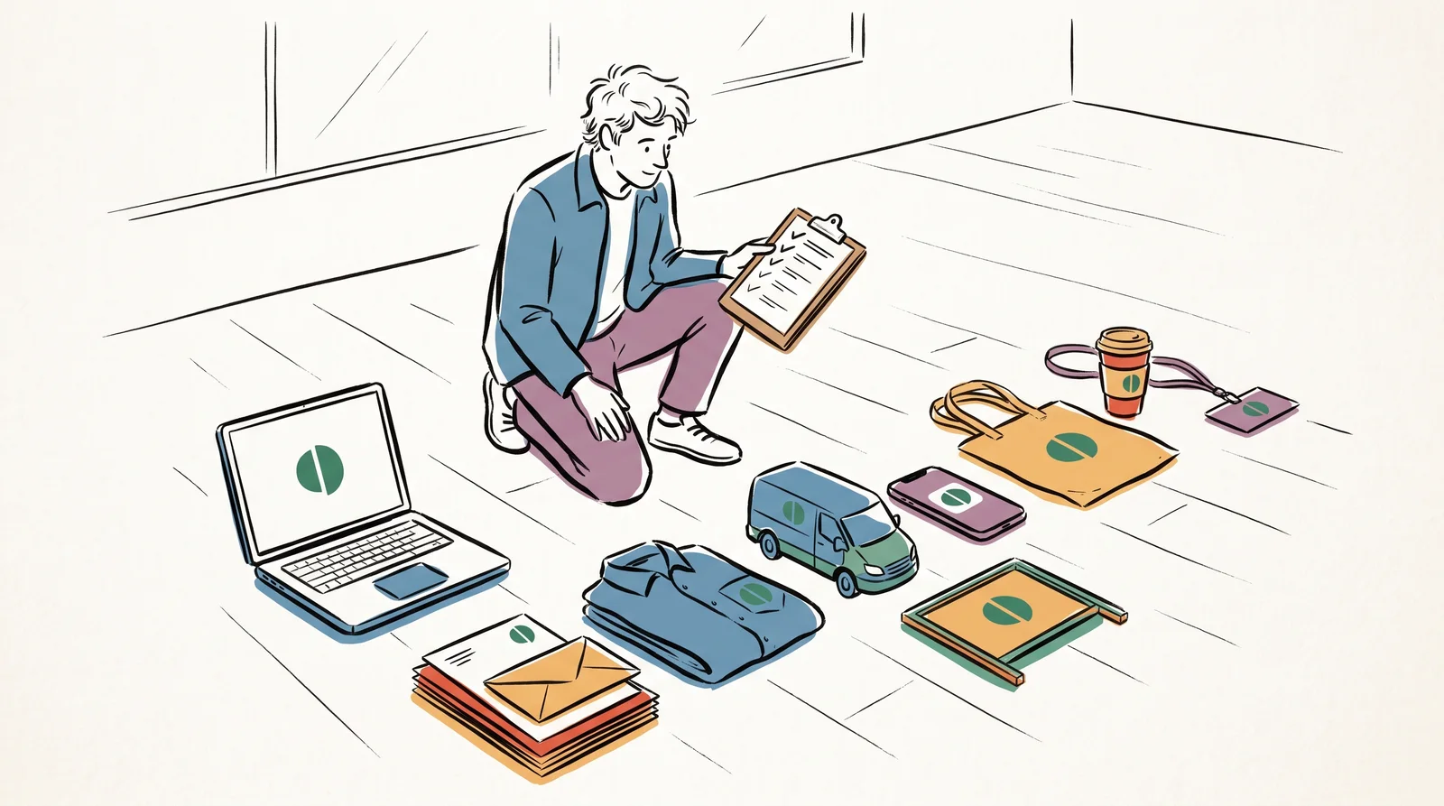
Side by side
What each application tests, and when to design it
| What it tests | When to design it | |
|---|---|---|
| Signs and wayfinding | Legibility at distance, in bad light and for people with poor sight. | At concept stage if the client has premises. A sign is made once and stays up for years. |
| Stationery and documents | Whether the layout survives someone typing into it, and printing in one colour. | Straight after approval. Invoices and letters are needed on the first day. |
| Retail and environments | Scale, with the same mark read across a road and at arm's length. | One hero space at concept, then the detail with the fabricator. |
| Uniforms and merchandise | Fine detail. Thread cannot hold thin lines or small type. | At concept stage. Stitch the mark once, two centimetres wide. |
| Vehicles | Reading at speed, on curved panels broken by doors and wheel arches. | One vehicle at concept, then the fleet on its normal repaint cycle. |
| Website and product | Tiny sizes, contrast for accessibility, motion and dark mode. | Alongside the identity, with the product team in the room. |
| Social, slides and email | Whether people who are not designers can use it without breaking it. | After approval, as locked templates in the software staff already use. |
| Advertising and events | Whether the idea survives the smallest, fastest format and a stand seen from an aisle. | When the first campaign is briefed, starting with the smallest format. |
Signs, uniforms and vehicles belong in the concept stage because they are the hardest to get right and the slowest to change.
The words, in plain language
- Application
- Any place the identity is used, such as a sign, a van, a slide or an email.
- Touchpoint inventory
- A list of everything that carries the brand, with how many exist, who makes each one and when it is next replaced.
- Standards manual
- The document that fixes how the identity appears on each application, item by item.
- Stress test
- Trying a concept on its hardest applications before anyone approves it.
- Rollout
- Putting the identity onto everything on the inventory. It usually costs more than the design.
- Phased rollout
- Changing items when they come up for replacement anyway, so the change costs little extra.
- Livery
- The paint and graphics on a vehicle, an aircraft or a train.
- Template
- A locked file that people who are not designers fill in. Most of what the public sees is made from these.
Why it matters
The most common mistake is approving an identity from mockups. Mockups are built to flatter. A stock mockup shows the logo on a perfect shirt, a clean van and a sunlit shopfront, with no fixings, no legal text, no seams and no bad light, so it hides exactly the problems this lesson is about. The client signs off a picture, and the problems arrive at the fabricator, where every fix costs money and delays the launch. Ask for real tests instead, such as a stitched sample and a sign seen from across the street.
The second mistake is spending the whole budget on design and leaving nothing for the rollout. The identity then lives in the guidelines and on the website while the signs and vans still carry the old one, sometimes for years, and customers meet two versions of the same company. The third is forgetting the long tail, which means email signatures, invoice templates, receipts and parking permits. Case studies rarely show them. Almost every customer sees at least one of them, and they are often the last things anybody changes.
Hard uses are the real test. The British Rail double arrow has lasted six decades partly because it works in one colour at any size, as a pictogram on a road sign, a mark on a ticket and a symbol painted on a train. A mark that only works large, in full colour, on white, gets quietly redrawn by every supplier who meets it, and the brand ends up with a dozen versions of itself that nobody approved. Testing the difficult applications early is how you find out which kind of mark you have.
The rest of this module takes the applications one at a time. They can be read in any order. It starts with signs and wayfinding, using Britain's road signs as the model, then moves to stationery, retail and environmental graphics, uniforms and merchandise, and vehicle livery. After those come the website and product interface, templates for social media and for presentations, advertising formats, email, and exhibition stands, each with the constraints that decide how an identity behaves there and the checks that catch it failing.
Elsewhere
Reading
- Type
- term
- Period
- ongoing