Rebrands and case studies

Member lesson

Google, 2015

Lesson 5 of 9 in Rebrands and case studies.

Jonathan Lee gives us insight into Google's rebranding · Design Indaba
Lesson

The new one is better and duller, and both halves of that sentence matter.
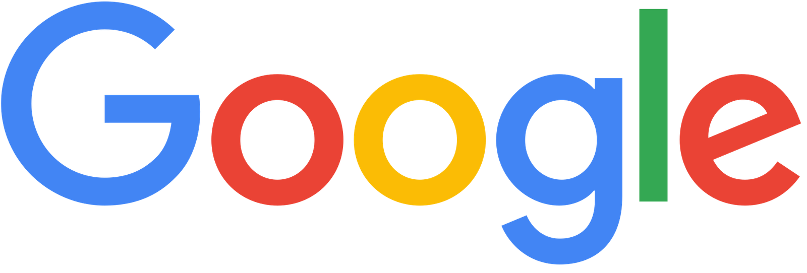
The Google logo introduced in 2015: the word Google in a geometric sans-serif with circular bowls and an even stroke weight, keeping the same blue, red, yellow, blue, green, red colour sequence.
Google's 2015 logo in a round, even sans-serif that keeps the old colour order. It stays clear at every size, down to a phone icon.Google, 2015. Google.Wikimedia Commons/Public domainTrademark of its owner
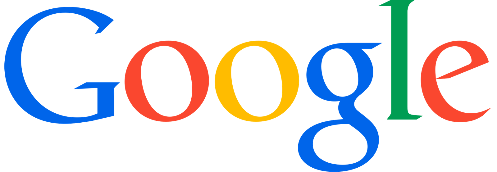
The Google logo as used from 2013 to 2015: the word Google in a serif type with bracketed serifs and a slight shaded edge, each letter in a different colour, blue, red, yellow, blue, green, red.
Google's logo from 2013 to 2015, in a serif type with the same colour order as today. The 2015 change swapped the letterforms and kept the colours.Google, 2013–2015. Google.Wikimedia Commons/Public domainTrademark of its owner
Member

The rest of this is for members.

You have read the opening of this lesson. The rest of it comes with a membership.

One membership covers all four courses and Brands.

  • All lessons in the four Learn courses
  • All brand breakdowns in the Brands section
  • All quizzes, flashcards and crosswords
  • An AI teacher on every lesson, for up to 60 questions a day
  • All course material published during the membership

Price

Membership is from $12 a month on the Yearly plan, which is charged at $144 once a year. Lifetime access is $59, paid once.Membership is from ₹200 a month on the Yearly plan, which is charged at ₹2,400 + GST once a year. Lifetime access is ₹3,999 + GST, paid once.

Check what stuck

Members only

You can't take this check yet.

Members answer these 3 questions and keep the ticket for this lesson. Every lesson has one.

  1. Question 1, locked

    By 2015, Google's Catull logo was being shown at sixteen pixels on a watch. What went wrong at that size?

    • The four brand colours blended into one muddy brown
    • The single-storey g became hard to make out at all
    • The serifs filled in and the bevel turned to mud
    • The letters spread too wide for the screen
  2. Question 2, locked

    Google's loading animation, assistant and icon set all feel like one family. What in Product Sans makes that possible?

    • Colours that split into four dots and reform as a G
    • Bookish serifs that give every product the same charm
    • A soft bevel and shadow applied across every product
    • Letters that sit slightly unevenly, like a signature
  3. Question 3, locked

    You put the 2015 Google wordmark beside a dozen other tech wordmarks and remove all the colour. What does the lesson expect?

    • Google would stand out thanks to the ear on its g
    • Google would look older than the others
    • Google would read as the only serif in the group
    • You would struggle to tell Google apart

Elsewhere in the library

Hear about new courses.

Leave an email and we will tell you when something new lands. We do not write often.