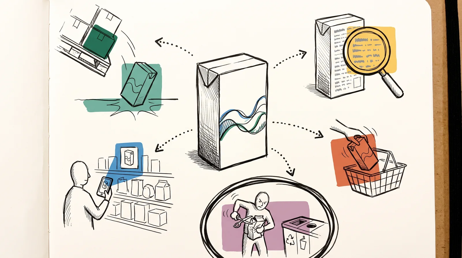
A pack does five jobs at once, and people judge it by the one it does worst. It protects the product. It carries the information the law demands, at the size and in the place the law demands it. It has to be found, by a shopper walking past a shelf or by somebody scrolling a grocery app where the whole pack is a picture no bigger than a thumbnail. It has to sell, which means telling a stranger what this is and why they should pick this one. Then it has to be opened, used and thrown away or recycled without a fight. Beginners tend to design for selling alone, because selling is the only one of the five jobs that looks like graphic design on a screen.
Protection comes first because the product sets the terms. Crisps go stale or rancid if air and light get in, and a glass bottle has to survive a fall from a pallet. Those needs decide the , which is the shape of the pack, its material and the way the parts go together, and structure is paid for in tooling that is slow and expensive to change. Graphics are the printed surface, and they can change at the next print run for the cost of new plates. So settle the structure first. The Pringles tube is the best-known case of a structure becoming the brand. Fredric Baur, a Procter & Gamble chemist, filed the patent for the tube and for the method of stacking the curved crisps inside it in 1966, and it was granted in 1970. When he died in 2008, his children buried part of his ashes in a Pringles can, as he had asked npr.org.
The law mostly lives on the back of the pack, and it is specific about size and position as well as content. Food sold in the European Union has to carry a set list of information under Regulation (EU) No 1169/2011 eur-lex.europa.eu, including the name of the food, the ingredients, a date mark, the net quantity, the business responsible and a nutrition declaration. The same regulation sets a minimum x-height of 1.2 mm for that text, or 0.9 mm where the largest surface is under 80 square centimetres, and it requires allergens to stand out in the ingredients list, which is why they usually appear in bold. In the United States the net quantity has to sit in the bottom 30 per cent of the principal display panel on most packs. India's labelling regulations of 2020 changed the non-vegetarian mark from a brown circle to a brown triangle, so that shoppers with colour blindness could tell it apart from the green vegetarian dot. Design the back first on anything regulated.
Being found comes before selling, and it happens before anybody reads a word. A shopper scans a shelf for a colour and a shape they already know, and a pack that has to be read before it can be recognised has usually lost them by then. Online it shrinks to a thumbnail. In 2018 researchers at the University of Cambridge's Engineering Design Centre and Unilever released guidelines for mobile ready hero images cam.ac.uk, after finding that different flavours and sizes of one product looked identical on a phone. Their answer is a simplified pack picture that keeps the brand, the product type, the variant and the size readable at that scale. The university's announcement cites a 24 per cent rise in sales of Magnum ice cream during an eight-week test.
The front of the pack does the selling. It has to tell a stranger what the product is, whose it is and which variant it is, in about the time it takes to walk past. Owned assets do the rest, and Toblerone shows how much a single one can carry. The Matterhorn had been on its boxes since 1970, and when Mondelez began moving some production to Slovakia in 2023, Switzerland's rules on national symbols meant the mountain had to come off. The replacement is a generic peak drawn in the same triangular style, with the hidden bear kept. Ranges add a second problem. A range has to look like one family from across an aisle and still let somebody pick the mild one over the hot one in a second, and the usual answer is to hold every element still except one device, most often a colour, that changes with each variant.
The last job starts after the sale. A pack has to open without scissors, close again if the product lasts a week, and then tell its owner which bin it belongs in. This is where sustainability is decided, mostly by structure, meaning how much material there is, how many layers it has and whether the parts come apart. The printed claims are the risky part. In January 2022 Keurig Canada agreed to pay a C$3 million penalty after the Competition Bureau found its claims that K-Cup pods could be recycled were false or misleading, since outside British Columbia and Quebec the pods were not widely accepted by municipal recycling programmes. The settlement also required changes to its packaging. In the EU, Directive (EU) 2024/825 eur-lex.europa.eu bans such as eco-friendly or green unless the trader can show recognised excellent environmental performance, and member states apply it from 27 September 2026.
The work itself runs in an order that saves money. The maker of the pack supplies a , the flat technical drawing with cut, fold and glue lines, and the artwork is built on that drawing. Ask for it before you design anything. Talk to the printer early as well, because they know what their press can hold on that material and which finishes can run together, and that knowledge is cheap at the sketch stage and expensive once artwork is final. Colour is approved on a proof printed on the real material, because a screen cannot show what ink does on brown board or clear film. Then make a rough mockup, give it to someone who has never seen the project, and watch them open it.
Checklist
Before a pack goes to print
- The front says what it is, whose it is and which variant, read from three metres away.Print it at actual size and walk back. That is roughly where a shopper decides.
- The pack still reads as a thumbnail on a phone.Online it is a picture a few centimetres wide, and variants that differ only in small type look identical there.
- Every mandatory item is on the pack at legal size, for every market it ships to.Get the list in writing from the client's regulatory contact. A pack that ships non-compliant can be recalled.
- Allergens stand out in the ingredients list, and the barcode has been graded.Both are checked by people who can take the product off the shelf.
- The artwork sits on the maker's current dieline, with bleed, and no type crosses a fold or the glue flap.A dieline from last year's tooling may describe a different pack.
- Colour is signed off on a proof printed on the real material.A screen cannot show what ink does on kraft board or clear film.
- Every environmental claim is specific and true where the pack is sold.Recyclable means little if local collection does not take it, and vague green words are banned in the EU from 27 September 2026.
- Someone outside the project has opened, used and thrown away a mockup while you watched.Packs that fight their owner show it within a minute, and never on a screen.
The words, in plain language
- Primary, secondary and tertiary
- Primary packaging touches the product. Secondary groups it for the shelf or the doorstep, and tertiary moves it by the pallet.
- Front of pack
- The face turned towards the shopper. American rules call it the principal display panel and say what must appear on it.
- Back of pack
- Where most of the mandatory information sits. On anything regulated it is designed first, because it has the least room to move.
- Structure
- The shape of the pack, its material and how the parts fit together. Changing it means new tooling, so it changes rarely.
- Dieline
- The flat technical drawing of a pack, showing where it is cut, folded and glued. The maker supplies it.
- Blocking
- Several facings of one pack reading as a single field of colour on the shelf.
- Mobile ready hero image
- A simplified pack picture built so the brand, product type, variant and size can be read at thumbnail size.
- Generic environmental claim
- A vague green word such as eco-friendly. Banned in the EU from 27 September 2026 unless backed by recognised excellent performance.
Why it matters
The expensive mistakes in packaging are rarely ugly ones. The commonest is judging the front on a laptop at full size, where every detail reads, and never looking at it from three metres or as a thumbnail, which is how shoppers actually meet it. The next is leaving the back until last, then finding the nutrition table will not fit at the legal type size and rebuilding the whole layout in the final week. The third is the worst. A pack that ships with a missing allergen or a claim that cannot be proved means a recall or a penalty, and a reprint either way, and none of it shows on a beautiful screen render.
Green claims are now a legal risk as much as a reputational one. How to word a claim, and why changing the pack beats changing the copy, is covered in "Sustainability claims and greenwashing" near the end of this module. The cost of a bad claim goes well beyond the fine. Keurig's penalty also came with the cost of changing its packaging and publishing corrective notices on its website and social channels, and costs like those are rarely in anyone's budget.
The habits that prevent most of this cost very little, and later lessons teach each one. " hierarchy" and "Shelf impact and " test the front at actual size from across a room, first alone and then in a row beside the competitors. "Packaging mockups and prototyping" covers the paper mockup and the stranger trying to open it. The thumbnail check is quick enough to do today. Shrink the pack shot to the width of a thumb on a phone and check that the variant survives. Each of these finds a problem that a screen hides, before the printing plates are made, which is the cheapest moment to fix anything.
The rest of this module goes deeper, one job at a time. It starts with Indian matchbox labels. They were printed by the million and solved recognition on a surface smaller than a business card. Then it covers reading a dieline, the order of information on the front, what the law puts on the back, barcodes and batch codes, and holding a range together across its variants. Production comes next: working with a printer, the split between structure and graphics, formats by category and materials. The last part covers regulation market by market, blocking, premium and value cues, unboxing, the choice between a label and a printed container, finishes, green claims and prototyping.
Elsewhere
Reading
- Food labelling: general EU rulesYour Europe, European Unioneuropa.eu
- Newly-developed image guidelines will improve mobile shopping experience worldwideUniversity of Cambridgecam.ac.uk
- Keurig Canada to pay $3 million penalty to settle Competition Bureau's concerns over coffee pod recycling claimsCompetition Bureau Canadanewswire.ca
- Type
- term
- Period
- ongoing