A logo is one drawing. An is the full set of parts a brand uses to look like itself, together with the written rules for how those parts combine, and it exists so that people who have never met the designer can make new things that still look right. The minimum working set is the mark and its permitted , a type system with defined roles, a palette with stated proportions, a grid or spatial logic, a direction for photography or illustration, and a rule for icons. None of these parts is complicated. What makes them a system is that each one has been decided and written down. Miss one and it will be invented at speed by whoever is making the thing on the deadline, usually badly and usually for good.
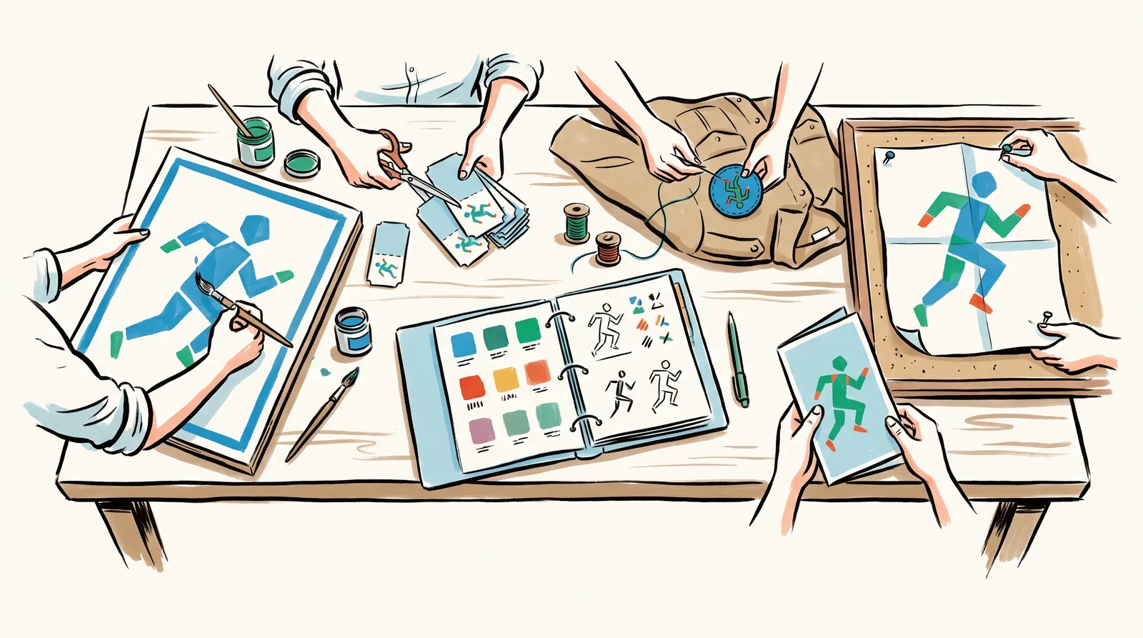
Most designers learn the idea from the Munich Olympics of 1972. Otl Aicher's design department gave the Games a palette of seven colours plus white, built around a light blue, and left out red, gold and black because those colours were tied to the Berlin Games of 1936. The typeface was Univers, and the sports pictograms were drawn to one geometric scheme so that every figure belonged to the same family. The rules went out in 1969 in a light blue ring binder. Tickets, signs, posters, uniforms and printed guides were then made by many different hands, and they still read as one event. That is the whole purpose.
The mark comes first, because much of the rest is measured from it. A brand rarely needs one arrangement of it. It needs three or four fixed lockups for the shapes of space it will actually meet, such as a wide one for a website header, a stacked one for a square post and the symbol alone for an app icon. Each lockup also needs , meaning approved versions for light backgrounds, dark backgrounds and one-colour printing. , the empty zone around the mark, is set in a unit taken from the mark itself, such as the height of a letter or the width of a stroke, so the rule holds at every size. is found by testing. Print the mark smaller and smaller on the material it will really appear on, and the last size before the detail closes up is your minimum.
Type and colour are written as roles rather than lists. A type system says which face sets headlines, which sets long text, which sets figures in a table, and which common font stands in when the brand face cannot load, as in most emails and shared documents. A palette says which colour leads and roughly how much of a surface each one covers. The grid decides margins, columns and where the logo sits. Nobody notices it until it is missing. Mastercard shows what a system held for years can earn. In January 2019 the company said its research had found that over 80 per cent of people recognised its two interlocking circles without the name, and it began using the symbol alone on cards, in shops and at the events it sponsors.
Photography needs written direction too. That direction says what the light is like, who is cast and how they are framed, and what never appears, and it puts wrong examples beside right ones so a photographer can see where the rule ends. Icons need a rule of their own, usually a drawing grid with one stroke weight and one corner shape, so that an icon drawn next year matches one drawn today. Many systems also carry a , such as a pattern, a shape or a way of cropping, which appears far more often than the logo. Some add a sound. Each of these parts gets its own lesson later in the module.
Working designers build a system from its hardest use backwards. A mark drawn at poster scale and then reduced almost always fails as a 16-pixel favicon or as embroidery on a shirt, and fixing it at that stage means redrawing the mark and reprinting everything that carries it. A mark that survives sixteen pixels and a needle will scale up without trouble. They derive rules instead of choosing them. When clear space comes from the mark and every size comes from one unit, the system is easier to explain, easier to follow and harder to argue with in a meeting.
Checklist
Before an identity system is handed over
- The mark has three or four lockups, each drawn for a real shape of space, such as wide, stacked and the symbol alone.Otherwise people squeeze the one version they were given into every space they meet.
- Every lockup has colourways for light backgrounds, dark backgrounds and one-colour printing.Each missing version gets invented by whoever needs it first.
- Clear space is set in a unit taken from the mark, and the minimum size was found by printing it and viewing it on screen.A rule measured from the mark holds at every size. A minimum decided at a desk is a guess.
- Each typeface has a named job, and there is a named fallback font for email and shared documents.Most brand documents are typed by people who do not have the brand font installed.
- The palette says which colour leads and roughly how much of a surface each colour covers.Five colours used in equal amounts look like nobody's brand.
- The photography and illustration direction shows wrong examples beside right ones.A rule is easier to follow when you can see where it ends.
- Icons follow one drawing grid, one stroke weight and one corner style.An icon drawn next year has to sit beside one drawn today.
- Someone outside the project has made a social post, an invoice and a sign from the rules alone, and you have fixed what came back wrong.Whatever they got wrong is a part of the system that does not exist yet.
The words, in plain language
- Identity system
- The full set of parts a brand uses to look like itself, with the written rules for combining them.
- Lockup
- A fixed arrangement of mark and wordmark. A system usually needs three or four of them.
- Colourway
- An approved version of the mark for a given background or printing method. Every one you do not draw will be invented badly by somebody else.
- Clear space
- The empty zone around the mark, measured in a unit taken from the mark itself so that it scales.
- Minimum size
- The size below which the mark stops working. Found by printing it, never by deciding it.
- Type roles
- The job each typeface does in the system, such as headlines, long text, figures in a table or the fallback when the brand font cannot load.
- Graphic device
- A recurring shape, pattern or crop that marks work as the brand's own. It usually appears far more often than the logo.
Why it matters
Most young identities fail the same way. The logo is fine, but the system has holes, and the holes get filled with whatever is to hand, such as a stock photograph in a completely different mood, an icon set downloaded from wherever, a presentation template in Calibri and a favicon that is the full logo squashed to sixteen pixels until it reads as a grey smudge. A customer meets the sum of all of these. The mark the money was spent on is a small part of what they see, and a patchy system makes even a good mark look like several small companies.
The second mistake is judging a system by the launch presentation. Every example in that deck was made by the designer who drew the system. That proves very little. The useful test is whether a competent stranger with no access to you can make a correct new thing from the rules alone. Hand the system to someone outside the project and ask for a social post, an invoice and a sign above a door. Whatever comes back wrong is a part of the system that does not exist yet, whatever the document claims, and it is far cheaper to find that out before launch than after.
The third is adding parts without giving them jobs. A palette of twelve colours with no proportions, two display typefaces that both want to lead, and a pattern that appears on some things and not others all look generous in a presentation. In use they produce work that varies from team to team. Fewer parts hold together better. Munich managed a whole Olympic Games with one typeface, a short list of colours and one family of pictograms.
The rest of this module takes the parts one at a time. It starts with a stamp that carried a whole airline in a few square centimetres, then looks at identities built as flexible rules, the main types of logo, and how a symbol is simplified to survive being made small. Then come monograms, lockups, logos that change with the space available, and the rules for clear space, minimum size and misuse. Colourways, favicons and app icons come next. After that the module covers icon sets, pattern, illustration, photography direction and sound, and it ends with how a system stays consistent for years without becoming dull.
Elsewhere
- Type
- term
- Period
- ongoing