Four words get used as if they meant the same thing in nearly every meeting, and the confusion costs money. They are , , and branding. A logo is a mark. An identity is the designed system that mark belongs to. A brand is the set of memories and expectations sitting in other people's heads, which is the part nobody in the room controls, and branding is the work of trying to move that third thing by means of the second, together with everything else the company does. Keep the four apart and most briefs, quotes and arguments about design get easier to settle.
The logo is the smallest of the four. Paul Rand, who drew marks for IBM, ABC and Westinghouse, described its job in a 1991 essay, writing that a logo does not sell, at least not directly, but identifies. He added that a logo takes its meaning from the quality of the thing it stands for, and gave the Mercedes star as a mark with nothing to do with cars that became a great because it stood for a great product. Designers sort logos into a few kinds. A is the name drawn as lettering, like Coca-Cola's script. A symbol works without the name, like Nike's swoosh, and a monogram is built from initials, like the interlocked LV of Louis Vuitton. A combination mark locks a symbol and a name together, and an emblem sets the name inside a shape, as the Starbucks mark did until 2011, when the words around the siren were removed.
An identity is everything a company designs and controls so that it looks, sounds and behaves like itself. The mark is one part. Type, colour, photography, layout, tone of voice and the rules that hold them together are the rest, which is why this course gives a whole module to identity systems. Wally Olins, who co-founded the consultancy Wolff Olins in 1965, argued in his 1989 book Corporate Identity that identity reaches further still. He said it covers four areas of activity, namely what a company makes or sells, the places where it makes or sells it, how it describes what it does, and how its people behave to each other and to outsiders. Most designers work on the third area. Customers experience all four.
A brand is the part nobody can design directly. It is what a person remembers, expects and feels when they meet the name or the mark, and it is assembled from things the company never drew, such as how long delivery took, what the packaging felt like to open, what a friend said and what came up when they searched the name. The law draws a related line. A is a legal right to a sign, such as a name or a logo, for particular goods and services, and a company can register it, license it and sell it. The company owns the trade mark, the artwork and the guidelines. The associations that make the sign worth owning stay in customers' heads.
A few more words cause specific damage. A tagline sits with the logo and is meant to last for years, while a campaign line belongs to one campaign and is meant to be retired with it. A rebrand changes what a company is called, how it looks or what it stands for, and a refresh redraws the existing identity without changing its meaning. Brand strategy is the thinking about what the brand should mean and to whom, and visual identity is the designed part a customer can see. The words in each pair sound close, and the projects they describe are priced very differently.
Working designers use these words exactly, and they translate when a client does not. When a client asks for a new brand, a good designer asks what they want to be true in a customer's head that is not true today, and only then decides whether the answer is a new logo, a new identity or changes that have nothing to do with design. Gap shows what happens when a logo is treated as the whole thing. In October 2010 it put a new logo on its website with no identity around it and no explanation, people judged the drawing on its own, and the company withdrew it within a week. The mark never did a job.
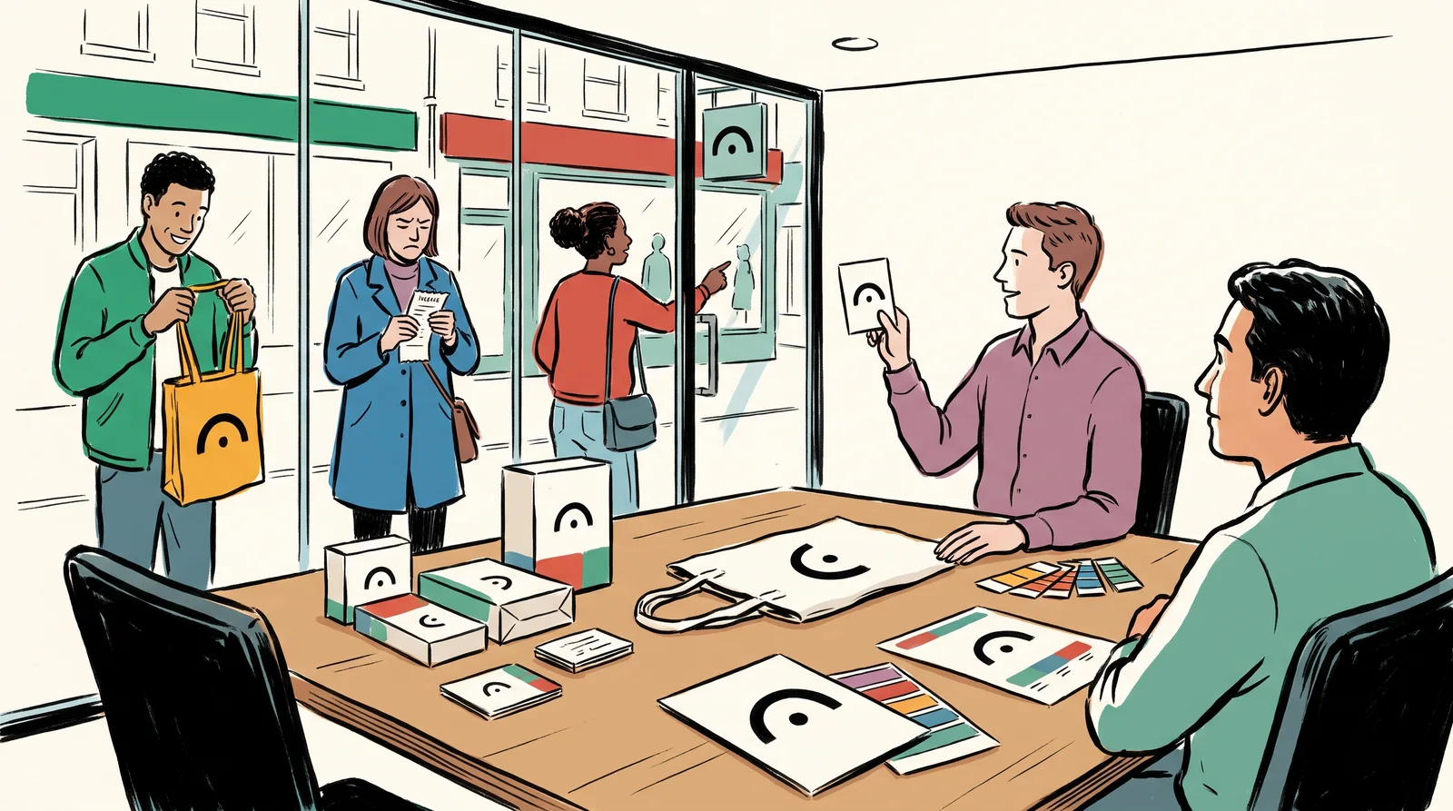
Common mistakes
Six ways these words go wrong, and what to say instead
Instead ofSaying we need a new brand when you mean a new logo.
Do thisName the project: a new logo, a new identity system, or a change in what customers believe. Each has a different scope and price.
Instead ofQuoting for branding with no list of what will be delivered.
Do thisList the deliverables by name, such as the mark, lockups, colourways, type, palette, templates and guidelines.
Instead ofJudging a new logo alone on a white slide.
Do thisJudge it inside the identity, on real applications, the way customers will meet it.
Instead ofTreating the tagline and this season's campaign line as the same thing.
Do thisA tagline stays with the logo for years. A campaign line belongs to one campaign and is retired with it.
Instead ofTalking about the brand as something the company owns.
Do thisThe company owns the trade mark, the artwork and the guidelines. The brand lives in customers' heads and is built from everything they meet.
Instead ofUsing logo, symbol and wordmark as if they were interchangeable in a contract.
Do thisDefine each term once in the scope, then use it the same way every time.
The words, in plain language
- Logo
- The mark a company signs its work with. One component of an identity, never a synonym for it.
- Wordmark
- The name drawn as lettering, such as Coca-Cola's script. It needs no separate symbol.
- Symbol
- A mark that works without the name, such as Nike's swoosh. Also called a brandmark.
- Identity
- The whole designed system: mark, type, colour, image, language, behaviour.
- Brand
- What is in other people's heads. You do not own it and you cannot design it directly.
- Branding
- The work of trying to change the brand through the identity and through everything else the company does.
- Trade mark
- A legal right to a sign, such as a name or a logo, for particular goods and services. A company can own it, which is one way it differs from a brand.
Why it matters
When a founder says we need a brand and a designer hears we need a logo, both leave the meeting satisfied and the project is already wrong. One of them is describing a problem in customers' memories. The other is quoting for a drawing. The gap between the two is the gap between a fortnight's work and six months, and between a fee in the low thousands and one many times larger. Nobody notices until the delivery meeting, when the client expected a sales problem to be solved and received a set of logo files.
The costliest confusion is about ownership. Companies believe they own their brand. They own the trade mark, the artwork and the guidelines, and those can be bought, commissioned and filed. A company with a beautiful identity and slow refunds still has a bad brand, because the brand is built from everything customers meet, and design is one input among several and often not the largest. No rebrand fixes that. Money spent redrawing a logo when the real problem is the service is money spent on the wrong layer.
Two habits prevent most of this. First, say what you mean in scopes and briefs, and define each of these words once at the top, because an ambiguous noun in a contract becomes an argument at delivery. Second, when someone asks for a rebrand, ask what they want customers to believe that they do not believe today. If they can answer, it may well be a brand problem. If the answer is that they are bored of the logo, that is a fair reason to redraw a mark and a poor reason to spend six months.
The rest of this module is a working vocabulary, grouped by where you will hear it. It starts with the words for a logo and its parts, then the words for type and for colour. Then it covers print and finishing, packaging, the words on a brief and the words in a contract, where two terms carry most of the risk. After that come the words for research, which decide how much weight a finding can bear, and the agency words that sound important and mean nothing. It ends with the words for a file you are about to send to a printer. Keep that one open at deadlines.
Elsewhere
- Type
- term
- Period
- ongoing