Rebrands and case studies

Member lesson

Zomato, 2018

Lesson 3 of 9 in Rebrands and case studies.

What Graphic Designers Can Learn from Zomato's Branding | Design Breakdown #01 · Designshala
Lesson

From a rounded sans that anybody could have used to letters that only work for one company.
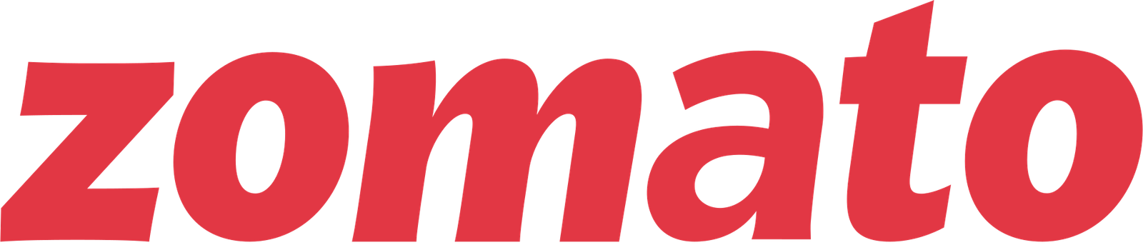
The Zomato logo as used from 2018: the word zomato in heavy red lowercase letters, sloped forward, with flat cut terminals and slightly irregular edges.
Zomato's wordmark from 2018: heavy red letters that lean forward. The red square the name used to sit in was dropped.Zomato, 2018. Zomato.Wikimedia Commons/Public domainTrademark of its owner
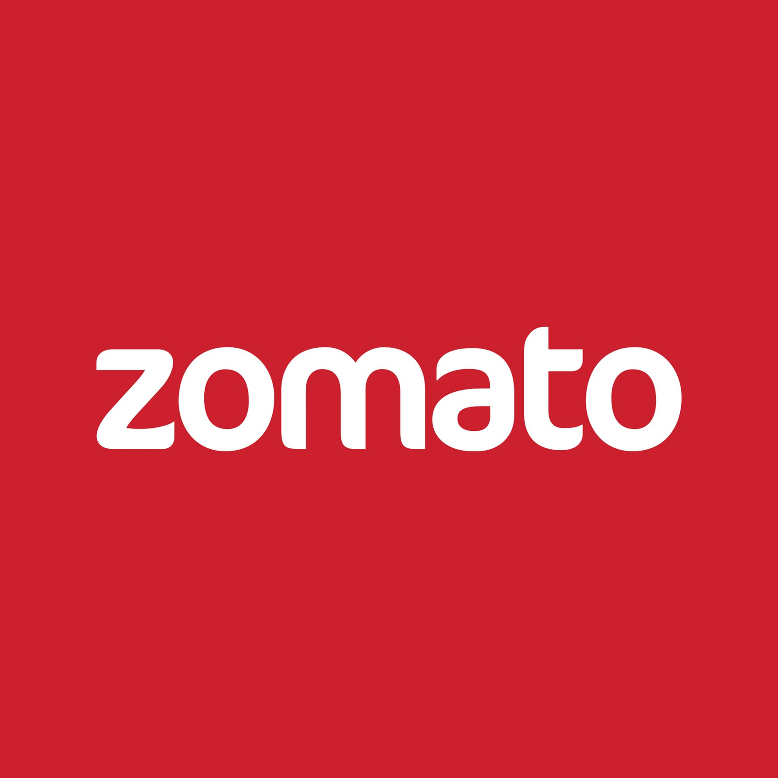
The Zomato logo as used in 2013: the word zomato in white lowercase rounded sans-serif letters, centred on a flat red square.
Zomato's logo in 2013: white rounded letters on a red square. Compare it with the 2018 wordmark, which lost the square.Zomato, 2013. Zomato.Wikimedia Commons/CC BY-SA 3.0Trademark of its owner
Member

The rest of this is for members.

You have read the opening of this lesson. The rest of it comes with a membership.

One membership covers all four courses and Brands.

  • All lessons in the four Learn courses
  • All brand breakdowns in the Brands section
  • All quizzes, flashcards and crosswords
  • An AI teacher on every lesson, for up to 60 questions a day
  • All course material published during the membership

Price

Membership is from $12 a month on the Yearly plan, which is charged at $144 once a year. Lifetime access is $59, paid once.Membership is from ₹200 a month on the Yearly plan, which is charged at ₹2,400 + GST once a year. Lifetime access is ₹3,999 + GST, paid once.

Check what stuck

Members only

You can't take this check yet.

Members answer these 3 questions and keep the ticket for this lesson. Every lesson has one.

  1. Question 1, locked

    Imagine swapping the word in Zomato's 2013 logo for another company's name. What does the lesson say would happen?

    • It would still read as food, thanks to the round letters
    • It could pass for a payments app or a bus booking service
    • It would fall apart, since the bowls were drawn for Zomato
    • It would become unreadable at the size of an app icon
  2. Question 2, locked

    Zomato's 2018 letters lean forward, with terminals cut on the slant. Why does the lesson say that suits the company?

    • It reads as speed, and the business had become delivery
    • It looks handmade, which suits a restaurant directory
    • It makes the red square easier to spot as an app icon
    • It matches the slanted letters other delivery apps used
  3. Question 3, locked

    A new quick-commerce brand wants to look a bit like Zomato. Which feature of the 2018 mark does the lesson say is easiest to imitate?

    • The hand-drawn irregularity of each letter
    • The bright red used on the delivery bags
    • The lowercase letters set on a red square
    • The forward slant of the whole word

Elsewhere in the library

Hear about new courses.

Leave an email and we will tell you when something new lands. We do not write often.