Rebrands and case studies

Member lesson

Burberry, 2018

Lesson 4 of 9 in Rebrands and case studies.

Burberry - Brand Experts react to the Rebranding (de-branding) · The Brand Review by Hyperfocus
Lesson

They replaced a drawing nobody else could use with a very good typeface. Five years later they took it back.
The Burberry wordmark introduced in 2018: BURBERRY in heavy black sans-serif capitals, with LONDON ENGLAND set much smaller and centred beneath it.
Burberry's 2018 wordmark in heavy black capitals. The knight on horseback and the serif letters were set aside for a plain sans-serif.Burberry wordmark. Burberry Group.Wikimedia Commons/Public domainTrademark of its owner
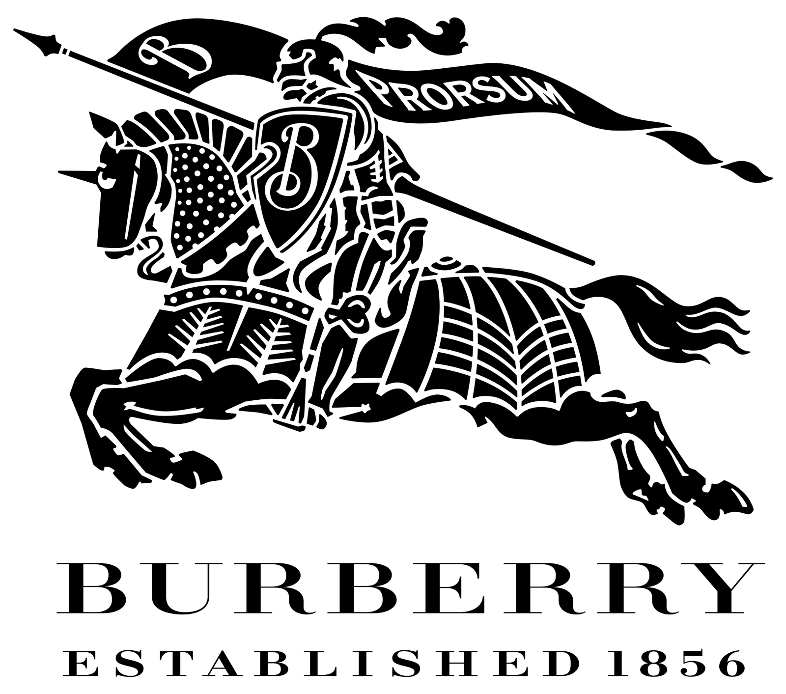
The Burberry Equestrian Knight device: a knight in armour on a galloping horse, carrying a lance and a pennant lettered PRORSUM, drawn entirely in solid black line, above BURBERRY in widely spaced serif capitals and the words ESTABLISHED 1856.
The Burberry knight on horseback above the name in serif capitals, the lockup that the 2018 wordmark replaced.Burberry Equestrian Knight lockup. Burberry Group.Wikimedia Commons/Public domainTrademark of its owner
Member

The rest of this is for members.

You have read the opening of this lesson. The rest of it comes with a membership.

One membership covers all four courses and Brands.

  • All lessons in the four Learn courses
  • All brand breakdowns in the Brands section
  • All quizzes, flashcards and crosswords
  • An AI teacher on every lesson, for up to 60 questions a day
  • All course material published during the membership

Price

Membership is from $12 a month on the Yearly plan, which is charged at $144 once a year. Lifetime access is $59, paid once.Membership is from ₹200 a month on the Yearly plan, which is charged at ₹2,400 + GST once a year. Lifetime access is ₹3,999 + GST, paid once.

Check what stuck

Members only

You can't take this check yet.

Members answer these 3 questions and keep the ticket for this lesson. Every lesson has one.

  1. Question 1, locked

    After 2018, Burberry's bold sans sat beside Balenciaga, Berluti and Balmain, who had all flattened the same way. What does the lesson say Burberry became?

    • The clear leader of a new British fashion look
    • A house whose two-hundred-year story read more clearly
    • Just one member of a category
    • A brand nobody could copy, thanks to Saville's spacing
  2. Question 2, locked

    The lesson says its strongest evidence about the 2018 change is behavioural, not aesthetic. What is that evidence?

    • Sales of scarves and bags fell after the 2018 launch
    • Burberry brought the knight back in 2023, to relief
    • Designers criticised the TB monogram as weak
    • Other fashion houses refused to flatten their logos
  3. Question 3, locked

    The Equestrian Knight was over-detailed and hard to reproduce small. Why does the lesson still treat it as the more valuable mark?

    • It was the most elegant option the house had
    • It worked well as an app icon on a phone
    • It could be turned into a repeat pattern easily
    • It was the one nobody else could have

Elsewhere in the library

Hear about new courses.

Leave an email and we will tell you when something new lands. We do not write often.