Typography

Member lesson

The specimen that taught the world to read contrast as money

Lesson 5 of 34 in Typography.

Bodoni, Manual of Typography - Manuale tipografico (1818) · bibliophilebooks
Lesson

Bodoni's hairlines only worked because the paper got better. Brands have been copying the hairlines without the paper ever since.
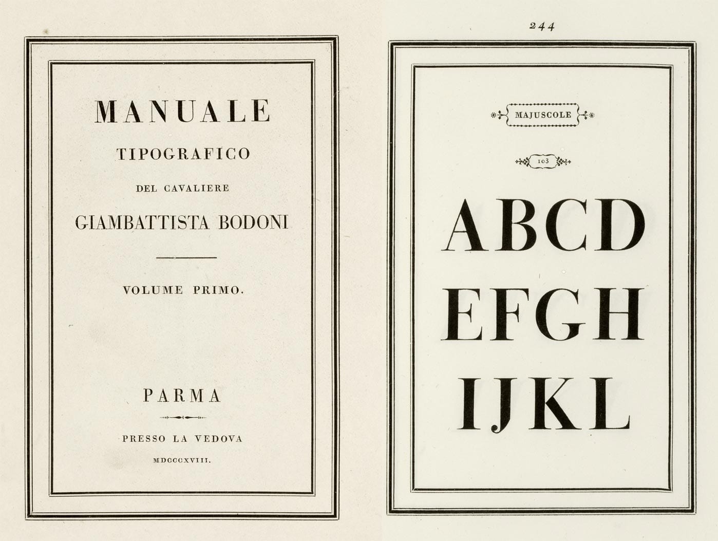
A two-page spread from Bodoni's specimen book. The left page is the title page, MANUALE TIPOGRAFICO set in widely spaced capitals inside a double rule. The right page, numbered 244, shows the capitals A to L at enormous size in a serif with hairline-thin horizontals and heavy vertical stems.
A spread from Bodoni's 1818 type specimen book, with giant capitals whose thin strokes are almost hairlines. That extreme thick and thin became a style of its own.Manuale Tipografico, specimen page. Giambattista Bodoni, published posthumously by Margherita Dall'Aglio, Parma, 1818.Wikimedia Commons/Public domain
Member

The rest of this is for members.

You have read the opening of this lesson. The rest of it comes with a membership.

One membership covers all four courses and Brands.

  • All lessons in the four Learn courses
  • All brand breakdowns in the Brands section
  • All quizzes, flashcards and crosswords
  • An AI teacher on every lesson, for up to 60 questions a day
  • All course material published during the membership

Price

Membership is from $12 a month on the Yearly plan, which is charged at $144 once a year. Lifetime access is $59, paid once.Membership is from ₹200 a month on the Yearly plan, which is charged at ₹2,400 + GST once a year. Lifetime access is ₹3,999 + GST, paid once.

Check what stuck

Members only

You can't take this check yet.

Members answer these 3 questions and keep the ticket for this lesson. Every lesson has one.

  1. Question 1, locked

    What made it possible for Bodoni to cut such extreme hairlines?

    • The Duke of Parma paid for thinner metal punches
    • He drew his letters with a much finer pen nib
    • Smoother paper and better presses had caught up
    • His widow redrew the letters after his death
  2. Question 2, locked

    A luxury brand sets its website text in a Didone at fourteen point. What does the lesson say happens on most screens?

    • The hairlines vanish and it turns to grey mush
    • The contrast looks sharper than it does in print
    • The text reads well as long as the leading is tight
    • It looks expensive, which is what the brand wants
  3. Question 3, locked

    A designer wants to borrow one thing from the Manuale Tipografico for their own layouts. What does the lesson say is worth copying?

    • The extreme contrast of the letterforms
    • The flat, unbracketed serifs
    • The double rule around the title
    • The air, the generous empty space

Elsewhere in the library

Hear about new courses.

Leave an email and we will tell you when something new lands. We do not write often.