Colour

Member lesson

Contrast, and why it reads as expensive

Lesson 3 of 27 in Colour.

Didot · Cerita Kelly
Lesson

In a palette, contrast is the distance in value between the lightest colour and the darkest.
1.8 : 1 fails3.1 : 1 large only4.5 : 1 passes
The same text at three contrast ratios against one ground.
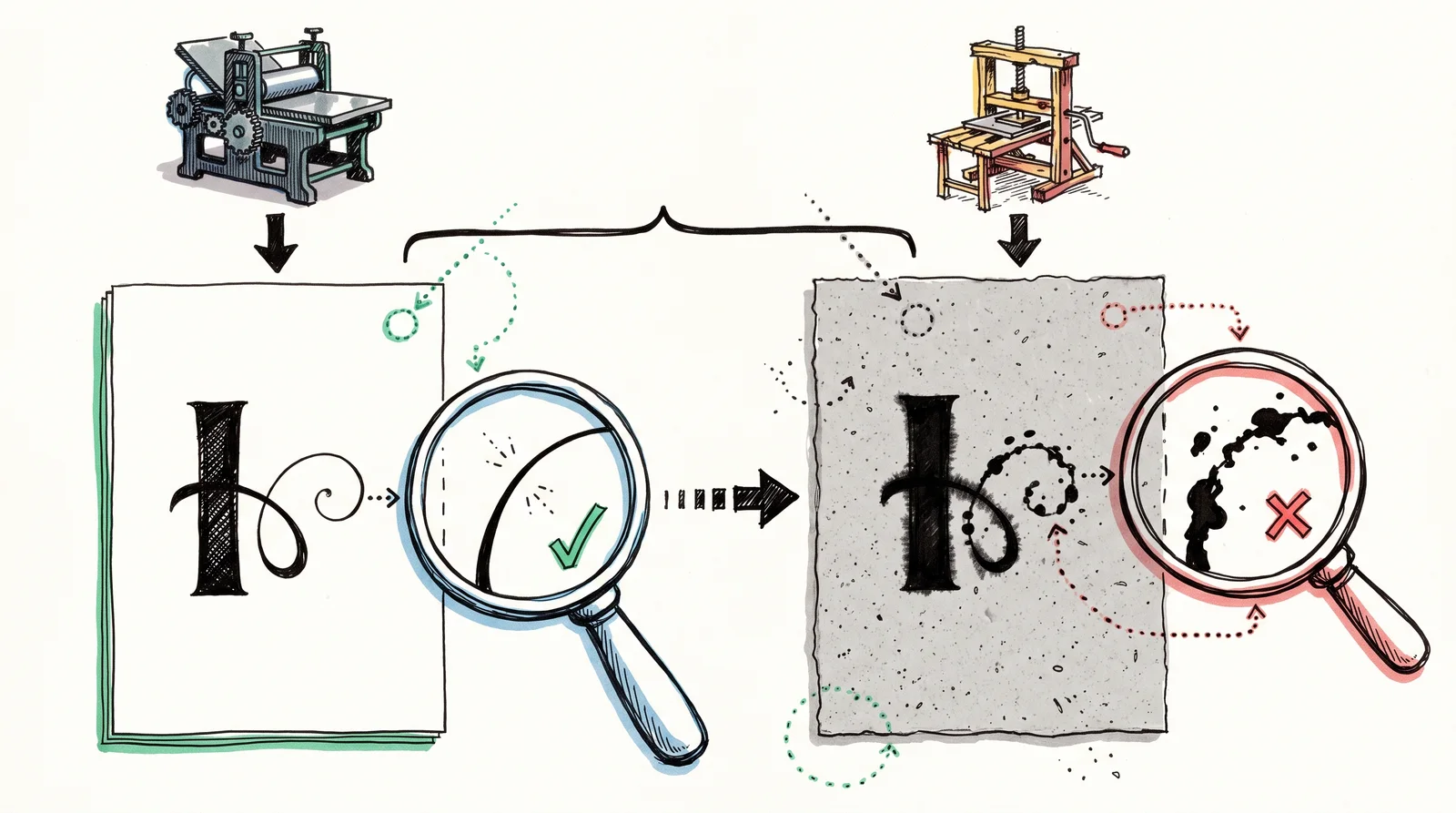
Two sheets with the same thick and thin ornament, crisp on smooth white paper and blotted on rough grey paper, with magnifying circles over the thin strokes.
The same fine mark printed on good paper and on cheap paper. Cheap presses filled in thin lines, so crisp contrast became a sign of money.
Member

The rest of this is for members.

You have read the opening of this lesson. The rest of it comes with a membership.

One membership covers all four courses and Brands.

  • All lessons in the four Learn courses
  • All brand breakdowns in the Brands section
  • All quizzes, flashcards and crosswords
  • An AI teacher on every lesson, for up to 60 questions a day
  • All course material published during the membership

Price

Membership is from $12 a month on the Yearly plan, which is charged at $144 once a year. Lifetime access is $59, paid once.Membership is from ₹200 a month on the Yearly plan, which is charged at ₹2,400 + GST once a year. Lifetime access is ₹3,999 + GST, paid once.

Check what stuck

Members only

You can't take this check yet.

Members answer these 3 questions and keep the ticket for this lesson. Every lesson has one.

  1. Question 1, locked

    Which change would increase a palette's contrast, in the sense the lesson uses the word?

    • Swap one colour for another hue of the same lightness
    • Add a fourth hue that sits at a middle lightness
    • Raise the saturation of every colour by the same amount
    • Make the lightest colour lighter and the darkest darker
  2. Question 2, locked

    A designer is torn between a palette of five mid-tones and one with a very light value and a very dark one. Which reads as more considered?

    • The five mid-tones, since more colours look richer
    • Neither, as palettes do not affect perceived quality
    • The very light and very dark pair
    • The mid-tones, as long as one of them is gold
  3. Question 3, locked

    A palette's teal and coral look nothing alike on screen. How does the lesson say to check whether they will separate in use?

    • Set them side by side and compare how far apart the hues are
    • Print them both on good paper and compare them in daylight
    • Desaturate the palette and see if they become the same grey
    • Raise the saturation of one until the two of them clash

Elsewhere in the library

Hear about new courses.

Leave an email and we will tell you when something new lands. We do not write often.