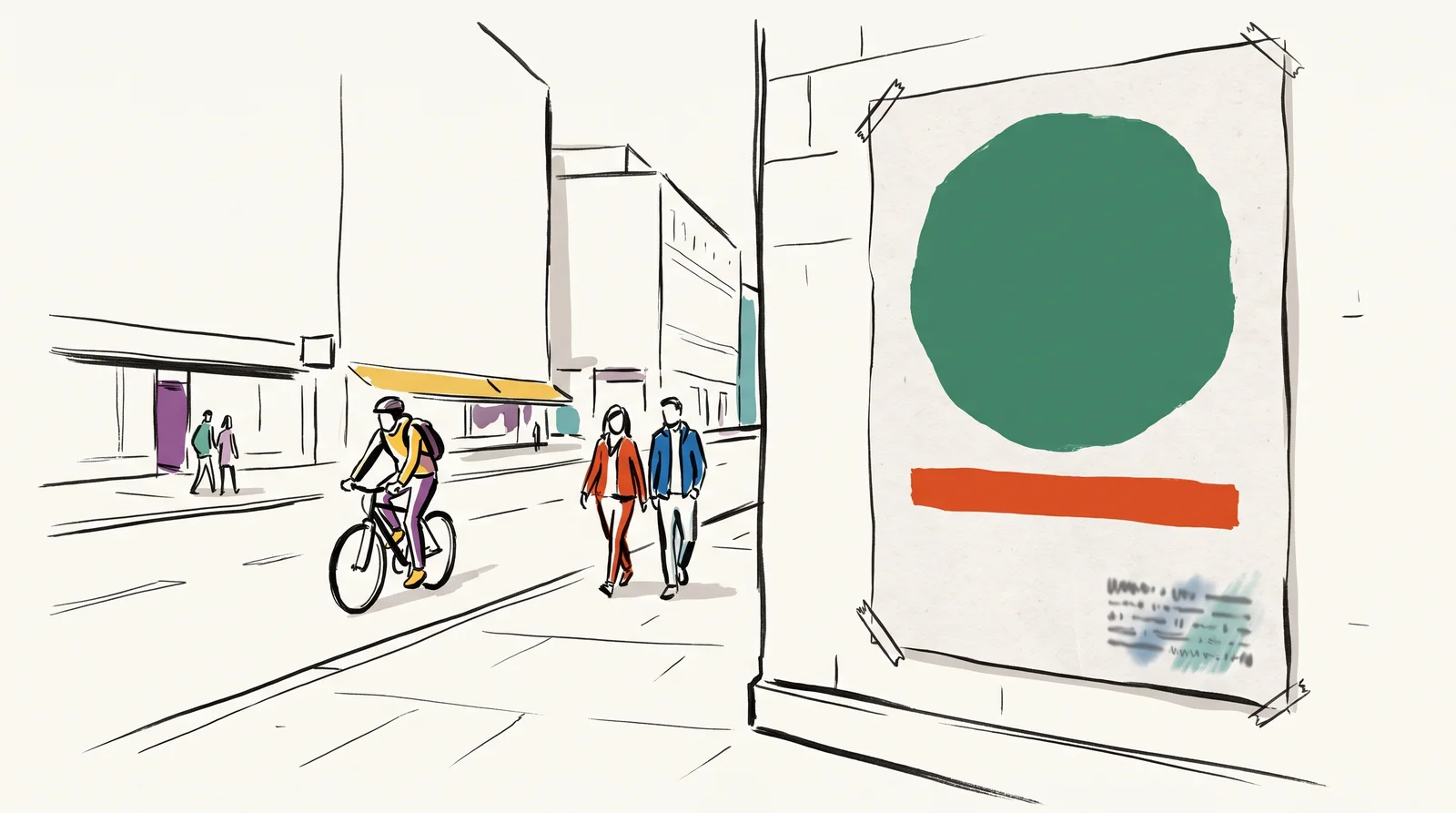
A poster is one printed sheet in a public place, read by people who did not ask to read it and are usually on their way somewhere else. It has to be noticed, understood and remembered by someone who gave it no permission and no time. Almost every weak poster is a poster designed at the wrong distance. It was made on a screen at arm's length, where everything is legible, and it will be seen from across a street by somebody moving. Nothing on the screen warns you. The design looks finished long before it works.
So the first decision is how far away and how long. Those two numbers decide everything else. A poster on an underground platform is read by people with a few minutes to wait and nothing else to look at, and it can carry a paragraph. A poster beside a road is seen for a moment by a driver, and Clear Channel Outdoor, one of the largest billboard companies, advises its clients to use seven words or fewer. Most posters sit somewhere between the two, on a wall or a bus shelter that people pass on foot. Decide which of those readers the poster is for before you choose a single typeface, because the answer sets the size of everything that follows.
Distance can be worked out on paper, because what the eye registers is size against distance. The maths is simple. An A0 poster seen from twenty metres fills about the same part of your view as an A4 print seen from five metres, since A4 is a quarter of the width of A0. It follows that a headline you can read comfortably on the A4 from five metres will be readable on the A0 from twenty, and one you have to strain for will fail. That is the most useful piece of arithmetic in poster design, because it lets you answer the hardest question at a desk, with an ordinary printer and a tape measure, days before anything is sent to press.
The designers who were best at this worked small on purpose. Abram Games, the British designer made the army's official war poster artist in 1942, is remembered by his daughter Naomi as saying 'I never work large because posters seen from a distance are small. If ideas don't work an inch high, they will never work.' He drew his roughs small. He tested them by asking family and friends what they meant, and threw away anything that got a blank look. His motto for the whole practice was maximum meaning, minimum means, and it is still the best short description of the job.
A poster is read in layers. The is one shape or a few words large enough to register before anything else resolves, and it has to carry the idea on its own. The second is what a person reads if the first made them slow down, usually a headline or a name. The third is the detail, such as the date, the place and the address, for the few who walk up close. On a gig poster the first read is usually the act, the second the venue, and the date and ticket details sit in the third. Each layer should be clearly larger than the one below it, because two elements of nearly the same size make the eye stop and choose, and a passer-by will not bother. Write the three layers down as three lines of text before designing anything, and check that the first line would do the job alone.
London's Underground took this seriously. Frank Pick, who began commissioning posters for the Underground in 1908, hired artists such as Edward McKnight Kauffer, and later asked the calligrapher Edward Johnston for a typeface of the Underground's own, partly so that its posters would never be mistaken for the advertisements around them. Johnston's letters went into use in 1916, and a descendant of them is still on the network today. The posters had a job to do among competitors, on a particular wall, at a particular distance, and they were designed for exactly that.
Checklist
Six checks before a poster goes to print
- Print the design at A4 and pin it at eye height. For an A0 poster that will be read from twenty metres, stand five metres back.The eye judges size against distance, so a quarter-size proof at a quarter of the distance shows what a passer-by will see. For other sizes, scale the distance by the same factor.
- Squint, or blur the file, until only the biggest shapes survive, and write down what is still readable.That is what the poster says to most of the people who pass it. If it is not the message, the hierarchy is wrong.
- Count the words in the first read, the part seen before anybody slows down.For a poster seen from a car, Clear Channel's rule is seven words or fewer. On foot you have a little longer, though never as long as you hope.
- Find the thinnest strokes and the smallest type, and try to read them from the scaled distance.Light weights, hairline serifs and small text over a picture are the first things distance takes away.
- Show the proof for three seconds to someone who has not seen the brief, then ask what it was for.Abram Games tested his roughs on family and friends in much the same way. A blank look means go back to the idea.
- Put the proof beside other posters, on a real wall or in a photograph of the site.A poster is never seen alone, and the one next to it is competing for the same glance.
What to do it with
- InDesignSubscription
Long documents, grids, parent pages and print-ready output.
Bad at Its AI makes pictures and words, not layouts, and Generative Expand has handled linked images and colour profiles badly.
- IllustratorSubscription
Vector drawing, where logos and dielines are actually built.
Bad at Its generative vector features produce shapes that look right and have terrible point structure underneath.
- FigmaFree tier, paid above it
The shared file where interface design happens: components, variables, prototypes and the handoff to code.
Bad at Its generative features make plausible screens rather than considered ones, and a plausible screen is the hardest kind to argue with in a review.
The words, in plain language
- Reading distance
- How far away the poster is read from. Decides the size of everything.
- Dwell time
- How long somebody actually looks. A glance from a car, a few minutes on a platform.
- Hierarchy
- The order things are read in, decided by you rather than by the viewer.
- Squint test
- Blur it until only the largest shapes survive. What is left is what it says.
- Scale proof
- A small print viewed from a scaled-down distance, so it looks the size the real poster will.
- First read
- The one shape or phrase seen before anything else resolves. It has to carry the idea alone.
Why it matters
Do the on everything before it leaves. Blur the design until only the biggest shapes remain, and whatever is still readable is what the poster actually communicates, whatever the brief said and however long the meeting took. If that is not the message, the is wrong. No amount of refinement fixes it. The test takes ten seconds and finds the problem while it is still cheap.
Print it and put it on a wall. Judging a poster on a screen at fifteen per cent is judging a different object, and posters approved that way are routinely found to be unreadable once they are up. The usual faults are predictable. Type that is too light, fine serifs that vanish at a distance, too many things at almost the same size, and text laid over a busy photograph each look fine at arm's length on a bright monitor, then fail on a grey afternoon across the road. If you can, go and stand where the poster will hang, at the time of day most people pass it, and look at what is already there. A proof costs very little next to a reprint.
The same discipline now applies to a small square in a feed. It is seen briefly, at low attention, among competitors, which makes it a roadside poster with different dimensions and a thumb in place of a car. A post that has to be tapped open before it makes sense has the same fault as a poster that only works up close. The squint test works there too. Scroll past your post at normal speed, on a phone held where you usually hold it, and notice what stays with you. Design both for the glance.
The module builds on "Poster composition", from Composition and layout, and goes deeper. It covers holding one idea against a series of reasonable additions, the Swiss poster and the grid it made standard, the painted metaphors of the Polish school and the Japanese handling of empty space. Then it turns to posters made of type alone, posters built on a single photograph, and series that are recognised before they are read. It finishes with the practical end, printing and the paper sizes that exist, and an honest look at posters made only ever to be seen on a screen.
Elsewhere
- Type
- term
- Period
- ongoing