Typography

Member lesson

The Preamble page of the Constitution of India

Lesson 4 of 34 in Typography.

Key Artists and Calligraphers of the Constitution Of India | Ministry of Culture · Ministry of Culture Govt. of India
Lesson

The most reproduced piece of graphic design in the country, and there is not a single typeface on it.
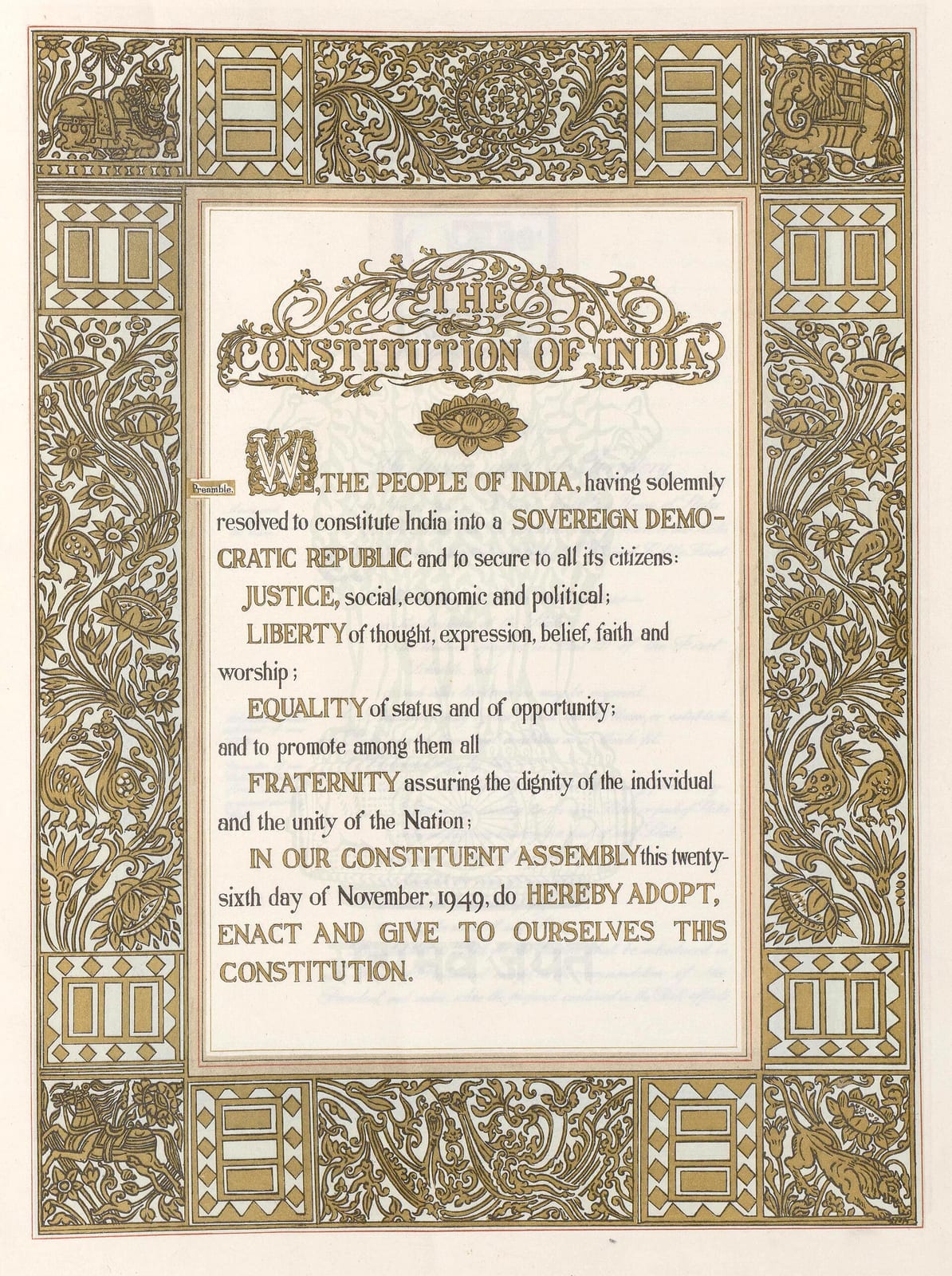
The Preamble page of the Constitution of India: a block of hand-lettered text beginning WE, THE PEOPLE OF INDIA, with JUSTICE, LIBERTY, EQUALITY and FRATERNITY picked out in capitals, framed by a wide gold border of foliage, peacocks, elephants, a bull and a chariot. A pale blue watermark of the Lion Capital sits behind the text.
The Preamble page of the Constitution of India, lettered by hand inside a gold border. Every word on it was drawn, not set in type.Preamble page, the Constitution of India. Ornamentation by Beohar Rammanohar Sinha; calligraphy by Prem Behari Narain Raizada; art direction by Nandalal Bose.Wikimedia Commons/Public domain
Member

The rest of this is for members.

You have read the opening of this lesson. The rest of it comes with a membership.

One membership covers all four courses and Brands.

  • All lessons in the four Learn courses
  • All brand breakdowns in the Brands section
  • All quizzes, flashcards and crosswords
  • An AI teacher on every lesson, for up to 60 questions a day
  • All course material published during the membership

Price

Membership is from $12 a month on the Yearly plan, which is charged at $144 once a year. Lifetime access is $59, paid once.Membership is from ₹200 a month on the Yearly plan, which is charged at ₹2,400 + GST once a year. Lifetime access is ₹3,999 + GST, paid once.

Check what stuck

Members only

You can't take this check yet.

Members answer these 3 questions and keep the ticket for this lesson. Every lesson has one.

  1. Question 1, locked

    On the Preamble page, JUSTICE, LIBERTY, EQUALITY and FRATERNITY step out in capitals while the words between stay small. What is that hierarchy built for?

    • The eye, so the page looks balanced on a classroom wall
    • The ear, matching how the Preamble is read aloud
    • The printer, so the capitals survive reproduction
    • The border, so the text lines up with the ornament
  2. Question 2, locked

    A studio resets the Preamble in a typeface, following exactly the same hierarchy instructions. What does the lesson predict they will get?

    • A cleaner page that improves on the hand-written one
    • A page with the same unevenness, only sharper
    • Something correct and dead
    • A page that would be impossible to reproduce widely
  3. Question 3, locked

    The border is packed with a Nandi bull, elephants, a peacock and lotus scrollwork. Why does it not compete with the text?

    • The text block is left almost bare
    • The ornament is printed as a pale watermark
    • The border uses only one ink colour
    • The text is set much larger than the border

Elsewhere in the library

Hear about new courses.

Leave an email and we will tell you when something new lands. We do not write often.