Colour

Member lesson

Colour that survives a shelf and a phone

Lesson 6 of 27 in Colour.

Lesson

The two places your palette actually has to work.
spot inkoutside bothvisiblesolid line · CMYK · dashed · RGBthe screen cannot show you the ink
The screen gamut, the print gamut and a spot colour outside both.
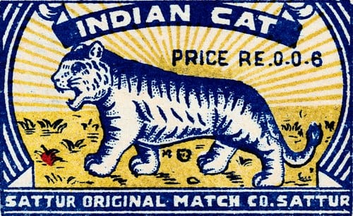
A matchbox label printed in blue and yellow only: a striped tiger walking across a field of sunburst rays, beneath a banner reading INDIAN CAT, with PRICE RE.0.0.6 at the right and SATTUR ORIGINAL MATCH CO. SATTUR along the bottom.
An Indian matchbox label printed in just two inks, blue and yellow. Two flat colours were cheap to print and still read from across a shop.Tiger, Indian matchbox label. Unrecorded designer, for an Indian match manufacturer.Wikimedia Commons/Public domain
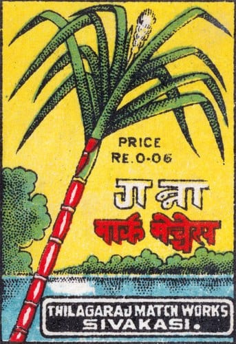
A matchbox label on a yellow ground: a tall sugarcane plant with a red and white banded stalk and green leaves, the name गन्ना in Devanagari beside it, PRICE RE.0-06 above, a band of blue water at the foot, and THILAGARAJ MATCH WORKS, SIVAKASI along the bottom.
A Sivakasi matchbox label that names its picture in Devanagari. Flat red, green and blue on yellow stay bright even on rough paper.Sugarcane, Indian matchbox label. Unrecorded designer, for an Indian match manufacturer.Wikimedia Commons/Public domain
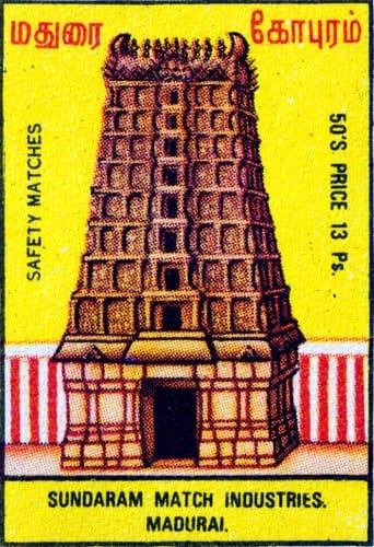
A matchbox label on a yellow ground: a Madurai temple gopuram drawn in brown and gold with red and white striped walls at its base, named in Tamil across the top, safety matches and fifty's price 13 Ps running vertically up either side, and SUNDARAM MATCH INDUSTRIES, MADURAI along the bottom.
A matchbox label showing a Madurai temple tower, named in Tamil. A few strong flat colours on a yellow ground carry the whole picture.Temple, Indian matchbox label. Unrecorded designer, for an Indian match manufacturer.Wikimedia Commons/Public domain
Member

The rest of this is for members.

You have read the opening of this lesson. The rest of it comes with a membership.

One membership covers all four courses and Brands.

  • All lessons in the four Learn courses
  • All brand breakdowns in the Brands section
  • All quizzes, flashcards and crosswords
  • An AI teacher on every lesson, for up to 60 questions a day
  • All course material published during the membership

Price

Membership is from $12 a month on the Yearly plan, which is charged at $144 once a year. Lifetime access is $59, paid once.Membership is from ₹200 a month on the Yearly plan, which is charged at ₹2,400 + GST once a year. Lifetime access is ₹3,999 + GST, paid once.

Check what stuck

Members only

You can't take this check yet.

Members answer these 3 questions and keep the ticket for this lesson. Every lesson has one.

  1. Question 1, locked

    A brand chooses its palette on a calibrated studio monitor, viewing everything at full size. What does the lesson say it should pick for instead?

    • Colours that look best on the newest phones
    • Colours that match the current season's trends
    • Colours that hold their identity when degraded
    • Colours that look richest under studio lighting
  2. Question 2, locked

    Why does the lesson say Pepsi went back to black type inside its cap?

    • Black prints most cheaply on cans
    • Black looks best on a phone at night
    • Black was Pepsi's original 1950 colour
    • Black is a colour Coca-Cola cannot use
  3. Question 3, locked

    A palette looks great on the designer's screen but falls apart when printed on the office's cheapest paper. What does the lesson call it?

    • A finished palette that just needs better paper
    • A mood board rather than a palette
    • A print palette that needs a screen version
    • A strong palette with one weak use case

Elsewhere in the library

Hear about new courses.

Leave an email and we will tell you when something new lands. We do not write often.