Semiotics is the study of , and a sign is anything that stands for something else to somebody. A word is a sign. So is a logo, a red light, a price set in a thin serif and the green dot on a packet of biscuits, and graphic design is made of very little besides. A designer choosing between two typefaces for a bank is choosing which idea of a bank a stranger will be handed, and semiotics gives you words for that choice beyond feel and vibe. The field has two founders, who worked at about the same time and independently of each other. One was a Swiss linguist, Ferdinand de Saussure en.wikipedia.org, and the other an American philosopher, Charles Sanders Peirce en.wikipedia.org.
Saussure split a sign into two halves that cannot be separated: the , which is the form, and the signified en.wikipedia.org, which is the concept it raises. His Geneva lectures became the Course in General Linguistics en.wikipedia.org, assembled from students' notes by two colleagues and published in 1916, three years after he died. The claim that made it famous is that the pairing is . English keeps one word for the animal and another for the meat, ox and beef; French uses one word for both. Convention does all the work. Design is full of the same arbitrariness, and the save icon in most software proves it every day, because it is still a floppy disk years after computers stopped having a slot for one and nobody is confused by it.
His second idea matters more to designers, and it is the one most often skipped. A sign takes its value from the other signs around it, and the Course puts it bluntly, that 'in language there are only differences without positive terms'. A traffic light works because red is not green, and nothing about red has anything to do with stopping. India has a clear case. Packaged food there carries a green dot inside a green square if it is vegetarian, and for years it carried a brown dot inside a brown square if it was not. In its 2020 labelling regulations the Food Safety and Standards Authority of India changed the non-vegetarian mark to a brown triangle, because the only difference between the two signs was colour, and shoppers who are colour-blind could not see it. The meaning had been in the difference all along, so a difference some people could not see was a sign that failed them.
Peirce started from the other end. Instead of asking what a sign is made of, he asked how it reaches the thing it stands for, and he gave three answers that this module comes back to in detail. An icon resembles its object, like the little figure on a lavatory door. An index is physically connected to it, as smoke is to fire or a photograph is to the light that made it. A symbol works by agreement alone, like a word, a wedding ring or the green dot. Most real signs mix all three, and knowing which one a mark leans on tells you how much teaching it will need before strangers understand it.
The idea working designers use most came later, from the French critic Roland Barthes en.wikipedia.org. In an essay called Rhetoric of the Image, published in French in 1964 and in English in 1977, he took apart a print advertisement for Panzani, a French brand of pasta. The photograph shows packets of pasta, a tin, a sachet, tomatoes, onions, peppers and a mushroom tumbling out of a half-open string bag, in yellow and green on a red ground. What it denotes is some shopping. What it connotes, Barthes said, is Italianicity, a word he coined for an idea of Italy put together for French buyers out of those colours, a trip to the market and a handful of tourist stereotypes. is what a sign shows. is what it suggests, and connotation is where most of a brand's meaning lives.
Working designers use all of this as a way of checking work, and rarely as theory. Every category has . These are conventions its buyers have learned to read without thinking, such as the green cross outside a pharmacy in much of Europe, or the kraft paper and hand-drawn type that so many organic brands now share. Following a code tells a shopper what the product is at a glance. Breaking one says the product is different, which helps when it is true and costs you when it only confuses. The job is deciding, sign by sign, which codes to borrow and which to break, and being able to say why in a sentence.
Try this
Read one pack as a set of signs
Take one packaged product from your kitchen and a rival from the same category. List every sign on the front of the first pack. That means each word, picture, colour, typeface, symbol and material, including the marks the law requires. Beside each one, write what it denotes and what it connotes, and whether it works mainly as an icon, an index or a symbol. Then do the same for the rival. Finish by circling every sign the two packs share, and underlining the ones only your pack has.
Time: 30 minutes. You need: Two packaged products from the same category, Paper and a pen, or a notes app.
Look for
- The circled signs. They are the category's codes, and they tell a shopper what kind of product this is without saying which one.
- The underlined signs. They are the only places your pack can be told apart, and there are usually fewer than anyone expected.
- Any difference carried by colour alone. Photograph both packs in black and white and check that each sign still separates.
- Connotations nobody intended. A leaf can say natural, and to a different reader it can say herbal medicine.
- Signs you could not label as icon, index or symbol. They are usually decoration, and decoration is the first thing lost when a pack shrinks to a thumbnail in a shopping app.
- The marks required by law, such as the vegetarian dot. Everyone in the market has been taught them, so they are the most reliably read signs on the pack.
The words, in plain language
- Sign
- Anything that stands for something else to somebody. A word, a logo, a colour, an arrow on a floor.
- Signifier
- The form you can point at. The mark, the word, the colour of the box.
- Signified
- The idea it raises in someone's head. Never the object itself, only the concept of it.
- Arbitrary
- Saussure's claim that nothing about the form makes it fit the idea. Convention does all the work.
- Denotation
- What a sign literally shows. The tomatoes in the photograph are tomatoes.
- Connotation
- What it suggests on top of that. The same tomatoes can suggest Italy, freshness or a market.
- Code
- A convention a group has learned to read the same way. A category's colours, a road sign, a dress code.
Why it matters
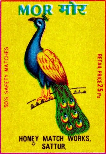
Arbitrariness is the most freeing thing anybody will tell a founder, and the most expensive. Your mark does not have to look like what you sell. It also cannot mean anything on its own, so the meaning has to be bought, in repetition, over years, at a price most small brands have never costed. The matchbox peacock is the case. Nothing about a peacock has anything to do with fire, and the bird is doing the work of a name.
The half of Saussure that gets skipped is the one about difference, and skipping it is the commonest expensive mistake in branding. A form that would read as distinct in an empty market reads as nothing in a crowded one. This is why the beige sans-serif skincare bottle stopped working. Nothing changed about the bottle. What changed is that a crowd of other bottles turned up wearing the same signifier, and difference was the entire supply of meaning. The second mistake is designing the connotation you enjoy and never checking the one a buyer receives, which is how a brand meant to look calm ends up looking clinical. The third is letting colour carry a difference on its own, the fault the food regulator had to fix, when around one man in twelve has some form of colour blindness.
So the first question to ask about a new mark is what it is different from, and only then whether it is beautiful. Then write that list down where other people can see it, and keep it there. Next, write one sentence saying what you want the mark to mean to a stranger in two years, because that sentence is the thing you are about to spend a marketing budget installing in other people's heads. If you cannot write it, you are buying a shape and hoping a meaning arrives with it.
The module builds on these ideas. It takes Peirce's three kinds of sign apart properly and shows which kind a new brand can afford, then turns to the Gestalt principles that decide what a stranger's eye groups together before a single word is read. After that come visual metaphor, pictures used as arguments, and the same image decoded in different ways by different audiences and countries. It ends on the signs that have worn out, the stereotype and the cliché, and on marks built to be read two ways at once.
Elsewhere
- Type
- term
- Period
- ongoing