Typography

Member lesson

Lettering versus type versus calligraphy

Lesson 17 of 34 in Typography.

Lettering vs Calligraphy vs Type Design – What’s the Difference? · Martina Flor
Lesson

Three ways of making letters that get treated as one skill. Calligraphy en.wikipedia.org is writing as a visual art. Lettering en.wikipedia.org is the art of drawing letters. A typeface en.wikipedia.org is a set of characters sharing common design features, made to be used by other people for purposes its designer cannot predict.
letteringdrawn for this word onlytypeone set · every word after
Lettering drawn once for one word, against type set from a repeatable alphabet.
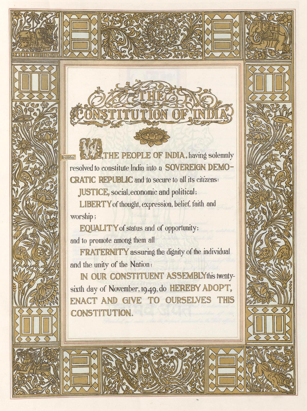
The Preamble page of the Constitution of India: a block of hand-lettered text beginning WE, THE PEOPLE OF INDIA, with JUSTICE, LIBERTY, EQUALITY and FRATERNITY picked out in capitals, framed by a wide gold border of foliage, peacocks, elephants, a bull and a chariot. A pale blue watermark of the Lion Capital sits behind the text.
The Preamble page of the Constitution of India, lettered by hand inside a gold border. Every word on it was drawn, not set in type.Preamble page, the Constitution of India. Ornamentation by Beohar Rammanohar Sinha; calligraphy by Prem Behari Narain Raizada; art direction by Nandalal Bose.Wikimedia Commons/Public domain

Try it

Type grew out of the flat pen. Turn the nib and watch a written o change where its weight sits.

Pen angle

30°

Nib width

26 units

Nothing in that drawing decided to be thick or thin. A flat pen is held at one angle and dragged; the stroke is at full width where it crosses the nib and thins to nothing where it runs along it.

At 0° the horizontal bar vanishes and the stress is dead vertical, that is a Didone, and it is why Bodoni looks engraved rather than written. Around 30° you get the tilted stress of a Renaissance face like Garamond, because that is the angle a right-handed scribe naturally holds a pen. At 90° the whole thing inverts and the verticals disappear.

Right now the thick axis runs at about 120°. Widen the nib without changing the angle and you get a bolder weight at identical contrast, which is exactly what a weight axis in a variable font does.

Member

The rest of this is for members.

You have read the opening of this lesson. The rest of it comes with a membership.

One membership covers all four courses and Brands.

  • All lessons in the four Learn courses
  • All brand breakdowns in the Brands section
  • All quizzes, flashcards and crosswords
  • An AI teacher on every lesson, for up to 60 questions a day
  • All course material published during the membership

Price

Membership is from $12 a month on the Yearly plan, which is charged at $144 once a year. Lifetime access is $59, paid once.Membership is from ₹200 a month on the Yearly plan, which is charged at ₹2,400 + GST once a year. Lifetime access is ₹3,999 + GST, paid once.

Check what stuck

Members only

You can't take this check yet.

Members answer these 3 questions and keep the ticket for this lesson. Every lesson has one.

  1. Question 1, locked

    A founder wants hand-lettering for the brand name and for all the website's body copy. What does the lesson advise?

    • Hand-letter both, so the whole brand feels consistent
    • License a typeface for both and skip lettering
    • Draw the name and license a typeface for the rest
    • Draw the body copy and set the name in a typeface
  2. Question 2, locked

    A brand cannot decide between a fully drawn wordmark and an off-the-shelf typeface. What does the lesson say is the right answer for most brands?

    • Draw every letter the brand will ever need to use
    • One of the middle routes between drawing and setting
    • Set everything in a free typeface and draw nothing
    • Commission calligraphy in place of either of them
  3. Question 3, locked

    A café hand-letters its whole menu, and the dishes change every week. What cost does the lesson point to?

    • Every new dish has to be drawn again by hand
    • The letters become hard to read at small sizes
    • The menu loses any sense of a brand behind it
    • The lines can no longer be broken in good places

Elsewhere in the library

Hear about new courses.

Leave an email and we will tell you when something new lands. We do not write often.