Colour in branding

Member lesson

Neutrals and supporting tones

Lesson 6 of 11 in Colour in branding.

Lesson

Neutrals cover more of a brand than the brand colours do. Backgrounds, body text, rules, borders, the paper itself. Choosing them casually is choosing the colour of eighty per cent of the work by accident.
primary · almost everythingsecondary · accents andstatesextended · charts and edgecasesif every tier gets equal space on the page, none of them is primary
A primary pair, a secondary set and an extended range, in the proportions each is used.
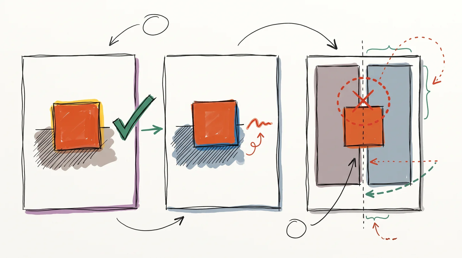
A doodle of three cards: a terracotta square on warm grey, the same square on cool blue-grey, and a layout mixing both greys with the seam between them circled in red.
The same brand colour sits on a warm grey and on a cool grey. Put both greys in one layout and the page looks slightly wrong without anyone knowing why.
Member

The rest of this is for members.

You have read the opening of this lesson. The rest of it comes with a membership.

One membership covers all four courses and Brands.

  • All lessons in the four Learn courses
  • All brand breakdowns in the Brands section
  • All quizzes, flashcards and crosswords
  • An AI teacher on every lesson, for up to 60 questions a day
  • All course material published during the membership

Price

Membership is from $12 a month on the Yearly plan, which is charged at $144 once a year. Lifetime access is $59, paid once.Membership is from ₹200 a month on the Yearly plan, which is charged at ₹2,400 + GST once a year. Lifetime access is ₹3,999 + GST, paid once.

Check what stuck

Members only

You can't take this check yet.

Members answer these 3 questions and keep the ticket for this lesson. Every lesson has one.

  1. Question 1, locked

    Which of these words means this? “A near-grey carrying a trace of hue. Does most of the surface area in most brands.”

    • Neutral
    • Warm and cool greys
    • Primary palette
    • Status colour
  2. Question 2, locked

    Which of these words means this? “Greys with a hint of yellow or blue. Mixing both in one system reads as a mistake.”

    • Specificity
    • Pantone TCX
    • Warm and cool greys
    • Acquired distinctiveness
  3. Question 3, locked

    Which of these words means this? “Pure black. Rarely correct on screen. In print a solid black is one ink, and a deeper rich black has to be built from several.”

    • Delta E
    • Colour depletion
    • True black
    • Metamerism

Elsewhere in the library

Hear about new courses.

Leave an email and we will tell you when something new lands. We do not write often.