Colour is something the eye and brain make out of light, which is why one colour can look different in two places. The retina has three kinds of cone cell, tuned roughly to long, medium and short wavelengths, and every colour you see is the brain comparing their signals, including the signals from whatever sits next to it. Neighbours change colours. Josef Albers built his teaching at Yale around this, and his book Interaction of Color, first published by Yale University Press in 1963, includes a famous exercise in which students make one colour look like two by changing what surrounds it. Designers meet the effect every day. A brand red looks brighter on black than on white, a grey looks warm beside blue and cool beside orange, and a swatch approved on its own can fail the moment it sits on a real photograph.
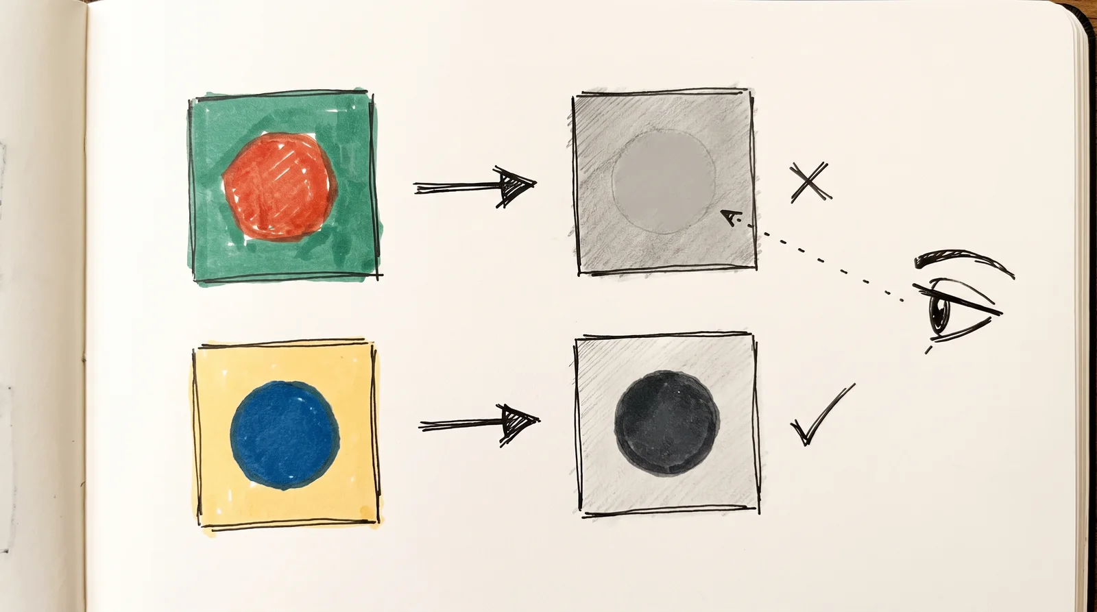
To talk about a colour precisely, split it into three properties. Hue is the family, the name you would give it, such as red or blue. is its intensity, or how far it sits from a grey of the same lightness. , or lightness, is how light or dark it is, and it does most of the work in design, because the eye reads edges and order from differences in value long before it registers hue. The American painter Albert Munsell described colour this way in A Color Notation in 1905, as hue, value and chroma, and the sliders in most colour pickers still follow the same split. Value is the one to watch. Turn a design to greyscale; if the important thing stops standing out, two colours share a value, and changing the hue will not rescue it.
Screens and printers make colour in opposite ways, and that is why they disagree. A screen adds light: red, green and blue pixels at full strength make white, and 256 levels of each give about 16.7 million combinations. Ink takes light away instead. The three process inks (cyan, magenta, yellow) each absorb part of the white light falling on the paper, and a fourth ink, black, does the dark work, because the three together make a muddy brown and waste ink; printers call it K, for the key plate that carried the detail. Each system reaches a different range of colours, called its . The most vivid screen greens and blues, and the brightest oranges, sit outside what four inks can print, so a colour chosen on a phone often comes back from the press noticeably duller. No setting in the file changes that.
Contrast is the one colour decision with a number attached. The Web Content Accessibility Guidelines (WCAG) measure the difference in luminance between text and its background as a ratio that runs between 1:1, no difference at all, and 21:1, black on white. Body text needs at least 4.5:1 for the widely used AA level, large text (roughly 24 pixels, or 18.5 pixels bold) needs 3:1, and the stricter AAA level asks for 7:1. The numbers are useful because they are blunt. Mid-grey #767676 on white scores 4.54:1 and passes, while #777777, one step lighter, scores 4.48:1 and fails, and pure red #FF0000 on white manages only 4:1. Colour vision varies as well. About 1 in 12 men and 1 in 200 women have some colour blindness, most often trouble telling red from green, so never let hue alone carry a meaning such as error or success.
A palette that works is small, and proportion matters in it as much as the choice of hues. Start with one colour that has a reason behind it, add a dark neutral for text and a light one for the ground, then one accent, and give each colour a job. Proportion then decides the feel. Penguin's first paperbacks in 1935, designed by the 21-year-old office junior Edward Young, gave each series one colour, orange for fiction, green for crime and dark blue for biography, and used it only in the bands above and below a white middle panel, so a shelf of them read as a system across a shop. The 60-30-10 split (a dominant colour, a secondary and a small accent) is a fair place to start. Two opposite colours that fight at equal volume can sit calmly at ninety to ten.
Colour carries meaning, and nearly all of that meaning is learned. Some of it is close to universal because the world taught everyone the same lesson, such as red for stop on traffic lights almost everywhere. Much of it is local. In India and China red is a wedding colour, while white is worn for mourning in many Hindu and Chinese families, and in much of Europe and North America it is the bride who wears white. Companies teach meanings too. Tiffany & Co. has held a trademark on its blue since 1998, and in 2001 Pantone standardised it as a private shade called 1837 Blue, after the year the company was founded. Be wary of the charts that say blue means trust and yellow means happiness. The research behind them is thin, and what readers judge far more consistently is whether a colour suits the product in front of them.
Finally, a colour has to be written down in several codes, because each medium reads a different one. RGB gives three numbers between 0 and 255 for red, green and blue light, and HEX writes the same three numbers in base sixteen for the web, so rgb(255, 204, 0) and #FFCC00 are one yellow. CMYK gives percentages of the four process inks for ordinary printing, and every press and paper shifts the printed colour a little. Pantone is a numbered library of premixed spot inks, a system Lawrence Herbert introduced in 1963, with C or U after the number for coated or uncoated paper. Keep all four in one table. That hour of work, done once for every brand colour, is what stops three suppliers delivering three slightly different reds.
Worked example
Build a five-colour palette and test it
- 01Choose one anchor colour and write a sentence on why, such as a material, a place or a gap in your category.A colour with a reason survives the meeting where someone says they prefer green.
- 02Add a near-black for text and an off-white for the ground, both leaning the same way, warm or cool.Neutrals cover most of the surface, and a warm grey beside a cool one looks wrong in a way nobody can name.
- 03Add one accent and one supporting colour, then give all five a job (ground, text, brand, support, action) and a rough share of the page.A palette without jobs turns into a colour picker, and every new page reopens the debate.
- 04Turn the palette and one real layout to greyscale and check that the text, the anchor and the accent each stand apart from the ground.Colours that share a value lose their hierarchy in print, in poor light and for colour-blind readers.
- 05Put every text and background pair through WebAIM's contrast checker, and change lightness rather than hue until body text reaches 4.5:1.Lightness is what the ratio measures, so nudging the hue wastes time.
- 06Print the five colours on the paper you will use and compare them with the screen version on a cheap phone at low brightness.Saturated screen colours lose the most on paper, and it is far cheaper to find out before a print run.
- 07Write the HEX, RGB, CMYK and Pantone values for all five in one table and send that table to every supplier.Suppliers left to convert on their own each guess differently, and three slightly different brand colours follow.
The words, in plain language
- Hue
- The colour family, the name you would give it, such as red or blue.
- Saturation
- How intense a colour is compared with a grey of the same lightness. Munsell called it chroma.
- Value
- How light or dark a colour is. The property that decides legibility and hierarchy.
- Additive colour
- Colour made by mixing light, as screens do. Red, green and blue at full strength make white.
- Subtractive colour
- Colour made by inks or paints absorbing light. The more you layer, the darker it gets.
- Gamut
- The range of colours a device or process can reproduce. A screen and a press have different ones.
- Contrast ratio
- WCAG's measure of the luminance difference between two colours, between 1:1 and 21:1. Body text needs at least 4.5:1.
- Spot colour
- A premixed ink printed from its own plate and named by a system such as Pantone, used when process inks cannot reach a colour.
Why it matters
The expensive colour mistakes nearly all come from testing too late. A palette picked on a bright laptop is printed on uncoated paper and comes back flat, or a colour chosen for its hue turns out to share its value with the background, so the button disappears in greyscale and for many colour-blind readers. Pale grey text is the worst offender. It looks refined to the designer at a desk and unreadable to someone on a phone in daylight. Each of these is cheap to catch in the first week and costly after launch, when the colour is already on packaging, signage and a year of posts.
Too many colours is the other common failure. Every extra colour dilutes the ones already doing the work, and a palette of nine with no stated jobs means every new page reopens the argument. Picking colours from a psychology chart wastes money more quietly, because a team chooses blue since it is said to mean trust and ends up looking like every bank and software company in its market. Meanings also travel badly between countries. Check a palette with people who live in each market before it prints.
The habits that prevent this are small. Look at everything in greyscale, run each text colour through a contrast checker, print on the paper you will really use, and look at the work on a cheap phone with the brightness turned down. Do all of it early, before a supplier has seen a single file.
The rest of this module goes further into each part. It starts with five short lessons on what the eye finds first, contrast that reads as expensive, a small palette, a single ink and colour that survives a shelf and a phone. Then come colour wheels and models, value, light against ink, and the full detail of RGB, CMYK, Pantone and HEX. Contrast and accessibility follow. After a palette built from a photograph, harmony, warm and cool colour, and tints and shades, it looks at what the research on colour psychology really supports and what colour means in different cultures, then builds a palette from scratch. , gradients, print against screen, and colour management and proofing come next, and it ends with the history of pigments and dyes, colour in film and colour taken from nature.
Elsewhere
- Type
- term
- Period
- ongoing