Colour

Member lesson

Accessibility and contrast ratios

Lesson 12 of 27 in Colour.

FIX Color Contrast – Accessibility in Web & UI Design · Pimp my Type
Lesson

The WCAG en.wikipedia.org contrast ratios turn the argument about whether something is readable into a number that two people can check. 4.5:1 for body text is the line most of the world has settled on.
1.8 : 1 fails3.1 : 1 large only4.5 : 1 passes
The same text at three contrast ratios against one ground.
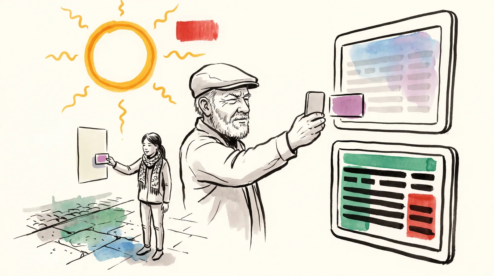
An older man squints at his phone in strong sunlight, with two enlarged screens beside him, one with faded pale grey lines and one with clear dark lines.
In bright sun, pale grey lines on a white phone screen fade away while dark ones stay clear. A contrast ratio turns that gap into a number anyone can check.

Try it

Pick a text colour and a background. The ratio and the grade change as you go, and 4.5:1 is the floor for body text.

Open till late, every day

Small type is where contrast fails first. A heading this size can get away with a pale colour that a line of body text cannot, which is why the rules give large text a lower floor.

2.78:1

  • Body text · needs 4.5:1
  • Large text · needs 3:1
  • Body text, strictest (AAA) · needs 7:1
Member

The rest of this is for members.

You have read the opening of this lesson. The rest of it comes with a membership.

One membership covers all four courses and Brands.

  • All lessons in the four Learn courses
  • All brand breakdowns in the Brands section
  • All quizzes, flashcards and crosswords
  • An AI teacher on every lesson, for up to 60 questions a day
  • All course material published during the membership

Price

Membership is from $12 a month on the Yearly plan, which is charged at $144 once a year. Lifetime access is $59, paid once.Membership is from ₹200 a month on the Yearly plan, which is charged at ₹2,400 + GST once a year. Lifetime access is ₹3,999 + GST, paid once.

Check what stuck

Members only

You can't take this check yet.

Members answer these 3 questions and keep the ticket for this lesson. Every lesson has one.

  1. Question 1, locked

    What contrast ratio does body text need to clear the common accessibility standard?

    • 4.5 to 1
    • 2 to 1
    • 10 to 1
  2. Question 2, locked

    Which of these words means this? “The common target: 4.5:1 for body text, 3:1 for large text and for interface parts you have to find.”

    • Dye
    • AA
    • Context effect
    • HEX
  3. Question 3, locked

    Which of these words means this? “The stricter one: 7:1. Worth hitting for anything long.”

    • AAA
    • Interpolation space
    • Split complementary
    • Gamut

Elsewhere in the library

Hear about new courses.

Leave an email and we will tell you when something new lands. We do not write often.