Typography in branding

Member lesson

Secondary and supporting typefaces

Lesson 3 of 8 in Typography in branding.

Typography in Branding How to Choose Fonts for a Brand Identity · 4 The Creatives
Lesson

Most brands need two typefaces and very few need three. One carries voice, usually in headlines. One carries volume, in body copy, interfaces, documents and anything long.
primaryheadlines · the voicesecondarylong text · the worksysteminterfaces · already therea brand that licenses one weight has a system with one voicecount the seats before you fall in love with the family
Three type roles: one for headlines, one for text, one already on every device.
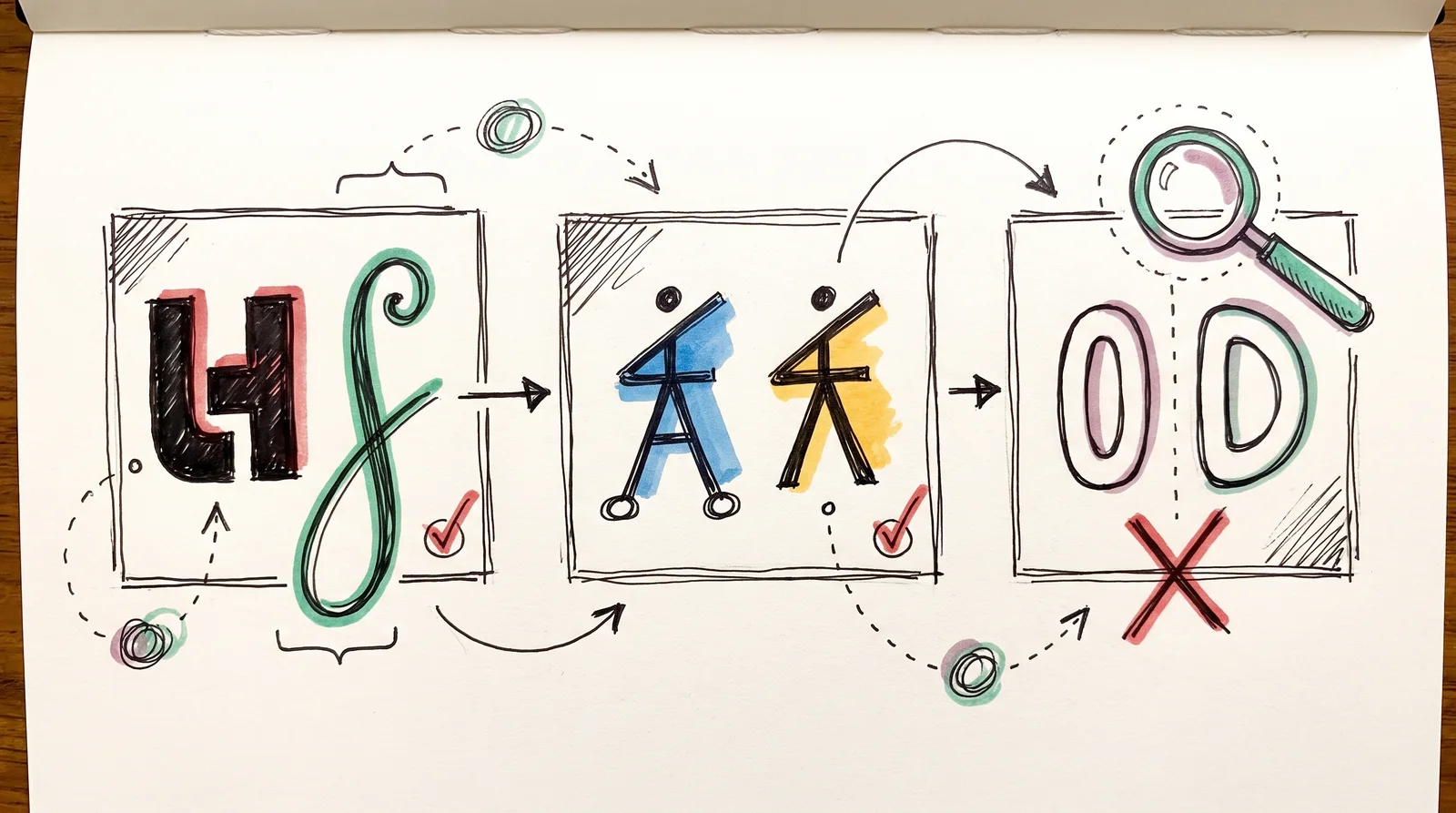
Three framed pairs of abstract letter shapes show a contrasting pair and a same-skeleton pair with ticks, and a nearly identical pair under a magnifying glass with a cross.
Three pairs of letter shapes: one pair clearly different, one pair sharing a skeleton, one pair nearly identical. The near-twins look like a mistake, the other two look chosen.
Member

The rest of this is for members.

You have read the opening of this lesson. The rest of it comes with a membership.

One membership covers all four courses and Brands.

  • All lessons in the four Learn courses
  • All brand breakdowns in the Brands section
  • All quizzes, flashcards and crosswords
  • An AI teacher on every lesson, for up to 60 questions a day
  • All course material published during the membership

Price

Membership is from $12 a month on the Yearly plan, which is charged at $144 once a year. Lifetime access is $59, paid once.Membership is from ₹200 a month on the Yearly plan, which is charged at ₹2,400 + GST once a year. Lifetime access is ₹3,999 + GST, paid once.

Check what stuck

Members only

You can't take this check yet.

Members answer these 3 questions and keep the ticket for this lesson. Every lesson has one.

  1. Question 1, locked

    Why does pairing two typefaces that look almost alike fail, when pairing two obviously different ones works?

    • Similar faces compete for optical weight and make the text look bolder than specified
    • Two similar faces double the licence cost for no visible gain
    • Browsers cannot tell them apart, so the fallback picks the wrong one
    • Near-sameness reads as a mistake, while a clear difference reads as a deliberate contrast
  2. Question 2, locked

    Which of these words means this? “Two typefaces used together. Works on contrast or on shared skeleton, rarely on similarity.”

    • Pairing
    • Set solid
    • Optical size
    • Language coverage
  3. Question 3, locked

    Which of these words means this? “The one for small print, tables and numbers. Chosen for function, not character.”

    • Tofu
    • Utility face
    • Modular scale
    • Webfont licence

Elsewhere in the library

Hear about new courses.

Leave an email and we will tell you when something new lands. We do not write often.