Colour

Member lesson

Contrast and legibility

Lesson 11 of 27 in Colour.

Checking color contrast for accessibility in Figma · Figma
Lesson

Contrast en.wikipedia.org is difference, and almost all of the difference that matters for reading is difference in value rather than in hue. Two colours of the same lightness will vibrate against each other and be hard to read even when they look nothing alike.
1.8 : 1 fails3.1 : 1 large only4.5 : 1 passes
The same text at three contrast ratios against one ground.
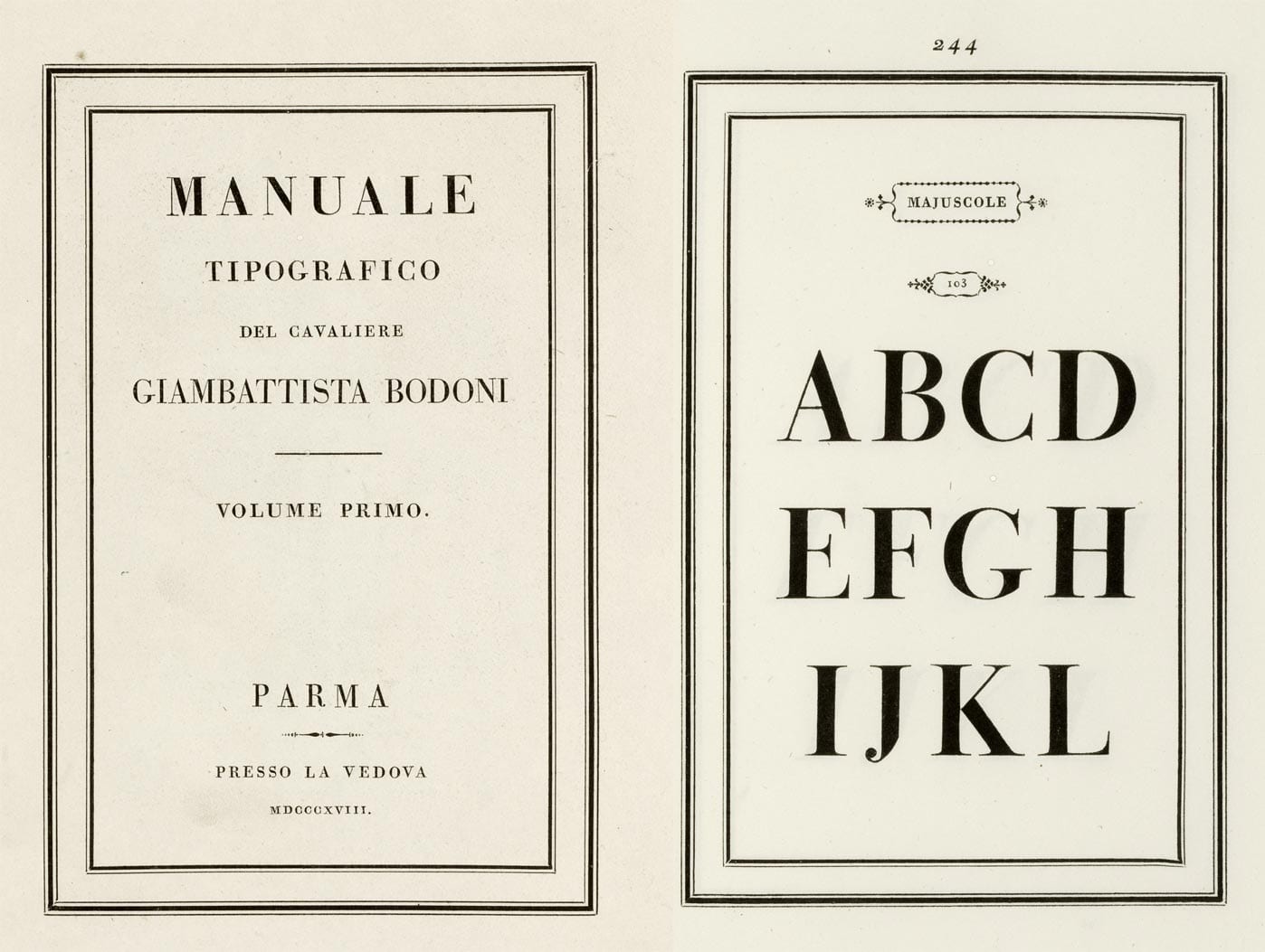
A two-page spread from Bodoni's specimen book. The left page is the title page, MANUALE TIPOGRAFICO set in widely spaced capitals inside a double rule. The right page, numbered 244, shows the capitals A to L at enormous size in a serif with hairline-thin horizontals and heavy vertical stems.
A spread from Bodoni's 1818 type specimen book, with giant capitals whose thin strokes are almost hairlines. That extreme thick and thin became a style of its own.Manuale Tipografico, specimen page. Giambattista Bodoni, published posthumously by Margherita Dall'Aglio, Parma, 1818.Wikimedia Commons/Public domain

Try it

Set a pale grey on white, then darken it until it passes. Most failing pairs are only one step too light.

Open till late, every day

Small type is where contrast fails first. A heading this size can get away with a pale colour that a line of body text cannot, which is why the rules give large text a lower floor.

2.78:1

  • Body text · needs 4.5:1
  • Large text · needs 3:1
  • Body text, strictest (AAA) · needs 7:1
Member

The rest of this is for members.

You have read the opening of this lesson. The rest of it comes with a membership.

One membership covers all four courses and Brands.

  • All lessons in the four Learn courses
  • All brand breakdowns in the Brands section
  • All quizzes, flashcards and crosswords
  • An AI teacher on every lesson, for up to 60 questions a day
  • All course material published during the membership

Price

Membership is from $12 a month on the Yearly plan, which is charged at $144 once a year. Lifetime access is $59, paid once.Membership is from ₹200 a month on the Yearly plan, which is charged at ₹2,400 + GST once a year. Lifetime access is ₹3,999 + GST, paid once.

Check what stuck

Members only

You can't take this check yet.

Members answer these 3 questions and keep the ticket for this lesson. Every lesson has one.

  1. Question 1, locked

    Text is set in a strong colour on a strong background and is still hard to read. What is the likely cause?

    • The two colours are close in value even though the hues are far apart
    • The typeface is too old
    • The screen is too bright
  2. Question 2, locked

    Which of these words means this? “The difference between two colours, in whichever dimension you mean. Usually value.”

    • Contrast
    • Mordant
    • Mourning colour
    • Legibility
  3. Question 3, locked

    Which of these words means this? “Whether the shapes can be told apart at all. Different from readability, which is whether a person will keep going.”

    • Legibility
    • Auspicious colour
    • AA
    • Structural colour

Elsewhere in the library

Hear about new courses.

Leave an email and we will tell you when something new lands. We do not write often.