Typography in branding

Member lesson

Display versus text faces in a system

Lesson 4 of 8 in Typography in branding.

Different Kinds of Text – 3 Questions to Start for Choosing the Right Typeface · Pimp my Type
Lesson

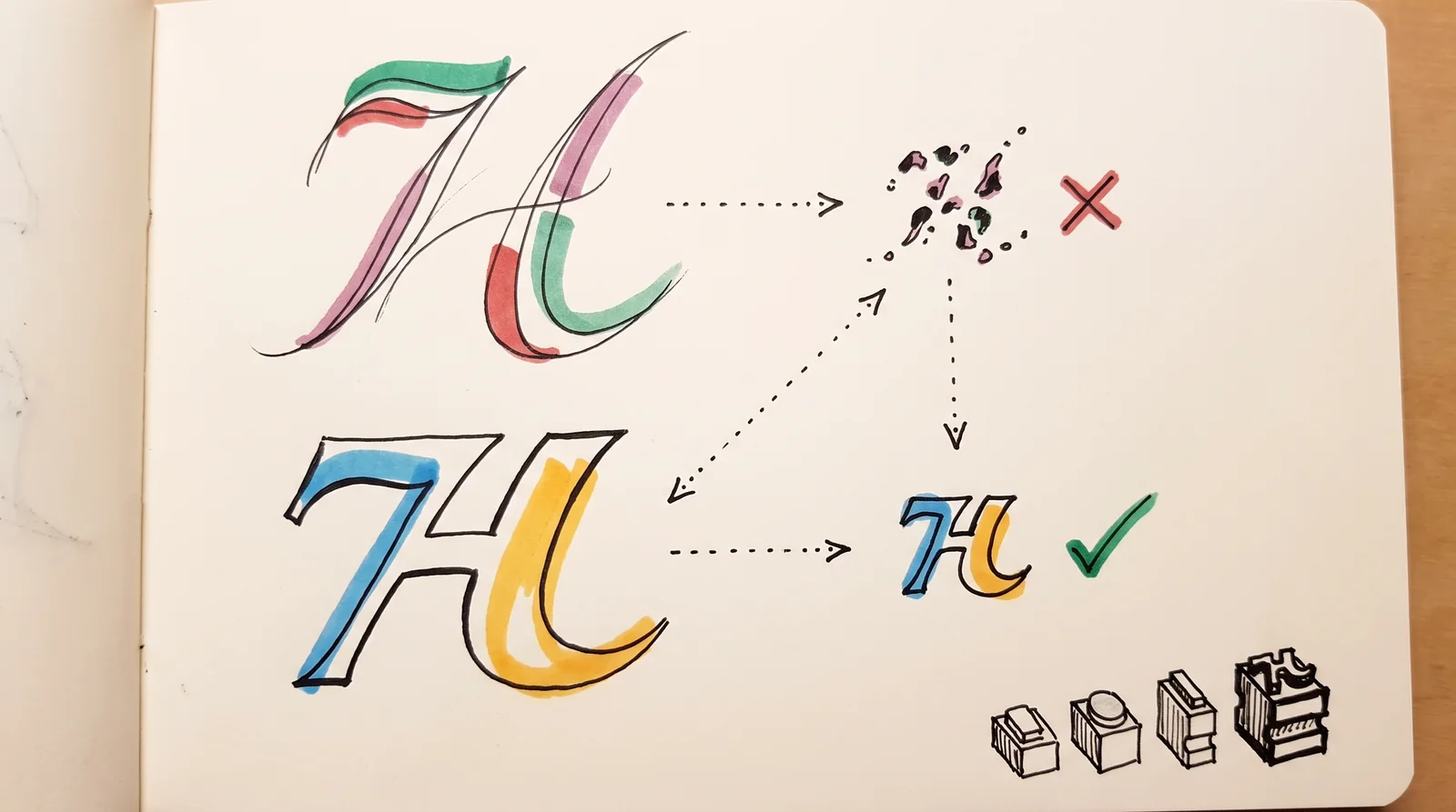
Display and text are different engineering problems wearing the same name. A display face can afford hairlines, tight fitting and idiosyncratic shapes because it will be seen at 90 point. A text face cannot afford any of them.
primaryheadlines · the voicesecondarylong text · the worksysteminterfaces · already therea brand that licenses one weight has a system with one voicecount the seats before you fall in love with the family
Three type roles: one for headlines, one for text, one already on every device.
A delicate letter shape breaks apart when drawn tiny, while a sturdier version of it stays clear at the same small size, with a row of graded metal type blocks in the corner.
A fine display letter loses its thin strokes when shrunk, while a sturdier text version stays clear at the same small size. Faces made for big and small sizes solve different problems.
Member

The rest of this is for members.

You have read the opening of this lesson. The rest of it comes with a membership.

One membership covers all four courses and Brands.

  • All lessons in the four Learn courses
  • All brand breakdowns in the Brands section
  • All quizzes, flashcards and crosswords
  • An AI teacher on every lesson, for up to 60 questions a day
  • All course material published during the membership

Price

Membership is from $12 a month on the Yearly plan, which is charged at $144 once a year. Lifetime access is $59, paid once.Membership is from ₹200 a month on the Yearly plan, which is charged at ₹2,400 + GST once a year. Lifetime access is ₹3,999 + GST, paid once.

Check what stuck

Members only

You can't take this check yet.

Members answer these 3 questions and keep the ticket for this lesson. Every lesson has one.

  1. Question 1, locked

    Body copy has been set in a display face. How does the page give it away?

    • The text renders noticeably bolder than the same size set in a text face
    • The page looks loose and slightly dull until the tracking is closed up
    • Readers give up around the third paragraph without knowing why, because the counters are tight and the contrast fights them
    • Line breaks fall in odd places, since display faces carry no hyphenation data
  2. Question 2, locked

    Which of these words means this? “Drawn to be seen large. Tight spacing, fine detail, extreme contrast.”

    • System stack
    • Utility face
    • Display face
    • Primary typeface
  3. Question 3, locked

    Which of these words means this? “Drawn to be read small. Open counters, sturdier strokes, generous spacing.”

    • Perpetual versus subscription
    • Set solid
    • Optical size
    • Text face

Elsewhere in the library

Hear about new courses.

Leave an email and we will tell you when something new lands. We do not write often.