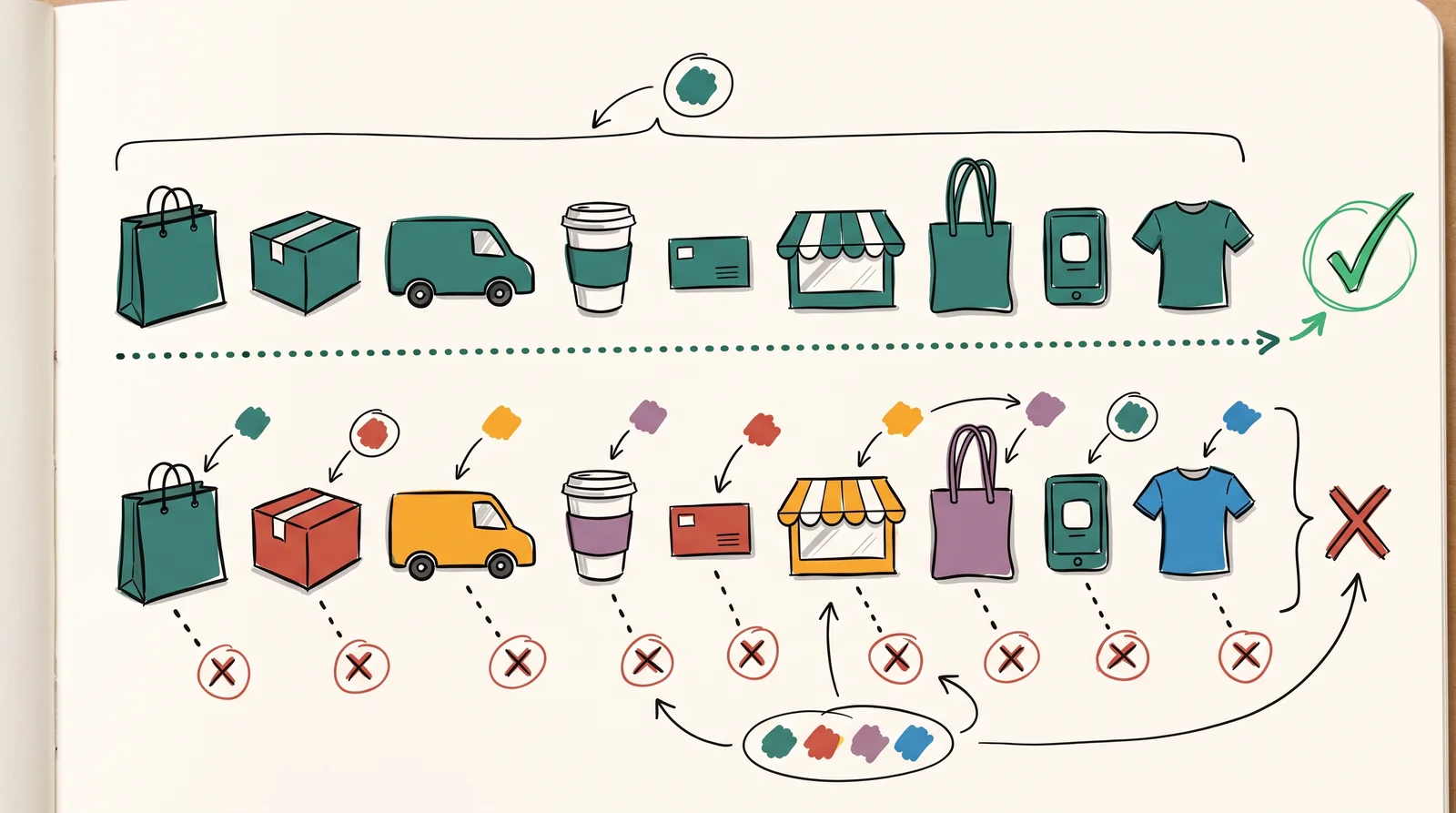
A brand's main colours, its , are the two or three colours a buyer should connect with it without seeing the name. The palette is short on purpose. Recognition needs repetition, and repetition is divided by every colour you add. A brand that puts one colour on nine pieces out of ten has shown that colour nine times. A brand with five equal colours has shown each of them twice, and two exposures buy nothing a person carries out of the room and still holds a week later.
One of them is almost always doing the work. Think of the brands whose colour you can name from memory, such as Cadbury's purple, Tiffany's blue, UPS brown or Coca-Cola red, and you will find a single with supporting neutrals, rather than a balanced set of four. The second colour is usually there to make the first one readable, or to mark a range, or to give a headline somewhere to sit. It is there to support. Writing it into the guidelines as an equal partner is the first step towards losing the colour you had.
The reason short palettes work is a fact about memory rather than about taste. Put two reds side by side and almost anybody can tell them apart. Take one away and ask for it an hour later, and the answer collapses into a category such as red, dark red or slightly orange. In a 2015 study in the Journal of Experimental Psychology: General, Gi-Yeul Bae and colleagues found that when people reproduce a colour from memory, their answers are pulled towards the centre of its named category. Buyers are not storing your hex value. They store a rough bucket and an association, and in any one category a bucket holds about one brand.
So the first job is to look at the competition rather than at a colour wheel. If an audit shows eleven competitors in navy, navy is unavailable however well it suits the positioning, because a colour that everybody uses points to the category instead of to you. The practical version is cheap. Photograph the shelf, or screenshot the first twenty search results or app icons, pull the dominant swatch from each and lay them in a row ordered by hue. The gaps in that row are your brief. Check each gap against local meaning before you fall for it, since white is the colour of mourning in parts of India and China.
Then test the candidates at their worst. Print them on uncoated paper, look at them on a phone at minimum brightness, have them embroidered, and see them through a shop window at dusk. Colours that live only in a design tool tend to collapse in exactly one of those conditions, and it is usually the one the brand needs most. Saturated oranges and mid-greens are the usual casualties, because a screen can show hues that four-colour print cannot reach. Pantone prints its guides with a coated and an uncoated version of each colour for the same reason, since one ink looks different on the two papers. For print, most brands then name a spot colour, a premixed ink with a Pantone number, and give separate recipes for four-colour print, screen and paint.
Finally, name the dominant colour in writing and say how it is used. Guidelines that list three primaries as equals produce work where each designer picks a favourite, and after a year the brand has three faces. Tiffany has used one pale blue since the cover of its catalogue in 1845, and Pantone mixed it as a custom colour, numbered 1837, the year the firm was founded. Cadbury specifies its purple as Pantone 2685C and spent years in court defending it. Neither choice was clever. What both companies did was keep one colour for a very long time.
Try this
Map the colours of one category
Choose a category you might design for, such as oat milk, local banks or running shoes. Collect twenty competitors by photographing a supermarket shelf or screenshotting the first twenty search results or app store icons. Pull the single most dominant colour from each with an eyedropper tool, and lay the twenty swatches in one row ordered by hue. Mark the crowded stretches and the gaps. Then pick two candidate colours from the gaps and test each one on a phone at minimum brightness and printed on plain office paper.
Time: 45 minutes. You need: A phone camera, or screenshots, any design tool with an eyedropper, such as Figma, a printer and plain paper.
Look for
- The one or two hues that most of the category shares, if there are any.
- Which hue the market leader owns, and whether anyone sits close enough to be confused with it.
- Gaps that exist for a reason, where the colour means something wrong for this product to buyers in this market.
- Whether your two candidates still look different from the nearest competitor on a dim phone and on cheap paper.
- How far each candidate moves between screen and print. A large shift means the printer will not match it.
- Whether each candidate passes a contrast of 4.5 to 1 as text on white, or needs a darker partner for words.
The words, in plain language
- Primary palette
- The two or three colours a buyer should associate with you without seeing the name.
- Dominant colour
- The one colour in the primary palette that does most of the recognising. Name it in writing.
- Ownable colour
- A colour free enough in your category to become yours.
- Category audit
- Collecting the main colour of every competitor, to see where the category crowds and where it leaves gaps.
- Colour category
- The named bucket memory files a colour under, such as red or dark blue. Buyers keep the bucket and lose the exact shade.
- Coated and uncoated
- Paper with and without a sealed surface. The same ink looks brighter and sharper on coated stock.
Why it matters
Most palettes die slowly rather than being rejected. Nobody votes against the primary. A campaign wants a warmer version for summer, a sub-brand argues for a colour of its own, a deck template gets rebuilt by somebody who never had the file, and each step is reasonable on its own. Five years later the brand colour is one of six on its own website. Audit coverage once a year by taking the last fifty things the company published and estimating what share of the visible area is the primary. The audit takes an afternoon. If that share has dropped, you have an answer before anybody needs an opinion, and a number is much easier to defend in a meeting than a feeling.
The common mistakes are predictable. One is choosing a colour because the founder likes it, without looking at the category. Another is approving a screen colour that no printer can match, or a pale colour that fails as text on white, which every web page then has to work around, since the usual minimum contrast for body text is 4.5 to 1. A third is borrowing colour meanings from the internet, such as blue for trust, which are far too vague to separate you from the other brands that read the same article. You will also meet the claim that colour lifts brand recognition by 80 per cent. The articles that repeat it rarely link to a study you can read, so keep it out of your decks.
There is a real argument about how much work colour should do. Some brands, Tiffany, Cadbury and easyJet among them, let one colour carry most of the recognition. Others, particularly in fashion, change palettes every season and put recognition into the logo, the type and the product instead. Both approaches work. What fails is the middle, a brand that says in its guidelines that it owns a colour and then uses it on only a third of the work it publishes.
Later lessons work outward from here. The next one covers the law on trademarked colours, which few brands ever qualify for and every brand can learn from. Then come the secondary colours that support the main ones, the extended ramps an interface needs, accents, and the neutrals that fill most of a surface. After those, the module shows how to set ratios, how to keep one colour consistent across print, screen, fabric and packaging and across different papers and boards, what owning a colour in a category takes, and how accessibility rules narrow the choice.
Elsewhere
- Type
- term
- Period
- ongoing