Colour in branding

Member lesson

Colour in accessibility compliance

Lesson 11 of 11 in Colour in branding.

Accessible color contrast requirements with examples · Pope Tech
Lesson

The contrast ratios themselves, and why 4.5 to 1 is the floor for body text, are covered in "Accessibility and contrast ratios" in the Colour module. For a brand palette, the two lower thresholds matter as much. Large text needs 3 to 1, and a separate 3 to 1 applies to interface components such as buttons, form fields and icons, which decides whether a pale brand colour can carry a headline or a button border at all.
1.8 : 1 fails3.1 : 1 large only4.5 : 1 passes
The same text at three contrast ratios against one ground.
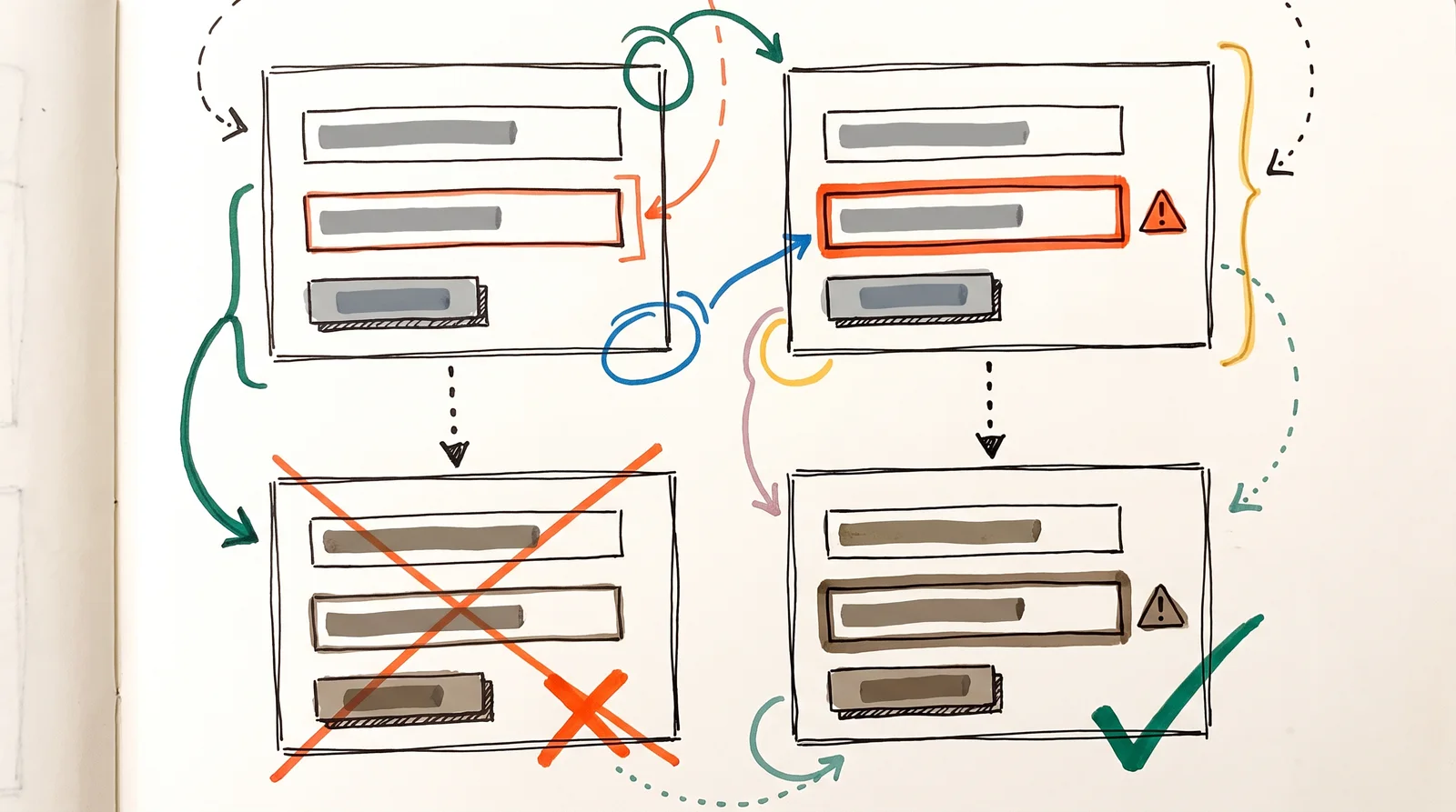
A doodle of two forms, one marking an error with a thin red outline and one with a thick outline and warning triangle, each shown again below in muddy colour-blind tones where only the second error is still visible.
A form error shown only in red can vanish for someone with colour blindness. Add a warning shape and a thicker border and everyone can see it.

Try it

Put a brand colour behind white text and see whether it passes. If it fails, darken it here until it does.

Open till late, every day

Small type is where contrast fails first. A heading this size can get away with a pale colour that a line of body text cannot, which is why the rules give large text a lower floor.

2.78:1

  • Body text · needs 4.5:1
  • Large text · needs 3:1
  • Body text, strictest (AAA) · needs 7:1
Member

The rest of this is for members.

You have read the opening of this lesson. The rest of it comes with a membership.

One membership covers all four courses and Brands.

  • All lessons in the four Learn courses
  • All brand breakdowns in the Brands section
  • All quizzes, flashcards and crosswords
  • An AI teacher on every lesson, for up to 60 questions a day
  • All course material published during the membership

Price

Membership is from $12 a month on the Yearly plan, which is charged at $144 once a year. Lifetime access is $59, paid once.Membership is from ₹200 a month on the Yearly plan, which is charged at ₹2,400 + GST once a year. Lifetime access is ₹3,999 + GST, paid once.

Check what stuck

Members only

You can't take this check yet.

Members answer these 3 questions and keep the ticket for this lesson. Every lesson has one.

  1. Question 1, locked

    A chart tells six data series apart by hue alone. Why does that fail, and what is the cheap fix?

    • Roughly one man in twelve has some colour vision deficiency, so add a pattern, a label or a direct annotation
    • Six series exceed the four allowed by the standard, so series must be merged until four remain
    • Adjacent series must meet the 4.5 to 1 body text ratio, so alternate hues need darkening
    • Screens render hue inconsistently, so the chart should be converted to greyscale
  2. Question 2, locked

    Which of these words means this? “The measured difference in relative luminance between two colours.”

    • True black
    • Contrast ratio
    • Ownable colour
    • Coverage
  3. Question 3, locked

    Which of these words means this? “Using colour as the only way of conveying something. Fails most standards.”

    • Colour space
    • Coated and uncoated
    • True black
    • Colour alone
End of Colour in brandingMembers onlyNow play it5 games from this module at four levels, and a stamp for your ticket book.

Elsewhere in the library

Hear about new courses.

Leave an email and we will tell you when something new lands. We do not write often.