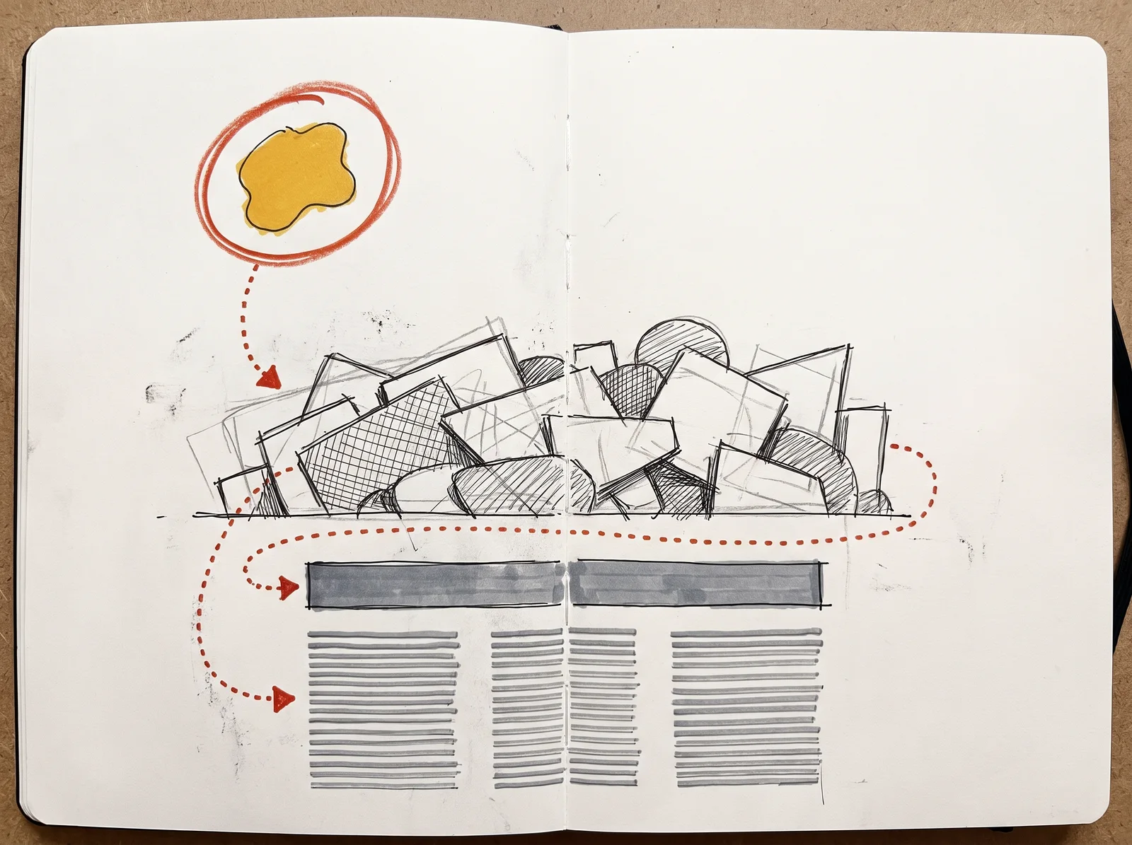
Composition is deciding where things go so that a reader meets them in the right order. Nobody reads a page evenly. The eye jumps between a few points, landing first on whatever differs most from its surroundings and then hunting for the next thing, so the designer's job is to decide that order and build the differences that produce it. Write the order down in words before you start, for example the headline first, then the picture, then the price, then everything else. Research on eye movement shows what happens when nobody does. In 2006 Jakob Nielsen reported an eye-tracking study in which 232 people looked at thousands of web pages and mostly scanned in an F shape, across the top and down the left edge, which is what readers do when a page gives them no order of its own.
You build that order out of contrast, and there are only a few levers. Size is the obvious one, but weight, colour, position and space all rank things too, and isolation is the strongest of the quiet ones, since a small element with space around it will outrank a bigger one lost in a crowd. The classic demonstration is 'Think Small', the 1959 advertisement for the Volkswagen Beetle by the agency Doyle Dane Bernbach, art directed by Helmut Krone with copy by Julian Koenig. The car is tiny, near the top left of a page that is almost entirely white, with a short headline under it and three columns of copy along the bottom. Full-colour car adverts were common then. This page was black and white and mostly empty, and in 1999 Advertising Age ranked the campaign the best of the twentieth century.
A is the structure underneath, a set of columns and margins with between the columns, decided once so that every later decision is quicker and every page agrees with the last. Its modern form came out of Swiss design after the Second World War, and Josef Müller-Brockmann's Grid Systems in Graphic Design, published by Niggli in 1981, is still the standard handbook. The idea is much older. Newspapers have run on columns for centuries, and medieval scribes ruled their pages to fixed proportions before writing a word. On screens the usual grid has twelve columns for a plain arithmetical reason, because twelve divides by two, three, four and six, so halves, thirds and quarters all land on column edges. The grid is for the designer. A reader should only ever notice that the page feels calm and ordered.
is the cheapest improvement in design. When things share an edge, the eye draws an invisible line between them and reads them as belonging together, so a page with three strong edges feels deliberate and a page with nine slightly different ones feels careless, even to someone who could not say why. Pick a few edges and hold them strictly. Measured alignment is only the start, because some shapes have to pass the line slightly to look as if they sit on it, and "Alignment and edge relationships" shows which ones and why. Near misses are the worst case of all. Two edges that miss each other by two millimetres look like a mistake, so either line them up exactly or move them clearly apart.
is any part of the page left empty, whatever its colour, and it does two jobs. First it groups things, because the eye reads items that sit close together as one unit, a tendency the Gestalt psychologist Max Wertheimer described as proximity in 1923. Move a caption closer to its picture and further from the next paragraph, and the page explains itself without a box or a rule. Second, space signals value. For most of printing history space cost money, because advertising was sold by the column inch, so a crowded page still reads as cheap and an open one as confident. Make the gaps uneven on purpose. Equal gaps everywhere carry no information, while one gap twice the size of the others tells the reader, without a single word, that a new section has begun.
Scale and balance come next. Scale is the size of one element compared with the others, and it needs to be decisive, because a headline a little bigger than the body looks like an error while one three or four times bigger looks like a choice. Balance is how spreads across the page. Symmetry, with everything centred on an axis, feels formal and settled, which suits an invitation or a title page, while asymmetry feels active and balances a heavy element against open space, the way a child balances an adult on a seesaw by sitting further out. Designers have argued about this for a century. Jan Tschichold's book Die neue Typographie of 1928 treated the centred layout as finished, yet by 1947, redesigning Penguin's paperbacks, he was centring title pages again. Both work when chosen.
Cropping is composition applied to a picture, and it decides what the picture is about. A tight keeps the subject and cuts away the explanation. Toulouse-Lautrec's 1893 poster for the Divan Japonais, a Paris cabaret, cuts off the singer Yvette Guilbert's head at the top edge and still lets you recognise her by her long black gloves, while the dancer Jane Avril, a black silhouette in the foreground, takes the first look. The working rules, where a crop may cut a person and how one picture survives being cut to several shapes, are set out in "Framing and cropping", near the end of this module.
Checklist
Before a page goes out
- You can say in words what should be read first, second and third.If you cannot name the order, the reader will not find one either.
- The first thing is clearly bigger, bolder or more isolated than everything around it.Small differences read as accidents, so the entry point needs a large one.
- Everything sits on one grid, and the margins match on every page or frame in the set.Margins that drift by a few pixels are the quickest way to make a set look amateur.
- The layout uses as few alignment edges as it can, and nothing misses an edge by a hair.Near misses read as mistakes, and every extra edge weakens the others.
- Related items sit closer to each other than to anything else on the page.Proximity does the grouping that boxes and rules are usually added to fake.
- The largest element is at least twice the size of the next, unless they are meant to be equal.Timid scale is the most common amateur tell there is.
- No crop cuts a person at a joint, and each leaves room in the direction of a gaze or movement.Cuts at the wrist, knee or neck read as injuries, and a face pressed against the edge feels cramped.
- Squinted at from across the room, or blurred, the page still shows the order you wrote down.The squint test shows the hierarchy the page really has, as against the one you meant.
The words, in plain language
- Hierarchy
- The order in which a reader notices things, built from differences in size, weight, colour, position and space.
- Entry point
- Where the eye lands first. Choose it, or the page will choose it for you.
- Grid
- Columns, margins and gutters set before the content arrives, so placement stops being a fresh decision on every page.
- Gutter
- The gap between two columns of a grid. Easy to forget to write down.
- Alignment
- Elements sharing an edge or an axis, which makes them read as a group.
- White space
- Any part of the page left empty, whatever its colour. It groups, separates and gives emphasis.
- Visual weight
- How strongly an element pulls the eye. Size, darkness, colour, isolation and complexity all add to it.
- Crop
- The edges chosen for a picture, which decide what it is about.
Why it matters
The most common composition mistake is giving everything equal weight. A page where the headline, the photograph, three logos and a button all compete has no , and a reader offered no order usually takes none and leaves. The second mistake is filling every gap because someone thinks the space looks unused, which removes the grouping and the calm that made the page readable. The third is timid scale, with sizes so close together that nothing is clearly first. All three cost the same thing. A poster or a post gets a few seconds of attention, and a muddled page spends them on working out where to look.
Two more habits waste time. Designing each page from nothing, with no grid, means the fifth post has a slightly different margin from the first, and a whole feed looks amateur for a reason nobody can name. Borrowed rules treated as laws produce stiff work too. The rule of thirds began as a suggestion in John Thomas Smith's Remarks on Rural Scenery of 1797, and the claim that great layouts follow the golden ratio falls apart when anyone measures them, because a spiral drawn over a finished design can be made to fit almost anything. Use such rules to get away from a dead centre. Then trust what you see.
Most layouts need a short routine. Decide the reading order in words, set a grid and one spacing unit, align to as few edges as you can, and make the most important thing much bigger or much more isolated than the rest. Then squint at the page from across the room, or blur a screenshot, and see what arrives first. If it is the wrong thing, change the contrast before you change anything else.
The rest of this module takes these ideas one at a time. After six short case studies, it covers why grids exist and the column, modular and baseline kinds. Then come visual , white space, scale, figure against ground and the path of the eye, followed by the Swiss grid tradition and then the case for breaking the grid on purpose. The rule of thirds and the golden ratio are tested against the evidence before balance, tension, rhythm, alignment, and framing and cropping. It ends by applying all of it to editorial spreads, posters, packaging and screens.
Elsewhere
- Type
- term
- Period
- ongoing