Typeface anatomy en.wikipedia.org is the naming scheme for the parts of a letter. Stems, bowls, shoulders, spurs, terminals, ears. The vocabulary looks fussy from outside and it exists for one reason: two typefaces can look identical at a glance and differ in four measurable ways, and without names you cannot say which four.
Try it
Drag the pen angle and watch where the thick strokes land. Nobody draws them; the angle of a flat nib puts them there.
Pen angle
30°
Nib width
26 units
Nothing in that drawing decided to be thick or thin. A flat pen is held at one angle and dragged; the stroke is at full width where it crosses the nib and thins to nothing where it runs along it.
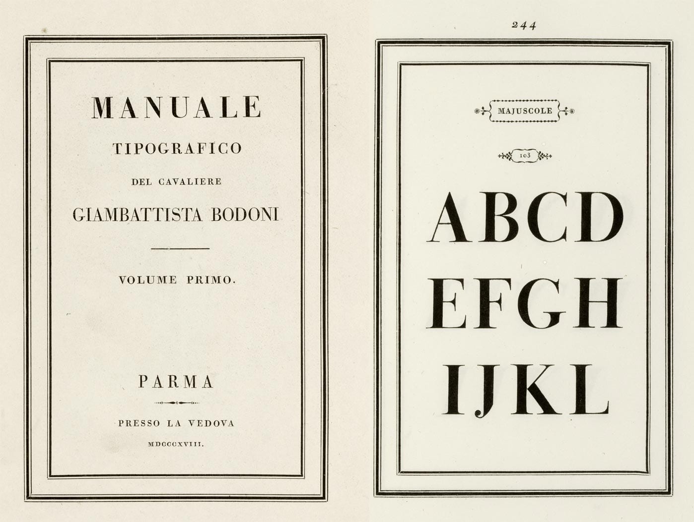
At 0° the horizontal bar vanishes and the stress is dead vertical, that is a Didone, and it is why Bodoni looks engraved rather than written. Around 30° you get the tilted stress of a Renaissance face like Garamond, because that is the angle a right-handed scribe naturally holds a pen. At 90° the whole thing inverts and the verticals disappear.
Right now the thick axis runs at about 120°. Widen the nib without changing the angle and you get a bolder weight at identical contrast, which is exactly what a weight axis in a variable font does.
The rest of this is for members.
You have read the opening of this lesson. The rest of it comes with a membership.
One membership covers all four courses and Brands.
- All lessons in the four Learn courses
- All brand breakdowns in the Brands section
- All quizzes, flashcards and crosswords
- An AI teacher on every lesson, for up to 60 questions a day
- All course material published during the membership
Price
Membership is from $12 a month on the Yearly plan, which is charged at $144 once a year. Lifetime access is $59, paid once.Membership is from ₹200 a month on the Yearly plan, which is charged at ₹2,400 + GST once a year. Lifetime access is ₹3,999 + GST, paid once.