A brand's main typeface is the one that sets most of its words. It is on the website and the app, the invoices and the job adverts, the back of the pack and the sign on the door. Headlines get the attention in a presentation, but the main face spends most of its life in paragraphs at 16 pixels and in legal text at 7 point. Judge it there first. Many strong brands choose a main face that readers barely notice, and let the logotype, the colour and a display face carry the personality.
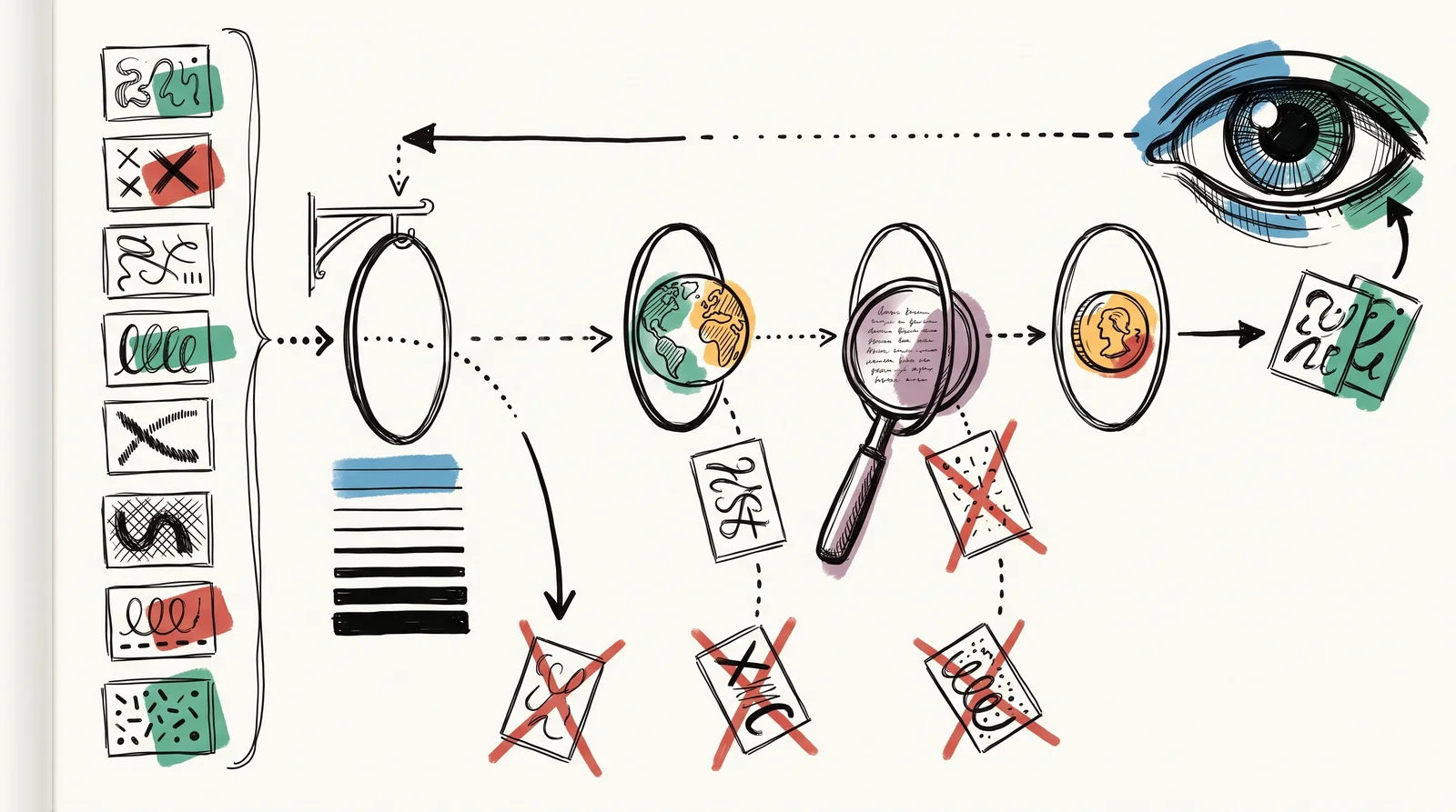
Choosing one is mostly elimination. Start from what the brand has to set: how much body copy, in which languages, at what sizes, on what media, and by whom. Those constraints remove most candidates before taste arrives. A family with three weights cannot run an interface. A face with no Cyrillic cannot follow the brand into Bulgaria or Ukraine, so a second face gets bought later and the brand looks different in Sofia. A licence priced by page views becomes a yearly bill nobody budgeted for. Whatever survives these tests is the shortlist, and only then does the look of the letters decide.
Large organisations now make this choice in public, and their reasons are worth reading. In January 2018 the BBC explained why it had commissioned its own family, BBC Reith, from the London foundry Dalton Maag. It gave three reasons. Its most used fonts, Helvetica and Arial, were anonymous. Those two and Gill Sans, its old corporate face, had been designed for print and read poorly on screens. And owning its type would cut what it paid every year for licences. Two months later Netflix launched Netflix Sans, also made with Dalton Maag, to replace Gotham, and its brand design lead Noah Nathan said that for a business as global as Netflix, font licensing can get quite expensive.
is where many type choices fail later. A font contains only the characters its makers drew, and a missing one shows up as an empty box that type people call . Google named its Noto family after the aim of ending that, no more tofu. Even inside the Latin alphabet, Polish needs letters such as ł and ą, and Vietnamese stacks two accents on one letter. Plenty of fashionable display faces have neither. IBM released its own family, IBM Plex, in 2017 to replace Helvetica, gave it away under an open licence, and the family now covers Cyrillic, Greek, Hebrew, Arabic, Devanagari, Thai, Korean and Japanese as well as Latin. Plex is also a , with a sans, a serif and a mono drawn to shared proportions, which is a common answer when a brand needs a formal voice and a friendly one that still look related.
The professional habit is to test with the brand's own words. A specimen showing the alphabet at 120 point tells you nothing about how a face behaves as a paragraph at 16 pixels, which is where it will spend its life. Paste in a page of the company's actual writing, with its longest product name, a price table and its worst legal sentence, and set it at every size the brand uses. Then read it closely. Check that a capital I, a lower-case l and the figure 1 can be told apart, that the numbers line up in a column, and that the italic is a real italic rather than a slanted roman.
Treat the licence as one of the criteria from the start. How are priced, and how the cost grows with the business, is the subject of the next lesson, "Licensing for a brand at scale". For the choice itself, one point belongs here. Several of the best working typefaces are now free under open licences, such as IBM Plex and most of Google Fonts, and choosing one takes the licence question off the table. The trade is simple. A free face is free for your competitors too, so the brand's distinctiveness has to come from somewhere else.
Checklist
Eight checks before you commit to a main typeface
- Set a page of the company's real writing at 16 pixels and at the smallest legal size.A face chosen from a large specimen can fall apart in paragraphs and footnotes, which is where it will live.
- Type every language on the three-year plan, with its accented and non-Latin characters.A missing character shows as an empty box, and adding a second face later splits the brand by country.
- Set Il1 and O0 side by side and read them at a small size.Codes, passwords and prices go wrong when a capital I, a lower-case l and the figure 1 look alike.
- Count the weights, and confirm there is a true italic.An interface needs several weights, and a browser that fakes a missing bold or italic makes the page look broken.
- Set a price list and a table with tabular figures switched on.Without figures of equal width, columns of numbers do not line up.
- Read the licence for desktop, web, app and broadcast use, and model the web cost at ten times your traffic.The next lesson, "Licensing for a brand at scale", explains how each use is priced and why the web bill grows with traffic.
- Find out what happens when a subscription ends.Some licences end your right to use the type, including on material already printed.
- Choose a system fallback font with a similar width and x-height.Readers see the fallback while the brand font loads, and a close match keeps the page from jumping.
The words, in plain language
- Primary typeface
- The one doing most of the work. Usually the one nobody notices.
- Superfamily
- A serif and a sans designed together, sharing proportions.
- Language coverage
- Which scripts and accented characters a font actually contains.
- Tofu
- The empty box a screen shows when a font has no character for a letter. Google's Noto is named after ending it.
- Tabular figures
- Numbers drawn to one shared width, so columns of prices and data line up.
- Font licence
- The permission you buy to use a font in stated ways. Desktop, web, app and broadcast are usually priced separately.
Why it matters
Type is one of the most expensive brand decisions to reverse. Changing it after launch means redoing every template, every printed piece, every app screen and every partner's copy of the guidelines, and it resets some of the recognition the brand has paid to build. The costly mistakes are late ones. The commonest is choosing from a specimen, which flatters every display face. The next is checking only today's market, then finding in year three that the face has no Arabic or no Vietnamese. Adding a second typeface for the missing script is how brands end up looking different in different countries, and the customers who notice are the ones in the newer market.
Smaller mistakes are cheaper to catch. A family with only three weights forces the web team to fake a bold. A face without makes every price list ragged. A web licence sized for launch traffic puts a growing brand in breach without anybody noticing, and a subscription that lapses can leave printed stock outside the licence. Each takes minutes to check before signing and weeks to put right afterwards. None of these appear in a pitch deck, and most of them appear within the first year of real use.
There is a real disagreement about how distinctive a main face needs to be. One side argues for a custom or rare face, because type is seen more often than any logo and a common font makes a brand look like everyone else. The other side says distinctiveness is cheaper to get from a logotype, colour and layout, and that the main face should be chosen for reliability. The second view suits most small brands. For an organisation the size of the BBC or Netflix, the licence savings can justify a custom family, which is the case both of them made.
Later lessons build outward from here. Next comes licensing at scale, what a font licence actually grants and how the cost grows with the business. Then it covers supporting faces and how to pair them, and why a face drawn for headlines fails in body text. After that come custom and modified type and what each costs, the brand's fixed set of sizes, what a website shows before the brand font arrives, and how the way type is set carries a tone of voice of its own.
Activity
Test five main typefaces on your brand's real words
Copy or write a page of your own brand's words, or No. 4's, including its longest product name and its dullest legal sentence. Paste it into Google Fonts as the preview text and try five candidates for its main face. Judge them at 16 pixels. The lesson's advice is that the main face lives in paragraphs and footnotes, so a specimen at 120 point will flatter the wrong one.
Open Google Fonts- 01Filter Google Fonts by every language the brand will need in the next three years.
- 02Paste the brand's page into the preview box and set the size to 16 pixels.
- 03Shortlist five families that have at least four weights and a true italic, including your brand's text face if it qualifies.
- 04Type Il1 and O0 in each and cross out any where the characters blur together.
- 05Write one line naming the survivor and the test that decided it.
Done when Five faces tested on your brand's own words, with one chosen and the reason written down./Time 45 minutes
Elsewhere
- Type
- term
- Period
- ongoing