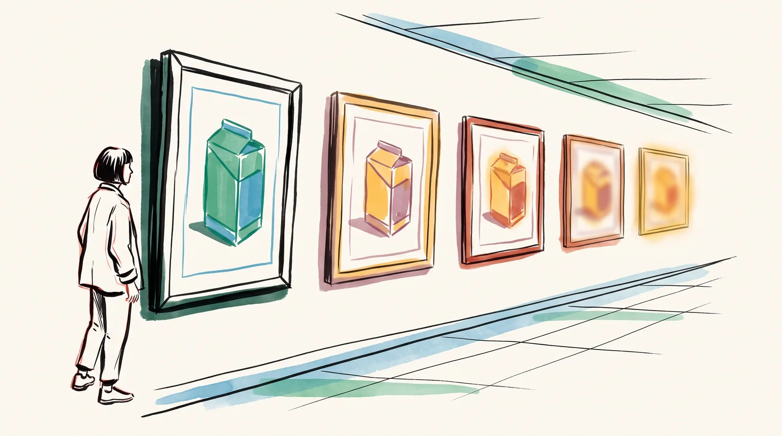
is output moving away from the agreed look a little at a time, with nobody deciding that it should. It is the mechanism, and carelessness has little to do with it. Every generation is a draw from a distribution centred on the model's average, so anything you do not explicitly hold will move towards that average. The palette warms first. The light softens, the composition slides to the centre, and the brand's own oddities, the details that made it recognisable, are the first things to be smoothed away.
It is hard to notice because each frame is defensible on its own. Nobody sees a problem in one image. The failure appears only when you put January's work next to June's, and by then six campaigns have shipped and three freelancers have each nudged the look in their own direction. This is a . No single instance looks wrong, so nobody reports it, and the drift is usually found by a new marketing director who asks why the brand looks different, or by a customer who no longer recognises the pack on a shelf.
Some things drift faster than others, and they tend to be the things a brand owns. Colour usually goes first. A diffusion model has no concept of an exact value, so a requested hex code comes back as a colour near it, and the light and grade in the scene move it further. A brand typeface cannot be reproduced at all, only imitated, and the imitation is wrong in the details a designer spots at once. Packaging combines small type, a specific structure and regulated copy, and a model approximates all of it while producing something that looks finished.
The process adds drift of its own. Every person writes prompts slightly differently, every art director finds new reference images, and every model update changes what the same words produce, so a prompt that gave the right look in spring can give a different one in autumn without anyone touching it. Brand books do not help much here. They were written to persuade people, with aspirational prose and rules made of adjectives, while a model works best from short, specific statements. A rule such as fresh but grounded gives a machine nothing to hold.
The defence is to make consistency structural instead of relying on attention, which means putting it where a tired person cannot skip it. A giving the light direction, the palette values, the camera height and a do-not list goes in front of every prompt. A frozen set of reference images goes with every job, and current models accept several at once; Google's Nano Banana 2, for example, takes up to ten images of objects and four of characters in a single request. For the product itself, a trained adapter or a real photograph composited into the scene does what words cannot. None of it depends on memory.
Then check the work regularly. A that runs automatically sets out what that check should test before anything ships. For drift, its value is that it never tires. A person checking colour and stray text gets less careful as the day goes on, while a gate puts the same questions to the last image of the day as to the first. Small slides get caught one frame at a time, before they add up to a look nobody chose.
Finally, tell drift from decision. A look that changed because you chose to change it is fine, and the change should be dated and written down so the next person knows it was meant. A look that changed because nobody was holding it is the problem this module is about. The difference is whether anyone can point to the day the rule changed and the reason it did. Keep a short change log beside the rules, with the date, the old rule, the new one and the name of whoever agreed it.
Try this
Twenty-four frames, with and without the house block
Write one plain prompt for your product in a setting. Generate it twelve times exactly as written, then twelve more times with your house block pasted in front of it, giving the light direction, the palette values, the camera height and the do-not list. Lay both rows out at thumbnail size, one above the other.
Time: Forty minutes. You need: Google AI Studio, or a Gemini API key, set up in the Accounts, keys and money module, a board or a contact sheet to lay them out on.
Look for
- Warmth, haze and a centred composition creeping into the unsteered row. That is the model's average.
- How many unsteered frames you could mistake for a competitor's.
- Which house rule held least well in the steered row. That one needs a reference image or an adapter, and more words will not fix it.
- Whether the brand colour in the steered row is the value you gave, measured with a colour picker rather than judged by eye.
- Whether the twelve steered frames agree with each other better than the twelve unsteered ones do.
The words, in plain language
- Drift
- Output moving away from the agreed look, a little at a time, with nobody deciding.
- Regression to the mean
- A statistics term borrowed loosely here. Unsteered, every run lands near the model's average.
- Brand floor
- The minimum an image must satisfy to be recognisably yours.
- Silent failure
- A fault nobody reports because no single instance looks wrong.
- House block
- A fixed paragraph of brand rules pasted in front of every prompt, covering light, palette, camera height and what is banned.
- Reference lock
- A frozen set of images that defines the look, used on every job instead of whatever somebody found last week.
- Quality gate
- The checks every image must pass before it ships, run the same way every time.
Why it matters
The commonest mistake is trusting attention. A good art director catches drift for as long as they are looking, which lasts until they are tired or on holiday. Consistency that lives in one person's eye leaves with them, and the slow loss of a look nobody chose to lose costs the brand recognition it spent years of media money building. Distinctive assets, the colours, shapes and characters people link to one brand, depend on being used the same way every time.
The second mistake is fixing drift with more words. When a colour or a pack keeps coming out wrong, the instinct is to add adjectives and capital letters to the prompt, and the model keeps averaging anyway. Words cannot hold some rules. Exact colour and a licensed typeface are two of them, and so is the product itself. Those need a reference, a trained adapter or the true asset composited into the frame, and every round of rewording before that point is paid for in rerolls and in the risk of shipping a pack that looks wrong.
The third mistake is auditing on a feeling. A team that only looks back when something seems off has already lost months, because drift never seems off from one week to the next. Put the audit on a calendar. Auditing a set against the guidelines gives the method. Twice a year is enough to see the slope while it is still a correction, before it becomes an accidental rebrand.
The rest of this module builds each of those structures in turn. It covers writing brand rules a model can act on, training a model on your own product, why colour is the first thing to break and how to protect it, and what to do about type and packaging, which a model can only imitate. Then it shows how to freeze a reference set, how to build a gate that checks every image automatically, and how to review six months of work against the rules. It ends by rewriting the brand book so a machine can use it without losing the people it was written for.
Elsewhere
- Type
- term
- Period
- ongoing